metacpan-web
 metacpan-web copied to clipboard
Links and informational elements in sidebar are not visually distinct
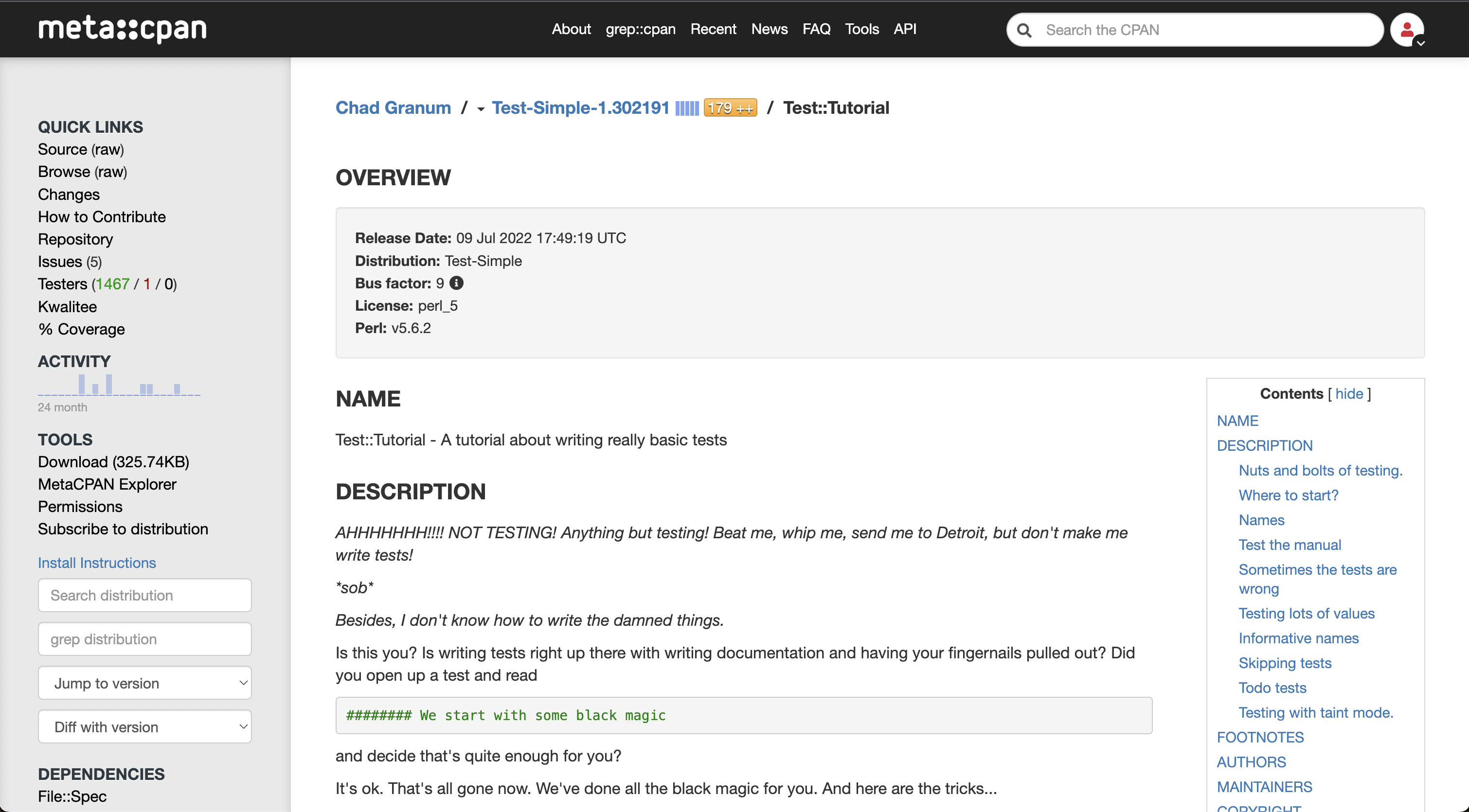
The left sidebar has various bits of content, some of which is purely informational (Module version) and others are links. By default these are displayed the same, which makes it difficult to distinguish the links from the rest of the content. They are underlined when hovering over them, but this requires scanning the entire list to see which are links, and doesn't make sense on mobile.
I would suggest that we can just make the underlines always visible.
I'm worried that underlining all those links might make the sidebar look a bit busy and distracting.
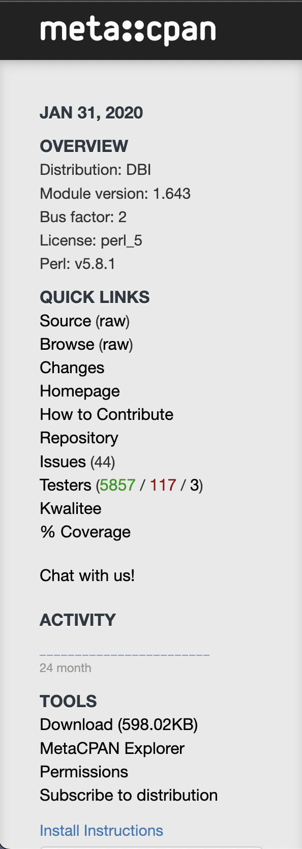
What do you think of the alternative below where the "informational" items grouped together under an Overview section near the top?
I'm also thinking of making the nav-header slightly larger and darker (the light text color on a light background probably isn't ideal for contrast).
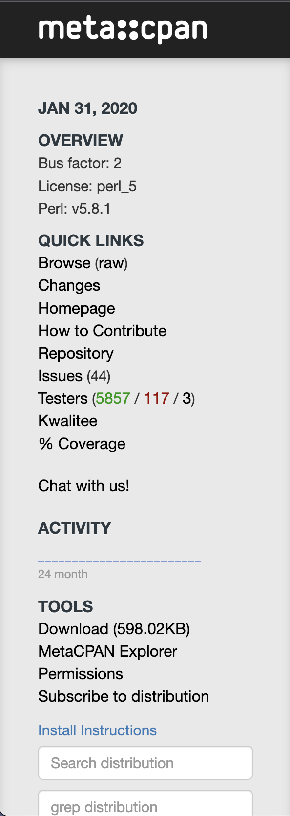
The reorganization shown is probably a good start - the sidebar is currently not particularly well organized. But I don't think that is enough on its own. Things like the distribution, the license, and possibly even the perl version could be extended in the future to link somewhere. And other elements are both links and informational, like "Issues", "Testers", and the coverage percentage. The fact that the "Testers" line contains 4 distinct links is never going to be obvious without something extra.
My suggestion to add underlines is based on the common understanding of underlines as clickable elements on web pages, as well as it being easy to implement. I'm not specifically attached to that as a solution. But I do think there needs to be something visually identifiable about the sidebar links, and not just separate section headings.
Regarding the styling of the sidebar shown, it's an improvement. The heading colors currently haven't been changed from the previous design. They don't have enough contrast against the new grey background of the sidebar.
That makes sense. What about this approach: Try to move all non-links (where possible) to the page content.
- This would decrease the number of items in the sidebar and make it easier to navigate (especially on mobile)
- Most of the informational links would probably be information that is good to know / have easily accessible if the sidebar isn't open
- Lets us keep the items in the sidebar as just links with no underline / busy styling
- If we need to turn some of these into links down the line, it would be easy to do so
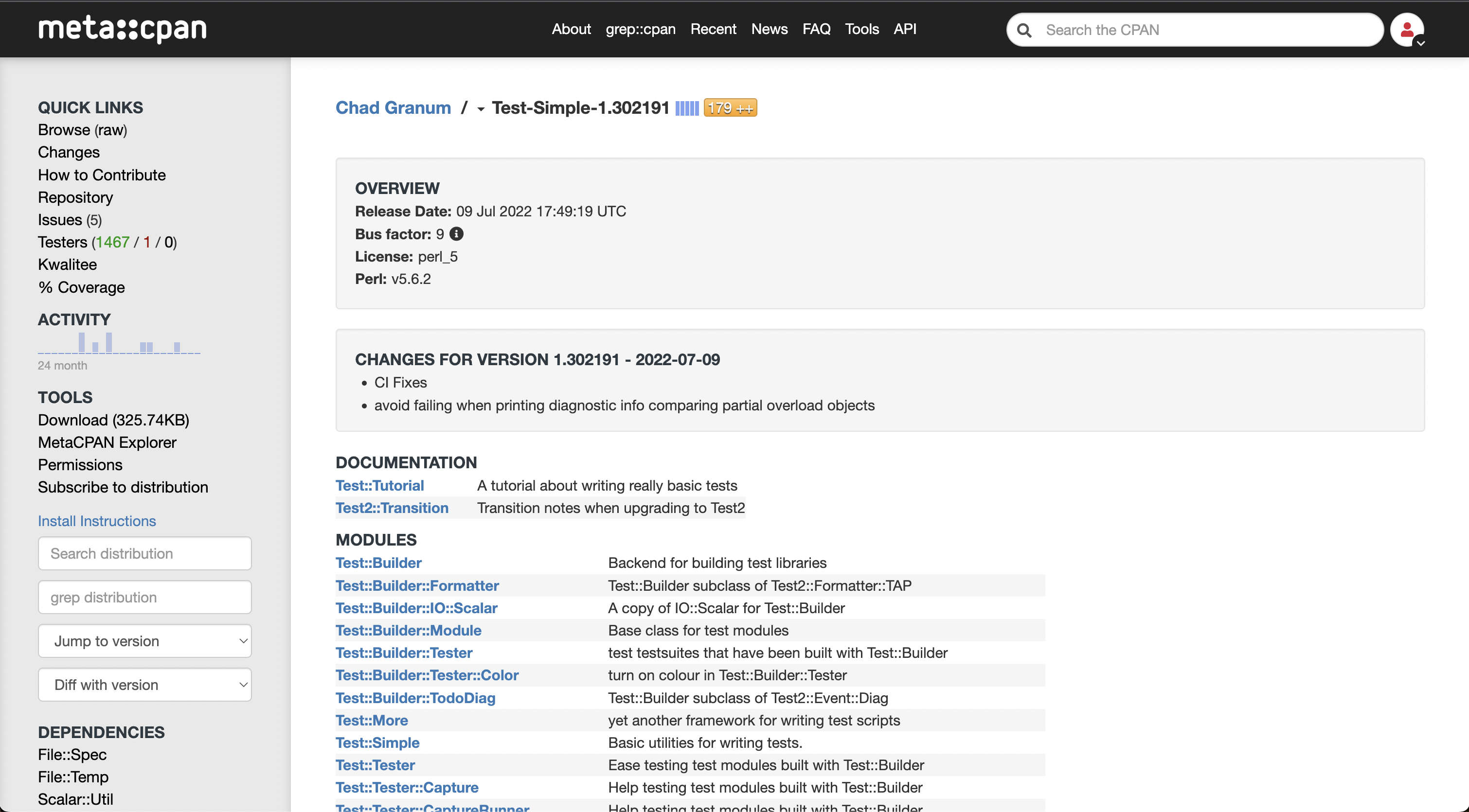
Below is what I was envisioning (although I still need to fix a few things like the date format and address elements that are both links and information, like "Issues" and "Testers" as you mention).
We might be able to make "Testers" a nav-header with links 4 links below it. I'm not sure of the naming for the individual links, but something that would link to the 4:
- http://matrix.cpantesters.org/?dist=Test-Simple+1.302191
- https://www.cpantesters.org/distro/T/Test-Simple.html?oncpan=1&distmat=1&version=1.302191&grade=2
- https://www.cpantesters.org/distro/T/Test-Simple.html?oncpan=1&distmat=1&version=1.302191&grade=3
- https://www.cpantesters.org/distro/T/Test-Simple.html?oncpan=1&distmat=1&version=1.302191&grade=4
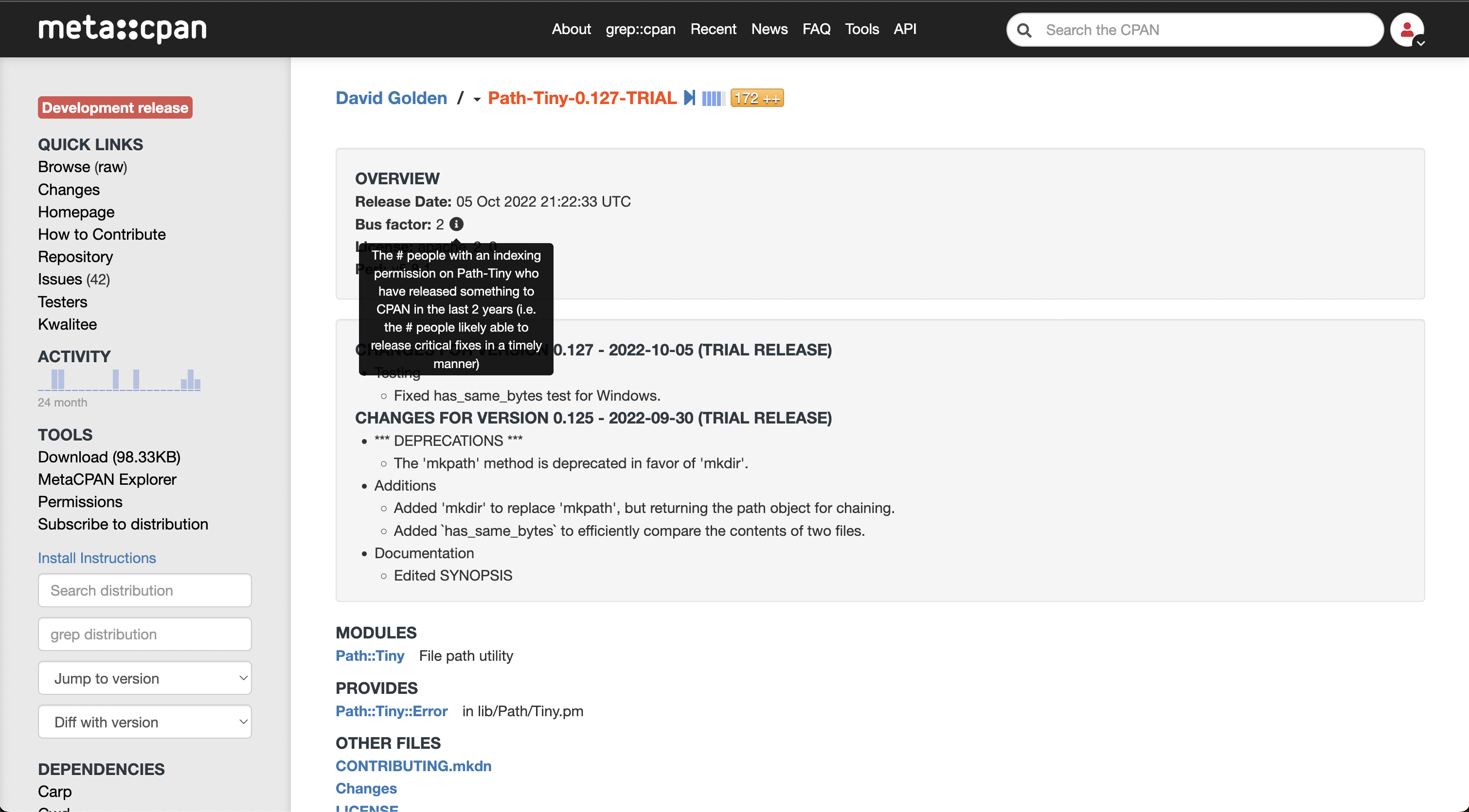
Separately, I think in places that we use the class="ttip" data-toggle="tooltip" we should be using a fa icon to indicate to a user that they can hover over it for more info if on a desktop or click if on mobile.
^ I do realize adding a new Testers section would negate by comment about shortening the number of items in the sidebar. But separately, if there are items in the sidebar that you or others think would be nice to have on all views and could be categorized under the potential Overview sections on the page content, that might help too.