bblog
 bblog copied to clipboard
 lishengzxc
border-image-*
之前一段时间在做游戏,在游戏中,经常需要用到九宫图,用九宫图可以保证图片的边框不会因为拉伸而走形。在 CSS3 中也有对九宫图的支持 — border-image。接下来就去说下它。
语法
<'border-image-source'> || <'border-image-slice'> [ / <'border-image-width'> | / <'border-image-width'>? / <'border-image-outset'> ]? || <'border-image-repeat'>
border-image-source
这个没啥好说的...,真要说下,就是可以设置 base64。
border-image-slice
这个可以好好唠个10块钱的了,先来找图,估计你看了也就明白了:

border-image-slice就是去控制九宫图是怎么切的,根据上图,其中:
- 1、2、3、4是绝对不会被拉伸了
- 5、7会被横向拉伸
- 6、8会被纵向拉伸
- 9横向纵向都拉伸
语法
/* border-image-slice: slice */
border-image-slice: 30%;

/* border-image-slice: horizontal vertical */
border-image-slice: 10% 30%;

/* border-image-slice: top horizontal bottom */
border-image-slice: 30 30% 45;

/* border-image-slice: top right bottom left */
border-image-slice: 7 12 14 5;

/* border-image-slice: … fill */
/* The fill value can be placed between any value */
border-image-slice: 10% 32 7 12 fill;

/* Global values */
border-image-slice: inherit;
border-image-slice: initial;
border-image-slice: unset;
单位相关
- 不加单位相当于
px(只支持px和%) - 百分比相对于
border-image-source图片的大小 - 关键字
fill指的是:图片中间部分是否需要保留,一般在游戏那样的场景中,中间部分会选择保留。如果不没有fill,如果有background就显示background。 - 相对的两个放下的值相加超过图片的大小会出现错误,比如图片宽度是
100px,border-image-slice: 10% 60px;,最后将会渲染出奇奇怪怪的东西 - 不支持负值
border-image-width
这个可以聊5块钱,就是去设置图片边框的宽度的,顺时针上右下左。一般来说,border-image-width和border-image-slice的值是设置相同的(非百分比,因为border-image-width百分比是相对于盒子的高宽的),但是border-image-width和border-image-slice也可以设置的不同,不同的效果就是将border-image-slice切出来的边框塞到border-image-width再进行拉伸或缩放,什么意思:就是将slice出来的1、2、3、4、5、6、7、8块东东再拉伸或者缩放成border-image-width的大小。
再简单的说,就是slice出来的东西,填充到border-image-width的空间里!!!并撑满!
因此利用这个特性,我们可以模拟高清屏幕的1px边框:
- 准备一个图片边框,这个图片有颜色(灰色)的边框
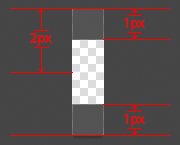
- 图片里面黑色的上下两块在画的时候设置为
1px,然后往里切割2px,然后在设置border-image-width为1px
<style>
.border-image-1px {
  border-width: 1px 0px;
  border-image: url("border.jpg") 2 0 stretch;
}
</style>
<div class="border-image-1px"></div>
但是,这是一个极其傻的 hack 方式,因为边框它是去模拟边框,虽然修复了高清1px的问题,但是边框颜色并不能设置了。
PS:偷懒的高清1px边框方案:https://github.com/lishengzxc/bblog/issues/2
除此以外,border-image-width的值可以设置的很大,但是设置很大话,又是奇奇怪怪的东西,虽然它也是有一定规则的,但是我不想去了解了(任性,以后要去好好研究看看)。
border-image-outset
这个是用来设置边框图像可超出边框盒的大小。MDN上说是可以有设置百分比的代码DEMO,但是似乎并运行不起来。也不支持负值。
设置了border-image-outset并不会改变最后盒子的大小。
border-image-repeat
默认值:stretch

.example {
  border-image:url("/files/4127/border.png") 30 30 stretch;
}
round

.example {
  border-image:url("/files/4127/border.png") 30 30 round;
}
repeat

.example {
  border-image:url("/files/4127/border.png") 30 30 repeat;
}
说实话,stretch是最常用的。