Does Katago have a logo?
I'm making a go server, and want katago to be an option that's always available. I was wondering if there was a standard logo assocaited with katago I could use as a visual asset/avatar?
I ended up seeing a logo in the top left here, so I'll use that. If there's any other visual assets, would be glad to hear. :)
There isn't a logo, but that image isn't particularly iconic for KataGo, please don't use it.
Haha! Well, fair enough. Is there an alternative? For my purposes it's better than nothing right now, but that is indeed noted.
To give a bit more context: I'm really designing a VR go interface that I just plan to connected to online-go.com. The current use of the katago images looks like this in the game:
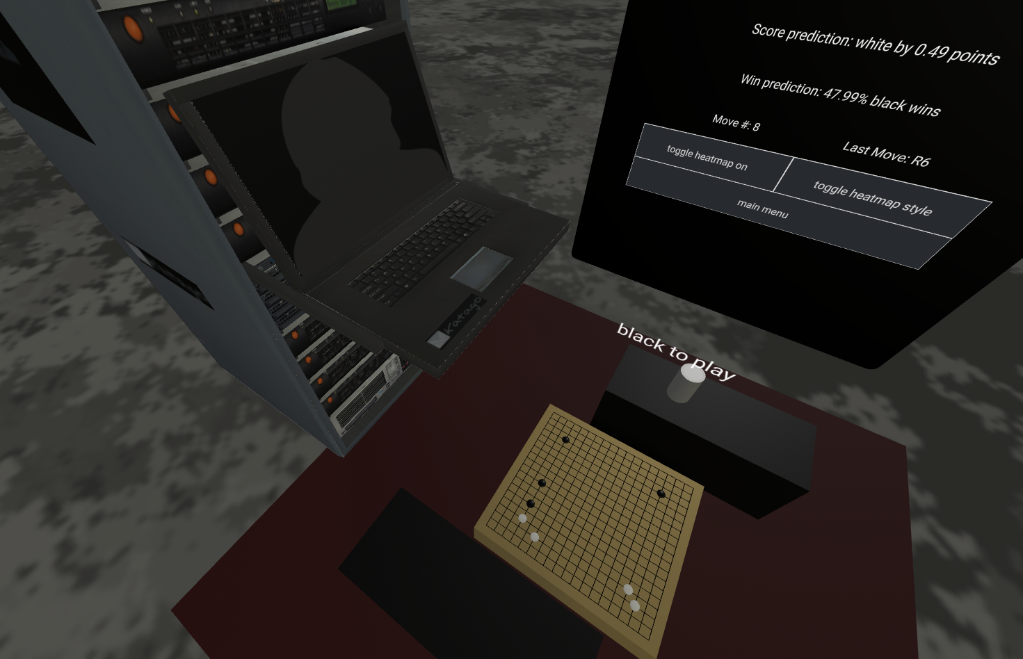
I do find it comically fitting that this well developed project has no visual language associated with it. As a project that is entirely run by programmers, no one seems to have injected any art into it.
Hehe, okay, if we need some sort of logo/icon, what do you think about these? Are they any good?



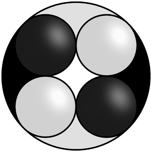
The first one looks good to me. It has Tai Chi flavor. The circle and square contains many traditional Go spirit. It may feel more solid if the center is a solid fill with black like the second one. Anyway, just some thoughts
Interesting, good start. It's definitely 'enough' and better than what I found earlier!
I think the 'soft lighting' on the stones clashes a bit with the very flat background colors.
I like the first two best; they are very classy. I think the 1st one is better than the 2nd because the "tail" of the white stones gets lost in the white background when the logo size is reduced
There isn't a logo, but that image isn't particularly iconic for KataGo, please don't use it.
So my handrawn ugly favicon disappeared? Hihi.
I like the second one the most, looking at them again, btw.
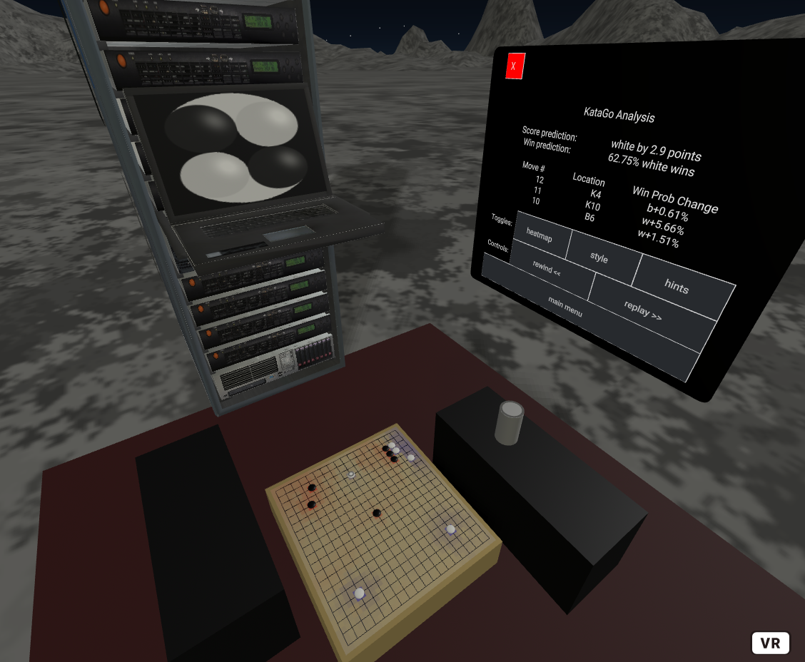
latest draft thrown in for now. ;)
(I'll of course be watching for updates, and my game isn't publically available yet anyways).
Looks good @kylebakerio !
@kylebakerio If the background of logo is brown not black, it will look better in my view.
Personally I'm not a fan of the tan backgrounds, but it's interesting to hear.
If the logo background is brown, one can see 2 black fish and 2 white fish. If black, one can only see 2 white fish.
I don't see any fish. ;)
I am aware of the effect you're talking about, but there's the question of clarifying the ying/yang element, vs. the aesthetics themselves (flat tan is not an attractive color here). I might also argue that having a third color for contrast contradicts the black/white. I might also argue that having two of the black fish seem to disappear supports the point of the symbol in its own way.
But given that it is transparent, I may superimpose it on top of a screen filled with terminal text in the background, which might make the black outline of the "fish" visible in a way.
Well, don't stop your whole tour because of one petty obstacle. The Go engine logo part of the whole server will support multiple Go engines. Universal && simple codes is the best. These are all what I, a blind computer user 😃 , could say.