angular-number-picker
 angular-number-picker copied to clipboard
 leftstick
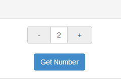
A directive used for picking number by using up/down button, instead of typing
angular-number-picker
=====================


A directive used for picking number by using -/+ button, instead of typing the number directly.
This is an angular directive designed in mobile-first concept. Which means you would have better user experience while in mobile development.
While running on mobile device, you would increase/decrease the number continuously by long tap the -/+ button.
Try it: plunker
Requirement
- angularjs (1.4.3+)
UI dependency(optional)
- bootstrap (3.3.5+)
Installation
via bower
bower install angular-number-picker --save
via npm
npm install angular-number-picker --save
via script
<script type="text/javascript" src="node_modules/angular/angular.min.js"></script>
<script type="text/javascript" src="node_modules/angular-number-picker/dist/angular-number-picker.min.js"></script>
Import
via ES2015
import {ngNumberPicker} from 'angular-number-picker';
via CommonJS
var ngNumberPicker = require('angular-number-picker').ngNumberPicker;
via script
<script type="text/javascript">
    var ngNumberPicker = window.ngNumberPicker;
</script>
Basic Usage
Add ngNumberPicker module as your angular app's dependency
var demo = angular.module('demo', [ngNumberPicker]);
ngNumberPickeris the variable you get from above "Import" stage
Use h-number tag in your html
<div ng-controller="DemoController">
    <h-number value="input.num" min="2" max="10" step="1" change="onChanged()"></h-number>
</div>
You can use transclusion, too
<div ng-controller="DemoController">
    <h-number value="input.num" min="2" max="10" step="1" change="onChanged()">
        <input type="text" ng-model="input.num">
    </h-number>
</div>
Writing DemoController
demo.controller('DemoController', ['$scope', function($scope) {
   $scope.input = {
            num: 0
        };

   $scope.getNumber = function() {
       alert('The number is: [' + $scope.input.num + ']');
   };

   $scope.onChange = function(){
       console.log('The number is Changed ', $scope.input.num);
   };
}]);
h-number configuration
| Attribute | Type | Required | Description |
|---|---|---|---|
| value | expression | Yes | Expression to evaluate as the input number |
| min | Number | No | The minimal point to limit the operation. 0 by default |
| max | Number | No | The maximum point to limit the operation. 100 by default |
| step | Number | No | The step value for the operation. 1 by default |
| singular | String | No | Label to be included after value when value is 1 |
| plural | String | No | Label to be included after value when value is not 1 |
| unit-position | String | No | where to place the singular/plural. Available options: left, right. right by default. |
| change | Function | No | Function to be called while number is changed |
build-in class
input-group
The wrapper class for the h-number element
input-group-addon
The wrapper class for +- operator
form-control
The wrapper class for the number area at the center
active
The active class will be added to the input-group-addon button, while touching them. So it's possible to implement your own behavior.
picker-unit-left
The picker-unit-left class will be added to the left unit span
picker-unit-right
The picker-unit-right class will be added to the right unit span
It's easy to implement those classes to achieve your own UI
run demo locally
Install npm dependency
npm install
Install bower dependency
bower install
run demo
npm start
I will launch a debug server at http://localhost:8000/
 leftstick