kitty
 kitty copied to clipboard
Gamma correct blending in cell fragment shading
I switched to Kitty recently and while I think that it's a very nice replacement for my previous terminal (I like specially that many things just work out of the box and that it's easy to configure, kudos for that), I wasn't immediately convinced about the rendering quality of small fonts (event despite I have a high DPI display).
The vertical strokes are specially problematic as the intensity is not uniform. Here you have a close up, where it can be seen what I mean:
To my eyes, the n, the h and the u are too blurry on the left stroke.
I thought there could be an explanation for it in the implementation of the alpha blending so I dig in the code and I found it is indeed the problem. In order to get high quality rendering, the alpha blending function needs to be gamma corrected (this video explains very well what this is about: https://youtu.be/LKnqECcg6Gw).
After implementing the correction, the rendering looks a lot better to me. Here you have a few screenshots for comparison:
Font size 9.0
- master
- branch
Font size 7.0
- master
- branch
In terms of performance, I've used this snippet to compare master vs this branch:
$ time python -c "for i in range(1000000): print(i, 'let me repeat myself ' * 5)"
I haven't done a scientific comparison, but a few repetitions show that essentially there's no noticeable difference.
The PR is a draft because there are other other blending functions in the same file that would require changes in the prototype and I didn't want to get down that rabbit hole without knowing if there's any interest upstream. It would also make sense to make the gamma value a configuration option.
This fix may be specially interesting for people complaining about the lack of support for bitmap fonts. I tested in the HD display of my laptop and font sizes even smaller that 7.0 look decent.
Wouldn't you get the same effect by just turning off antialiasing? That's essentially what it looks like your patch is doing. Look at magnified versions to check.
Anti-aliasing is definitely still there. Here are magnified versions of the first two images:
OK that's interesting. next question is wont gamma correction change the reproduced colors? For non-black and white text. I recall we had established that gamma correction was already done/not needed in #2249. If so this feature would probably make more sense as a "brighten" text feature.
This is complementary to any gamma handling related to the color profiles, but somewhat independent. I'm no expert in color handling, but my basic knowledge is that not having any specification of the display and its color profile, it's fair to naively assume that the colorspace is sRGB. In any case, luminance is encoded logarithmically and even if the base of the logarithm is unknown, it's better to assume a wrong base than linearity (the base is normally between 1.8 and 2.2, in the PR I picked the lowest value to not cause the font to get too thick in comparison with master). The purpose of the PR is to perform alpha blending in a linear scale, which is where linear interpolation makes sense, and convert the result back to the logarithmic scale afterwards. The video I linked explains it very well (you can skip to 1:57 and stop at 3:10).
This PR shouldn't change at all how colors are displayed, it's just about how they are blended for text. I haven't tried, but it you open a PNG in Kitty it should look exactly as before.
That said, the changes I made are incomplete because I'm not sure about how to apply the same principle to the functions that blend premultiplied colors (I wonder if it's possible to do it without undoing the pre-multiplication).
OK, I see what you are saying. More questions.
-
What gamma value needs to be used? Why 1.8, according to https://en.wikipedia.org/wiki/Alpha_compositing#Composing_alpha_blending_with_gamma_correction it should be 2.2 most commonly.
-
For the premul case, perhaps use this: http://ssp.impulsetrain.com/gamma-premult.html
-
Performance impact: pow() is a fairly expensive function, still I doubt it will affect user visible performance unless the terminal window is pretty large/GPU is very low end, but it will increase GPU load, which should show up on GPU load monitoring tools.
- I think the gamma value should be a user setting. I chose the minimum because the higher the value, the thicker fonts look. I don't have any particular opinion about how thick fonts should be, but I picked a small value to reduce the difference between master and the branch.
- That solution requires to do the alpha pre-multiplication in linear RGB space and then convert ot sRGB and the adjustment needs to be done at the source of the pixel data. I think it's easier if you tell me if this is possible at all because I would need to dig in the code to find what could be the source of the premultiplied colors.
- I did this experiment. I took a console using half my 4K screen and run a infinite printing loop. Then I took nvidia-smi to sample the volatile GPU utilization without and without pow. The utilization was around 23% in master and 33% in the branch. So, yes, there's a cost. For users more concerned with performance than quality the correction should be an opt-in feature. Personally, I will keep it without any hesitation.
On Mon, Feb 15, 2021 at 12:33:00AM -0800, Juan Hernando wrote:
- I think the gamma value should be a user setting. I chose the minimum because the higher the value, the thicker fonts look. I don't have any particular opinion about how thick fonts should be, but I picked a small value to reduce the difference between master and the branch.
Remember this is not only about drawing white text on black backgrounds. The code has to provide for blending say red text on green backgrounds. As such, there is presumably a gamma value that gives the "best" or "most visually correct" result across the spectrum.
- That solution requires to do the alpha pre-multiplication in linear RGB space and then convert ot sRGB and the adjustment needs to be done at the source of the pixel data. I think it's easier if you tell me if this is possible at all because I would need to dig in the code to find what could be the source of the premultiplied colors.
This shader blends foreground and background colors. The background color comes from the vertex shader and can therefore be premultiplied there with gamma. The foreground color comes from calculate_foreground in the cell shader itself, so is completely under our control.
- I did this experiment. I took a console using half my 4K screen and run a infinite printing loop. Then I took nvidia-smi to sample the volatile GPU utilization without and without pow. The utilization was around 23% in master and 33% in the branch. So, yes, there's a cost. For users more concerned with performance than quality the correction should be an opt-in feature. Personally, I will keep it without any hesitation.
Hopefully by using the premult technique we can reduce that. But if it remains in the region of a 30% bump I would probably want it defaulted to off.
On Mon, Feb 15, 2021 at 12:33:00AM -0800, Juan Hernando wrote: 1. I think the gamma value should be a user setting. I chose the minimum because the higher the value, the thicker fonts look. I don't have any particular opinion about how thick fonts should be, but I picked a small value to reduce the difference between master and the branch. Remember this is not only about drawing white text on black backgrounds. The code has to provide for blending say red text on green backgrounds. As such, there is presumably a gamma value that gives the "best" or "most visually correct" result across the spectrum.
That's a good point. I will increase the value to 2.2
- That solution requires to do the alpha pre-multiplication in linear RGB space and then convert ot sRGB and the adjustment needs to be done at the source of the pixel data. I think it's easier if you tell me if this is possible at all because I would need to dig in the code to find what could be the source of the premultiplied colors. This shader blends foreground and background colors. The background color comes from the vertex shader and can therefore be premultiplied there with gamma. The foreground color comes from calculate_foreground in the cell shader itself, so is completely under our control.
I see, if the correction can be done in the vertex shader then it should be possible to both complete the implementation and improve the performance.
I'm quite busy at the moment, but I will try to follow up on this in the next days.
You might be able to get the GPU to do this for you at little or no cost:
Check for all the extensions with "sRGB" in their name: https://www.khronos.org/registry/OpenGL/extensions/EXT/
Many of them feature linear transforms for compositing in sRGB color space.
Using gamma = 2 will make it possible to replace pow with x*x which is chipper and is in the 1.8 - 2.2 range, won't that be a good compromise?
Using gamma = 2 will make it possible to replace pow with x*x which is chipper and is in the 1.8 - 2.2 range, won't that be a good compromise?
That would save the inner pows, but the outer one would have to stay (as a sqrt).
Remember this is not only about drawing white text on black backgrounds. The code has to provide for blending say red text on green backgrounds. As such, there is presumably a gamma value that gives the "best" or "most visually correct" result across the spectrum.
I've rebased this branch on master to try this. It doesn't work quite right with other backgrounds, and tweaking gamma doesn't seem to do much.
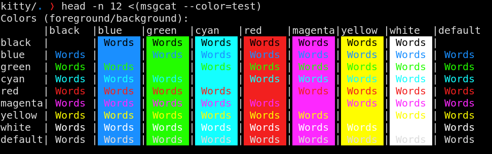
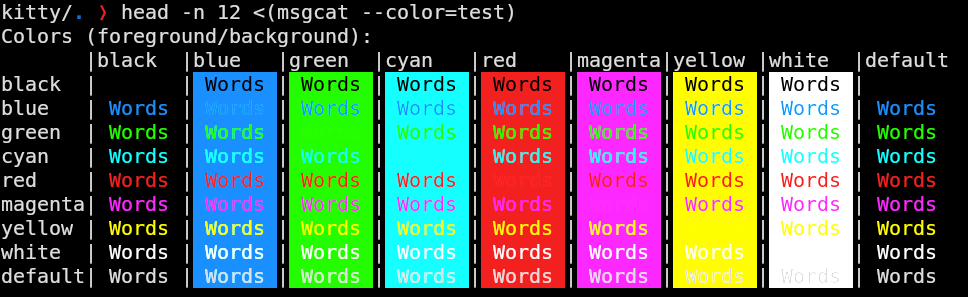
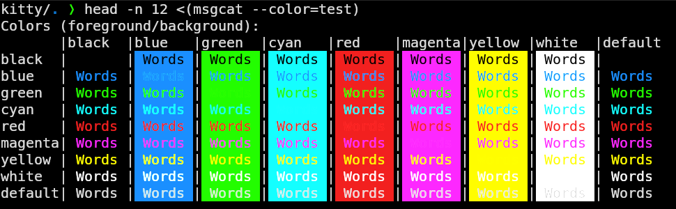
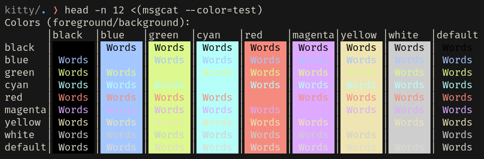
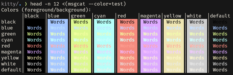
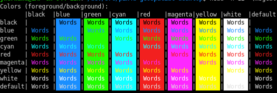
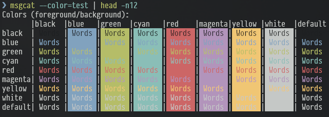
On the default config it's not that bad. There is some visible aliasing when the foreground and background are the same. Using my config it is worse; there's almost a white border around the text in certain combinations. See the red and magenta columns especially. I suspect that's because my config is not using "pure" colors as the defaults are.
master:
1.8 gamma:
2.2 gamma:
master with my config:
1.8 gamma with my config:
I've been thinking of finishing this PR properly many times, but I didn't find the time and motivation. You're giving a reason to finish it @allemangD. To me it looks like color bleeding related to incorrect handling of premultiplied alphas.
What puzzles me is that I tried your test in my version (which is based on de0f225c4586bac30d74e5c5b5972f4f5028e46d) and I don't see the bleeding:
 I would say it looks quite good at this small font size.
Can you share a minimal config that reproduces the issue to see if I can get a similar result?
Here are the colors and font size I was using. https://gist.github.com/allemangD/a3b506ae521137b319643676dee17aef
The first three screenshots were with --config=none. I don't know if it would matter but I'm on Ubuntu with nvidia-driver-470. Maybe different drivers would handle the blending differently?
I've just tested on your version (3f7a812, based on de0f225c) and I still see the same issue. For reference, my screenshots above were done after rebasing onto e337fcaa.
Now I can reproduce it, in fact I didn't remember I had commented out the code for doing the gamma correction. The interesting thing is that I didn't miss it.
It seems something has changed in font rendering and between Ubuntu 18.04 (which I was using at the time of submission) and Ubuntu 20.04. Looks like the font is rather different.
With 18.04

With 20.04

In Ubuntu 20.04 the rendering looks much better to my eyes, specially the n and h. It may not look like, but the magnification factor is the same in both images as well as the font size.
@allemangD, what was your motivation for testing this branch? In your screenshots from master it doesn't look bad after all.
I'm considering closing the PR as it doesn't seem necessary anymore.
what was your motivation for testing this branch?
I've always had some sense that fonts in kitty seemed "softer" around the edges somehow, and this looked like a possible (fixable) explanation. The branch does fix that, but based on your last comment I'm now wondering if it's just increasing the perceived weight, and I should find a heavier font.
No, no, it doesn't only do that. This commit tries to fix a real problem that is usually ignored when doing alpha-blending.
But for whatever reason it seems that in Ubuntu 20.04 the font hinting is better than it used to be in Ubuntu 18.04 and then the lack of gamma correction becomes a lot less evident.
I recently switched fonts in Kitty and got a bit disappointed in how it rendered the font on lower DPIs. First I thought it was something related to the antialiasing or lack of subpixel rendering, but then I found this PR and since those are pretty complex I thought I would give this patch a try instead.
I tested the shader-patch in this commit and the font looks much better and almost completely solves the issue I had with rendering (it is now pretty close to Windows/Mac rendering at the same size), but I also managed to reproduce the issue with the aliasing on brighter backgrounds which looks pretty bad:

This is using Gentoo with Wayland and amdgpu driver, the colorscheme is Base16 Tomorrow Night, and the font is PragmataPro.
For reference, this is how the font looks without the patch (the hinting in the font is helping it slightly, but it looked much worse when autohinting was used):

The brightness variations get more obvious when looking at more text, and I was honestly quite disappointed in the result.
I don't have much experience with OpenGL or colorspaces, but my suspicion is that we also need to correct for gamma for the other colors, and not just when blending the foreground color itself. To test this hypothesis I took the suggestion from above and modified the vertex shader to first generate colors in linear gamma from sRGB, and then the fragment shader finally gamma corrects as the last step after having used premultiplied alpha blending in linear space.
This is the result:
So far I have not yet made any tests regarding the performance-impact of this, but I tried to mitigate some of it by using a lookup-table for the 256-color to linear conversion and by using branchless implementations of sRGB-linear and linear-sRGB conversions.
Maybe using GL_FRAMEBUFFER_SRGB and GL_SRGB_ALPHA textures can improve performance further (since the shader itself will not have to perform most of the conversions), but from what I can tell this is not always supported and would also require all/most of the shaders to operate in linear space with more invasive modifications to Kitty compared to just editing a shader program. Not sure if this is worth investigating.
Minor update on some very basic performance testing: It seems like variations in load and temperature are affecting the results more than me swapping out the shader programs. I tried the original shader, the shader from @hernando, and https://github.com/m4rw3r/kitty/commit/3dcd1481a2ccba2ac95f844e93a34a00210e2073. They all fall within ~3% of each other, without any specific one being consistently faster.
I also tried setting GL_FRAMEBUFFER_SRGB and making textures use GL_SRGB_ALPHA, and then I removed the conversions in the shader. The visual result was the same, but the performance on my system was still within variance depending on load and what the GPU felt like doing so it does not seem like it affects performance one way or the other as long as you need the sRGB conversions.