vue-twemoji-picker
 vue-twemoji-picker copied to clipboard
 kevinfaveri
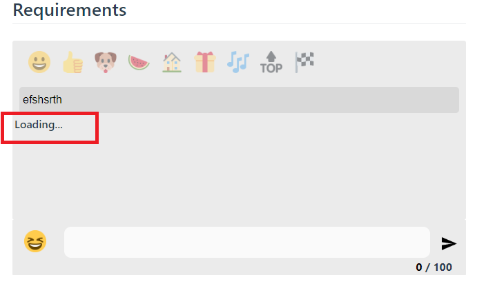
Loading Props for Components
Useful for showing a default loading placeholder if the datasets are being loaded on demand.
- Loading prop for Twemoji Textarea.
- Loading prop for Twemoji Picker.
Would be nice to have a slot for the loader, in case the user wants to pass something other than a string, like a loading icon.
So, you mean relative to the isLoadingLabel? Because there is a slot already for the button so you can configure as you wish: https://kevinfaguiar.github.io/vue-twemoji-picker/docs/twemoji-picker-api/#twemoji-picker-button
I am talking about isLoadingLabel. But I fail to see how the twemoji-picker-button slot allows me to customize the loading text?
I was asking for something like this
<twemoji-picker>
  <template v-slot:loading>
    <MyAwesomeLoadingComponent />
   <!-- Display component rather than a string "Loading..."-->
  </template>
</twemoji-picker>
Hi there! This is why I asked haha Basically this issue was for some loading effect on the component itself... But I will think about changing isLoadingLabel and update here... Thank for your support