mini-graph-card
 mini-graph-card copied to clipboard
[bug] Aggregation using wrong data when data is missing
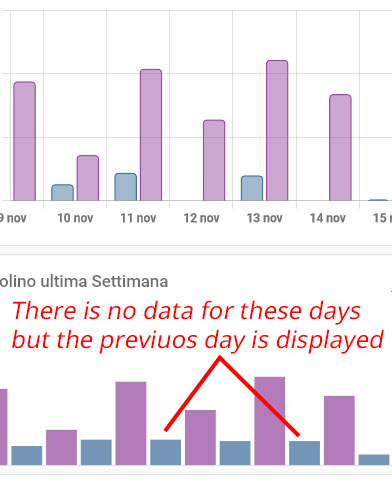
I'm trying to display two devices usage with a statistic graph, aggregating it by date (day) but when the data is missing the previuos data are shown. This image is a parallel with the Lovelace statistic graph (which correctly avoids displaying the bar when data is missing):

Any solution? My code:
type: custom:mini-graph-card
entities:
  - entity: sensor.pro_6000_9e5e_time
    color: '#7396b7'
  - entity: sensor.smart_series_7000_be71_time
    color: '#b27bba'
hour24: true
name: Spazzolino ultima Settimana
icon: mdi:toothbrush
align_state: center
unit: s
hours_to_show: 168
aggregate_func: max
group_by: date
show:
  graph: bar
  labels: true
  legend: false
I believe it is here:
https://github.com/kalkih/mini-graph-card/blob/8e70381e3d887e5803bc8fc4bc115ecc4dc587e0/src/graph.js#L80-L98
coords is pushed with a new data point for every group of data history[i]. But if there are no entries in the history group, item is falsey in getCoords and the result from the previous history group will be used: last[1].
If you accept the challenge to fix this, you'll likely have to fix downstream functions, too, in order for them to handle empty coords entries.
Thank you for the analisys, but i'm not a coder at this level. Maybe is enough replace last[1] with a 0 to get a flat bar?
Not sure. I guess, it depends on the aggregate function and the type of data. The current logic probably has some reason for its existence, even though I don't get it right now...
I dug a bit deeper into it in the course of #961. The correct substitute for missing data indeed depends on the aggregation function used, e.g. delta should surely be 0 in that case. So, that seems to be a bug.
However, in your case and from Home Assistant's view, the sensor had a constant value during the whole day of 12th November. So, displaying the max of it as non-zero seems correct to me. The statistics view does some additional magic, which we cannot reproduce in this graph card. (Only partly with, e.g., the delta aggregation function.)
Can you check again please with a non-statistics graph from HA, i.e. from the history menu? If that looks similar to our graph, you'll have to either adapt graph card's options to better match the statistics view. Or maybe you'll even have to fix the data in the sensor configuration itself.