basic-vue-chat
 basic-vue-chat copied to clipboard
 jmaczan
💬 Easy to use Vue chat
basic-vue-chat


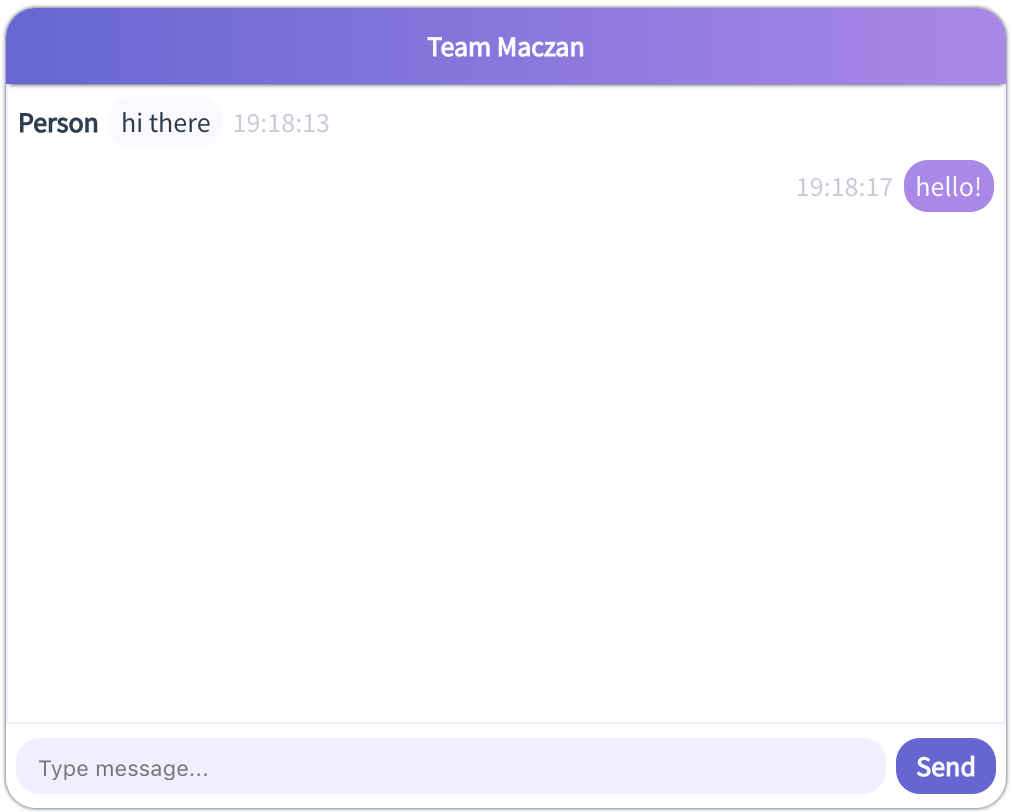
Implementation of Vue-based chat.
- basic-vue-chat
- Installation
- npm
- yarn
- using repository
- Dependencies
- Usage
- Pushing messages
- Handling messages from user
- Images
- Commands
- Mock data
- Customization
- Styles
- Title
- Initial data
- Styling
- Code structure
- Technologies used
- Installation
Installation
You can install the component using package managers, such as npm or yarn or install component from the repository.
npm
npm i basic-vue-chat
yarn
yarn add basic-vue-chat
using repository
git clone https://github.com/jmaczan/basic-vue-chat.git
cd basic-vue-chat
npm i
Dependencies
Components uses Vue (vue package), Fontawesome and Moment.js for Vue (vue-moment).
Usage
Chat is a single Vue component, which you can find in /src/components/basic-vue-chat/. To start, just import BasicVueChat component and put the following line into your html code:
<basic-vue-chat />
Pushing messages
To push message to chat, just pass newMessage prop to BasicVueChat. Example:
<basic-vue-chat :new-message="message" />
The message object above may be part of data in your Vue component in which you will use BasicVueChat.
Example of correct message structure:
{
  id: 0,
  author: 'Person',
  imageUrl: 'http://path/to/image',
  image: '',
  contents: 'hi there',
  date: '16:30'
}
You can find example of message pushing in App.vue file.
Handling messages from user
When user sends message, the message is propagated to BasicVueChat component and event newOwnMessage is emitted. To handle this event, you can for example do this:
<basic-vue-chat @newOwnMessage="onNewOwnMessage" />
where onNewOwnMessage(message) is a method in your Vue component in which you will use BasicVueChat.
Example of correct event payload structure:
{
  id: 1,
  imageUrl: 'http://path/to/image',
  image: File(),
  contents: 'hello',
  date: '16:31'
}
Images
You can upload and receive images. To attach image, use paperclip button. Image will be emitted in message on image (as File object) and imageUrl (path string) properties.
Commands
To start development, you can use hot reload mode:
npm run serve
To build production version:
npm run build
To run tests:
npm test
Mock data
To attach mock data, just pass logic prop attachMock to BasicVueChat.
Customization
Styles
Styles are imported in main BasicVueChat component and variables have !default values, so it means that you can override default values by defining your own variables before styles import.
<style lang="scss">
$primary: red;
// above the following import you can override default values of variables like $primary
@import "../../assets/scss/main.scss";
</style>
Title
Pass prop title to BasicVueChat component.
<basic-vue-chat :title="'My Best Team'" />
Initial data
Pass prop initialFeed to BasicVueChat component.
<basic-vue-chat :initial-feed="feed" />
Example of correct data structure:
const feed = [
  {
    id: 1,
    author: 'Person',
    imageUrl: 'http://path/to/image',
    contents: 'hi there',
    date: '16:30'
  },
  {
    id: 0,
    author: 'Me',
    contents: 'hello',
    date: '16:30'
  }
]
Pass prop initialAuthorId to BasicVueChat component to define current user's ID. Default value is 0.
Styling
Chat uses SCSS, so you can easily override variables used in project. You can find them in /src/assets/scss/modules/_variables.scss. All variables have default values.
| Description | Variable | Default value |
|---|---|---|
| Primary color | $primary | $slate-blue (#6B63D8) |
| Secondary color | $secondary | $lavender (#B284ED) |
| Header color | $header-color | $ghost-white (#FAF9FF) |
| Input background color | $input-background-color | $alice-blue (#F2EFFF) |
| Font family | $font-family | 'Source Sans Pro', sans-serif |
| Font weight | $font-weight | 400 |
| Font size | $font-size | 14px |
| Dark text color | $dark-text-color | $madison (#2C3E50) |
| Light text color | $light-text-color | $ghost-white (#FAF9FF) |
| Dark background color | $dark-bg | $madison (#2C3E50) |
| Light background color | $light-bg | $white (#FFFFFF) |
| Chat window width | $window-width | 500px |
| Chat window height | $window-height | 400px |
| Message max width | $message-max-width | 200px |
Code structure
- assets
- Sass standard CSS code structure
- Components styles in
partialsdirectory - Variables and settings in
modulesdirectory
- components
- chat's components are in subdirectories of
basic-vue-chatdirectory
- chat's components are in subdirectories of
- helpers
- reusable helpers for scrolling functionalities
- App.vue - runner file
- main.js - project config
Technologies used
- JavaScript
- Vue
- Moment.js
- HTML5
- CSS
- SCSS
- BEM
- Tests
- Jest
- Vue test utils
- Tooling
- npm
- Continuous Integration
- Travis CI
- Linting
- ESLint standard config
Developed and tested under macOS High Sierra 10.13 and Google Chrome 69.
 jmaczan