au.jkotchoff.scrollableView
 au.jkotchoff.scrollableView copied to clipboard
 jkotchoff
An Alloy Scrollable View that shows an iOS style paging control for android
Crossplatform ScrollableView widget 

This widget for the Appcelerator Titanium Alloy MVC framework provides a view that mimics the iOS implementation of the Ti.UI.ScrollableView paging control for the Android platform.
Quick Start
Get it 
Download this repository and consult the Alloy Documentation on how to install it, or simply use the gitTio CLI:
$ gittio install au.jkotchoff.scrollableView
Use it
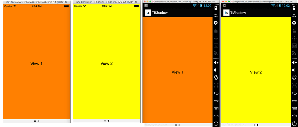
- Require the widget in a view:
<Alloy>
  <Window>
    <Widget src="au.jkotchoff.scrollableView">
      <View backgroundColor="orange">
        <Label text="View 1"></Label>
      </View>
      <View backgroundColor="yellow">
        <Label text="View 2"></Label>
      </View>
    </Widget>
  </Window>
</Alloy>
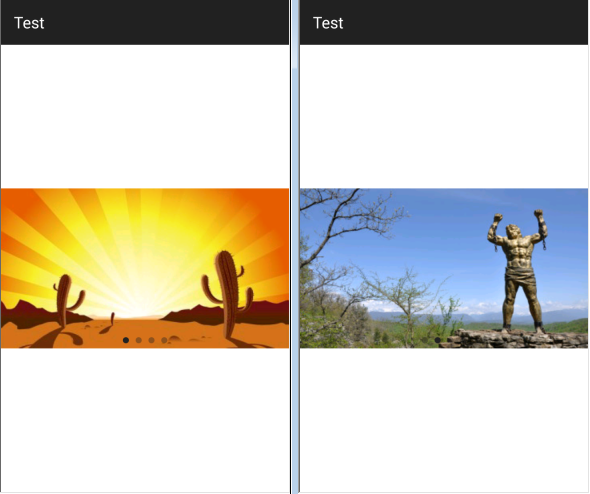
- Or retrieve the images on run time:
<Alloy>
  <Window>
    <Widget id="sView" src="au.jkotchoff.scrollableView" height="200" />
  </Window>
</Alloy>
function setImagesToScrollableView(name) {
    var views = [];
    _.each(name, function(item) {
        var img = Ti.UI.createImageView({
            image: '/images/' + item + '.jpg',
            width: Ti.UI.FILL
        });
        views.push(img);
    });

    $.sView.setViews(views);
}

setImagesToScrollableView(['1', '2', '3']);
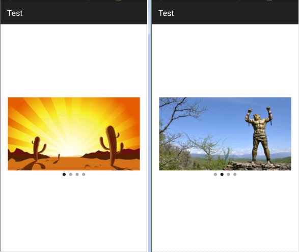
Style the ScrollableView
You can change some default values for the widget, like the image used as the paging button indicator or the paging control background color. Those are the possible parameters you can change while initializing the widget:
| Parameter | Type | Description |
|---|---|---|
| pagingControlBackgroundColor | color | Any valid color, including transparent. |
| pagingControlDotImage | image file | To change the default black button indicator, set here your own image. |
| pagingControlBelow | boolean | By default, the paging control is set over the images. You can set this value to true to set it below the images (note: the images will shrink their height 20dp from the total height of the widget control). |
Example for paging control inline/below the images:
Methods
| Method | Description |
|---|---|
| setViews(views[]) | Array with all the views to show |
| setCurrentPage(number) | Jump to the specified page |
| setHeight(value) | You can set initial height as property and modify it later with this method (e.g. you retrieve images from a remote server and you don't know if there are images, so you can setHeight(0)) |
| moveNext() | Goes to next page |
| movePrevious() | Goes to previous page |
| getCurrentPage() | Get current page index |
| getTotalPages() | Get total number of page |
Event listeners
The listeners of ScrollableView can be set both, in the View as in the Controller.
- Example in View:
<Alloy>
  <Window>
    <Widget id="scrollableView" src="au.jkotchoff.scrollableView" onScroll="onScrollEvent">
      <View backgroundColor="orange">
        <Label text="View 1"></Label>
      </View>
      <View backgroundColor="yellow">
        <Label text="View 2"></Label>
      </View>
    </Widget>
  </Window>
</Alloy>
- Or in Controller:
$.scrollableView.addEventListener("scroll", function() {
  \\ your code here
});
Changelog
- 1.0 Initial version
- 1.1 Add setView method & enable event listeners
- 1.2 Add support to receive a custom paging control image
- 1.3 Add setHeight method & support for pagingControl below the images
Licenses
This project is licensed under the Apache Public License (Version 2). Please see the LICENSE.txt file for the full license.
 jkotchoff