component-inspector
 component-inspector copied to clipboard
Feat: Svelte support
This plugin looks great. Would be cool to add support for Svelte. Happy to try have a crack at it in my free time if you're open to contributions 🙂
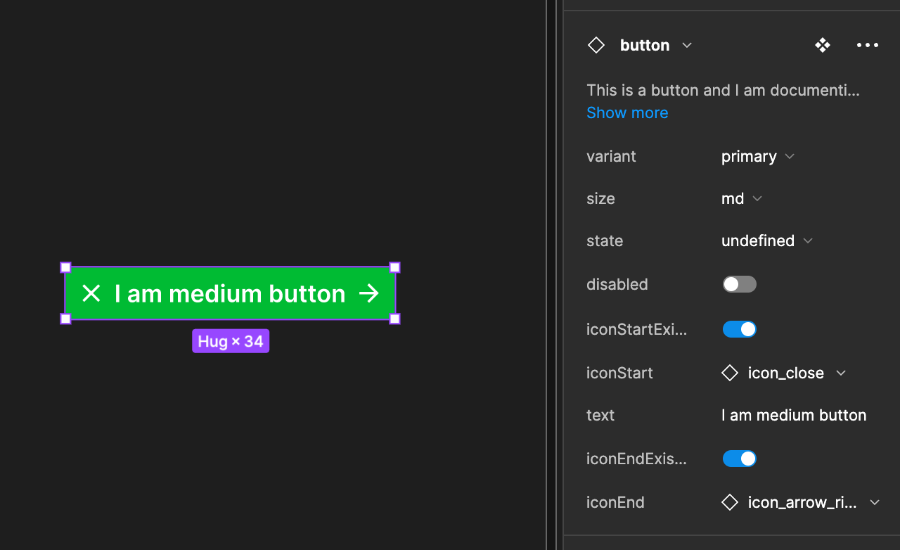
would love that. could you provide an example of the desired output code for a svelte component definition and instance? for example... for this button definition:

i am generating this for react:
<Button
  iconEnd={<IconArrowRight />}
  iconStart={<IconClose />}
  size="md"
  variant="primary"
>
  I am medium button
</Button>
import { FC, ReactNode } from "react";
/**
 * Button Component
 * This is a button and I am documenting this in the
 *   component pane inside of Figma.
 * https://www.figma.com/file/SI4jkD6CJf6NcaleDuBcS3?node-id=1%3A24
 * @figma component:00ea0093136b86763e764ff04161a7a49165fd47
 */

type ButtonPropsSize = "sm" | "md" | "lg";
type ButtonPropsState = "hover" | "active";
type ButtonPropsVariant = "primary" | "danger";

interface ButtonProps {
  disabled?: boolean;
  iconEnd?: ReactNode;
  iconStart?: ReactNode;
  size?: ButtonPropsSize;
  state?: ButtonPropsState;
  variant?: ButtonPropsVariant;
}

const Button: FC<ButtonProps> = ({
  disabled = false,
  iconEnd,
  iconStart,
  size = "lg",
  state,
  variant = "primary",
  children,
}) => (
  <>
    {iconStart}
    {children}
    {iconEnd}
  </>
);
and this for angular:
<button [size]="md" [variant]="primary">
  <icon-close iconStart></icon-close>
  <icon-arrow-right iconEnd></icon-arrow-right>
  I am medium button
</button>
/**
 * Button Component
 * This is a button and I am documenting this in the
 *   component pane inside of Figma.
 * https://www.figma.com/file/SI4jkD6CJf6NcaleDuBcS3?node-id=1%3A24
 * @figma component:00ea0093136b86763e764ff04161a7a49165fd47
 */

type ButtonVariant = "primary" | "danger";
type ButtonSize = "sm" | "md" | "lg";
type ButtonState = "hover" | "active";

const templateButton = [
  `<ng-content select="[iconStart]"></ng-content>`,
  `<ng-content select="[iconEnd]"></ng-content>`,
  `<ng-content></ng-content>`,
].join("");

@Component({ selector: "button", template: templateButton })
class Button {
  @Input() disabled?: boolean = false;
  @Input() size?: ButtonSize = "lg";
  @Input() state?: ButtonState;
  @Input() variant?: ButtonVariant = "primary";
}
if you could indicate what best practice svelte would be (plus any gotchas for things like slot syntax), i could probably implement fairly quickly...