tsai
 tsai copied to clipboard
Understanding GradCAM
Hello,
Im not sure to understand the figures ploted by show_gradcam() from the XCM model.
Does anyone could explain me the results?
Her is an example of plot that I get with show_gradcam() :
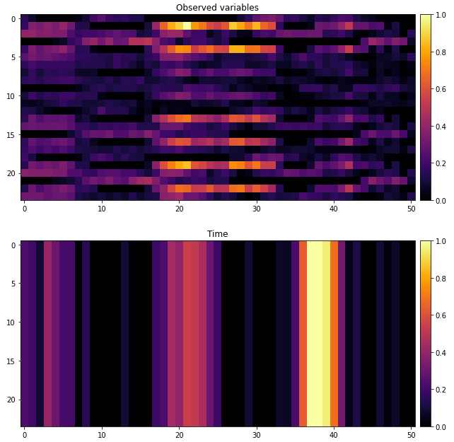
What you are seeing are the activation heatmaps for the two branches of the XCM: the 2D conv (first figure, shape=[1xvarsxseq_len]) and the 1D conv (second figure, shape=[1x1xseq_len]).
What I'm not sure of is why for the same sample there are different time intervals highlighted...
@vrodriguezf thanks. Can you correct me if I'm wrong. the x axis is the time (corresponding to the time windows), and the y axis correspond to the features in the multivariates timeseries.
exactly, in the second plot the y axis is irrelevant because the feature map represented is one dimensional (comes from a 1D conv).
Thanks @vrodriguezf. So in the 2D gradCAM the X axis correspond to the variables and the Y axis to when they have be impactfull in the sequence ?
I'll close this issue as it seems to be resolved. Please, reopen if necessary.