front-end
 front-end copied to clipboard
Text and Button Color in Footer fails contrast accessibility guidelines
Describe the bug
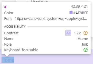
The color difference between the footer background #E0DAF8 and the purplePrimary Color in text and Button background #AF9BFF doesn't have enough contrast. Its less than the minimum required contrast value and isn't easy to read. A color palette change with colors having a better contrast is needed.
This is also applicable to the text color for pagination links and the color of the Logo.
To Reproduce Steps to reproduce the behavior:
- Go to https://hirejuniors.dev/
- Open Dev Tools and enable the Element Selector.
Ctrl + Shift + C - Hover over link text.
- Make note of
Contrastvalue underAccessibility.
Expected behavior Contrast value should be more than 4.
Screenshots

Desktop (please complete the following information):
- OS: Windows 10
- Browser: Edge
- Version: v87
Smartphone (please complete the following information):
- Device: Nokia 6.1
- OS: Android 10
- Browser: Edge
- Version: v45
Additional context I have a few suggestions in terms of color palette changes:
-
The easiest change while maintaining current color palette would be to add a darker variant of the purple. I found
#574D7Ea suitable option.
-
A newer purple palette I found more vibrant w/ better compatibility with a future dark theme that would require lighter shades of purple.
- Primary:
#892CDC - Lighter variant:
#C69FEF - Darker variant:
#6511C6
- Primary:
-
A different color from the current palette altogether, I find
#FED710(A warm yellow) and its shades, very appealing.
I can produce mockups once a direction has been decided. 😄
Thanks, @Amorpheuz for opening this issue. Let me know if you want to work on this 🙂
I would love to work on this! @harshil1712 What kind of fix would you prefer of the three suggestions I provided under additional context or do you have a different fix in mind for this?
Hey @Amorpheuz,
I like the dark color scheme more. Changing the color at this point doesn't make a lot of sense right now. We want to rehaul the whole UI at some point. But I don't think this is the right time to focus on those right now. So let's continue with the current color scheme.
However, if you want, please feel free to work on a new UI. You can open a new PR/Issue where we can discuss more on this. 🙂