Improved diagnostics picker formatting
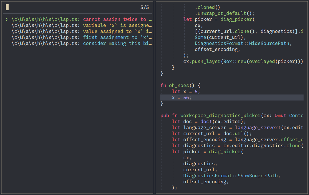
The current layout for the diagnostics picker is not that great.
The file path takes up a lot of space (for example \c\U\a\s\h\h\s\c\lsp.rs) and most of the diagnostic text is cut off as a result:
screenshot
My suggestion is to nest the diagnostics for each file like this for example:
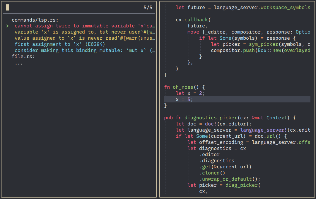
This reduces the redundant file paths and allows to show more of the actual diagnostic message.
However, I'm not sure how well this integrates into the picker, since it expects a flat list where each entry can be selected from what I can tell. It's also not 100% clear to me how searching should be implemented using this layout.
Something like this would also be nice for global search, see #5730. I think it makes sense to track all of these feature requests in this issue because any solution to this problem should be generic and not just applied to a single picker.