hackage-server
 hackage-server copied to clipboard
 haskell
Hackage not rendering as intended on MS Edge
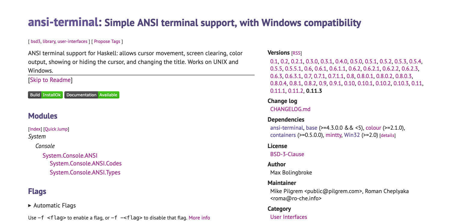
In Edge on my machine, Hackage currently renders like this below (a long list of content; no 'structured' page, as in the past; no left-hand padding between the browser frame and content) (using ansi-terminal as an example). I've 'CTRL+F5', so I don't think it is a 'browser cache of bad CSS'-type issue:

could be a bug with that version of edge? here's firefox (and same in chrome):
if you work out what gets edge confused and if it isn't transient to that version of edge, pr welcome!
I can confirm that Hackage does support Google Chrome. My version of Edge is 'Version 105.0.1343.42 (Official build) (64-bit)' (which claims to be up to date). Edit: I think that version of Edge was released 3 days ago, so perhaps it has introduced a new bug.
@ysangkok do you have access to an edge browser/windows machine or have any suggestions here? :-)
I am also on Version 105.0.1343.42 (Official build) (64-bit), and I don't have this issue. I zoomed in until just before the sidebar is pushed down, and you can see on the right how hackage.css:404 applies, which is what makes the sidebar show up on the right. I don't know why that section isn't applied for you, since it does look like your screen is 950 virtual pixels wide.

If I zoom in one more notch, the low-width layout applies, which is in hackage.css:466:

@mpilgrem Could you please check which of these sections is applied on the element with class="properties" ?
@ysangkok, many thanks - I will investigate. My laptop screen is 1920x1080 with 'Scale' 150% (the recommended setting). If I change the Zoom in Edge from 100% to 90% or to 110%, the page renders as intended.
It does look likely to be some strange Edge bug. At Edge Zoom 100%, I have both the hackage.css:404 and the 'wrong' render:

The two column layout is not the only thing broken in your screenshot. It looks like you have no margins, which doesn't seem consistent with this snippet:
@media only screen and (max-width: 949px) {
  #content {
    width: 88vw;
  }
This should cause a 12% margin to always be present, even on narrow screens. What causes this clause to not apply? Is it the media query or the max-width? Even on wider screens, it seems like #content is bounded using less than 100 vws.
What if you make a small HTML file with just this one DIV and this CSS? Does it work as expected?