expandable-collection-view-kit
 expandable-collection-view-kit copied to clipboard
 eleev
eleev
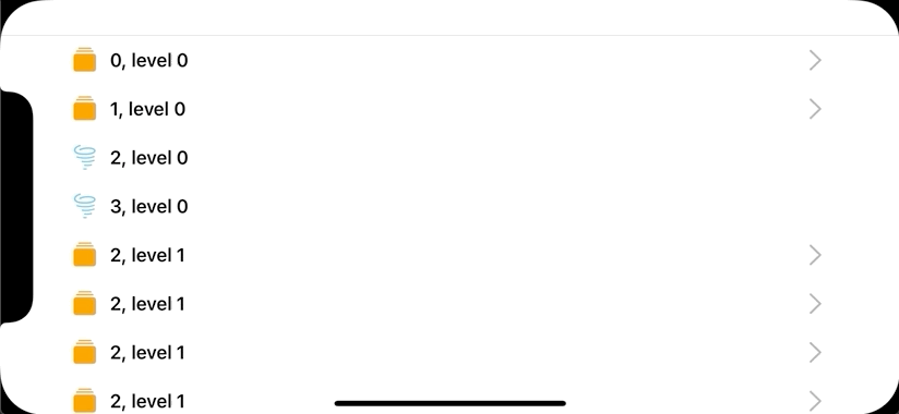
🗂 Expandable, hierarchical, flexible, declarative UICollectionView with diffable data sources & SwiftUI-like tree items builder [Swift 5.1, iOS & iPadOS 13].
expandable-collection-view-kit 
Last Update: 18/July/2021.

If you like the project, please give it a star ⭐ It will show the creator your appreciation and help others to discover the repo.
✍️ About
🗂 Expandable, hierarchical, flexible, declarative UICollectionView with diffable data sources & SwiftUI-like tree items builder [Swift 5.1, iOS & iPadOS 13].
📺 Demo
Please wait while the .gif files are loading...


🍱 Features
- Ease of use
- Instantiate
ExpandableCollectionViewManagerclass, provide its parent view controller and specify theFoldersandItems.
- Instantiate
- Flexible API
- There are many customization points that can be used to adjust:
Folders,Items,Navigation,appeareancesand also customanimations. - Swift's
Function Buildersmake it very easy to create a tree of interconnected items
- There are many customization points that can be used to adjust:
- Autolayout
- You don't need to do anything related to autolayout - the component properly handles all the changes. The only thing you need to do is to instantiate the
ExpandableCollectionViewManagerand fill it in with items.
- You don't need to do anything related to autolayout - the component properly handles all the changes. The only thing you need to do is to instantiate the
- Performant
- The under-the-hood implementation uses Swift's
Diffable Data SourcesandCollection View Compositional Layoutwhich provides high performance and tested backing APi.
- The under-the-hood implementation uses Swift's
- Extendable
- The component can be further extended with new types of items,
Function Buildertypes (such asFor Eachthat applies a group of modifiers to a set of items, rather than copy-pasting the same modifiers or managing boilerplate configuration), decoratable content views for items and the list goes on.
- The component can be further extended with new types of items,
📚 Usage
Instantiation
Basic
Create a property that will hold the ExpandableCollectionViewManager reference and the instantiate it via one of the designated initializers:
let expVCManager = ExpandableCollectionViewManager(parentViewController: self)
Here self is the reference to the UIViewController where the property is used.
Pre-filling
To pre-fill the collection view, you may use the trailing closure syntax for one of the designated initializers:
let expVCManager = ExpandableCollectionViewManager(parentViewController: self) {
    Folder(title: "ToDo") {
        Item(title: "Compose Email")
            .setImage(systemName: "paperplane")
        Item(title: "Watch Netflix")
    }

    Item(title: "Buy new iPhone")
    Item(title: "Cleanup")
}
Configuration
Adding More Items
You can add more items by using appendItems method:
expVCManager.appendItems {
    Folder(title: "Marvel") {
        Item(title: "Spider-Man")
        Item(title: "Iron Man")
        Item(title: "Black Widow")
    }
    Folder(title: "DC") {
        Item(title: "Batman")
        Item(title: "Batgirl")
        Item(title: "Nightwing")
    }
}
Item Modifiers
There are a number of item modifiers that can be applied to them to change their behaviour or appearance:
expVCManager.appendItems {
    Folder(title: "Marvel") {
        Item(title: "Spider-Man")
            .setImage(systemName: "tray.full.fill") // 1

        Item(title: "Iron Man")
        Item(title: "Black Widow")
    }
    .setTintColor(.systemOrange) // 2
    .isExpanded(true) // 3
    .isItemsCountVisible(true) // 4

    Folder(title: "DC") {
        Item(title: "Batman")
        Item(title: "Batgirl")
        Item(title: "Nightwing")
    }
    .isChevronVisible(false) // 5
}
Let's break down the API's line by line:
- Changes the default image icon for either
Itemand/orFolder - Changes tint color of a
Folder's icon - Determines whether a
Folderis automatically expanded - Displays a
Folder's item counter label that - Changes the visibility of chevron icon
Actions
Actions allow to specify a closure that will be executed on item tap action:
Item(title: "Spider-Man")
    .setImage(systemName: "spider.fill")
    .setAction { [weak self] indexPath, title in
        self?.showWarning("Item \(title) that is at \(indexPath) index path has been tapped.")
    }
Actions have two input parameters an item's index path and title. That should make the API more or less flexible for action handling use cases.
Animator
You can specify cells' unfold animation. It's expressed as enum type, where the default is .simple, which is the default diffing animation (hide/show). However, there is a an another option that you to use one of the pre-built animations or implement and inject your own.
expVCManager.unfoldAnimation = .custom(AnimationFactory.moveDown(duration: 0.415)) // 1
expVCManager.unfoldAnimation = .custom(AnimationFactory.verticalUnfold(duration: 0.435)) // 2
Let's break the sample code down. The AnimationFactory is a built-in type that has a number of pre-implemented animations.
- The
moveDownanimation simply moves each unfolded item to the direction of unfolding with the specified duration. - The
verticalUnfoldanimation is a bit more complicated: it applies a series of affine transformations to each unfolded cell.
To define an inject your own animations, you need to use the following typealias that defines the required closure's signature for the .custom unfold animation type:
let delayFactor = 0.015

let slideOutAnimation: ExpandableItem.Animation = { cell, indexPath, collectionView, completion in
    UIView.animate(
        withDuration: duration,
        delay: delayFactor * Double(indexPath.row),
        options: [.curveEaseInOut],
        animations: {
         cell.transform = CGAffineTransform(translationX: collectionView.bounds.width, y: 0)

    }, completion: completion)
}

expVCManager.unfoldAnimation = .custom(slideOutAnimation)
Here we used the ExpandalbeItem.Animation typealias to get the right closure’s signature and then we implemented our custom cell animation. The final step is that we injected it via the .custom(slideOutAnimation) type.
Transition Handling
The component also supports custom handler for view controller transitioning. It can be specified via the following property:
expVCManager.onCellTapHandler = { _, destinationViewController in
    // 1. Prepare presentation part of the destination view controller
    let navController = UINavigationController(rootViewController: destinationViewController)
    // 2. Present the view controller
    self.present(navController, animated: true)
}
That makes different kinds of view controller navigation logic to work on a per-item basis. Which means for one view controller bound item we can use UINavigationController to present its view controller, wheres for some other item we can use modal view controller presentation style.
View Controller Configuration
There is yet an another modifier for Item type that allows to specify a UIViewController type:
Item(title: "Spider-Man")
    .setImage(systemName: "spider.fill")
    .setViewControllerType(IssuesViewController.self) { [weak self] viewController in
    viewController.comics = self?.endpoint(\.latest.spiderman.comics)
    }
Here we specified the target view controller type that needs to be transitioned when the Spider-Man cell is tapped and its configuration code, where we, for example can inject data, perform any other operation or simply omit.
🏗 Installation
Swift Package Manager
Xcode 11+
- Open
MenuBar→File→Swift Packages→Add Package Dependency... - Paste the package repository url
https://github.com/jVirus/expandable-collection-view-kitand hitNext. - Select the installment rules.
After specifying which version do you want to install, the package will be downloaded and attached to your project.
Package.swift
If you already have a Package.swift or you are building your own package simply add a new dependency:
dependencies: [
    .package(url: "https://github.com/jVirus/expandable-collection-view-kit", from: "1.0.0")
]
Manual
You can always use copy-paste the sources method 😄. Or you can compile the framework and include it with your project.
🙋♀️🙋♂️ Contributing
Your contributions are always appreciated. There are many ways how you help with the project:
- You can suggest something
- You can write additional documentation or sample codes
- Implement a new feature
- Fix a bug
- Help to maintain by answering to the questions (if any) that other folks have
- etc.
Overall guidelies are:
- Please, discuss a feature or a major source change/addition before spending time and creating a pool requested via issues.
- Create a separate branch and make sure that your code compiles and does not produce errors and warnings.
- Please, don't be upset if it takes a while to review your code or receive an answer.
👨💻 Author
🔖 Licence
The project is available under MIT Licence
 eleev
eleev