electronjs.org-old
 electronjs.org-old copied to clipboard
Improving navigation in the docs
I find it hard to navigate in Electron's documentation without using CTRL-F often or going back and forth between different pages.
Since the content width is fixed, the remaining space could be used to include a navigation panel.
The best example I found is the Vue.js docs. The highlight is updated as you scroll through and the search engine is great.
@kevinsawicki Thanks for taking the time to reply to me. I should have come here first instead of complaining on Twitter.
Great suggestion, @darahak. I've been thinking the same thing: a sidebar which lists all the APIs and their methods, properties, etc.
It's a common pattern on API docs sites, and it seems to work pretty well.
- https://stripe.com/docs/api
- https://lodash.com/docs/4.17.2
I hope to find time to work on this soon!
These are good examples too.
- Stripe has a nice layout, but there's too much stuff on screen (scrolling is really slow). I think it could work really well if you don't render all the docs at the same time.
- For lodash, I think the contents panel is too large and should have a reduced width (I have a 27" screen, which emphasizes the problem). The search field a really great addition though.
I created an app awhile back called microscope: http://github.com/simonhochrein/microscope Which allows searching electron apps
Neat idea, @simonhochrein. A little off-topic, but note that (as of yesterday) you can now consume all the apps as a module from GitHub:
npm i electron/electron-apps
https://github.com/electron/electron-apps
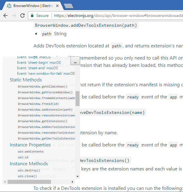
Just hacked a simple one into the page:
And the gist for code you need to run in console every time: electron-doc-read-help.js
That would be very much appreciated. To add to that:
-
It is hard to tell where one method/property ends and another begins. Since all APIs are
codethey don't look like proper titles. Consider changing font size to make them look like a title. Also consider adding more margin between entries. I just used DevTools to make the h4's 200% and that makes a huge difference when scanning. I don't think it's the final answer, but it's a start...
-
Add a table of contents to the top of every page so you can see, at a glance, what the module contains. Node does this in their docs.