emoji-picker-react
 emoji-picker-react copied to clipboard
 ealush
Using pickerStyle to update color
Thank you for the lib! It's been super helpful and really easy to integrate with. We're trying to implement dark mode via the pickerStyle. I see #214 has already talked about dark mode but we were hoping to do our own implementation quickly. pickerStyle seems to update the style of emoji-react-picker but does not seem to impact other classes. Here's our code snipper:
            <Picker
              pickerStyle={{ background: backgroundColor, backgroundColor: backgroundColor, color: backgroundColor }}
              onEmojiClick={(_, emoji) => onEmojiChange(emoji.emoji)}
              preload={false}
              native
            />
and the result:
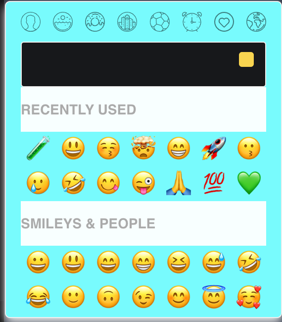
Is this expected behavior? It would be great to be able to set the style of other components even before first class support for dark mode comes. Thank you again for the lib!
We managed to style via mui styled component:
import dynamic from 'next/dynamic'
import Popper from '@mui/material/Popper'
import Box from '@mui/material/Box'

const Picker = dynamic(() => import('emoji-picker-react'), { ssr: false })

const StyledEmojiPickerBox = styled(Box)(({ theme }) => ({
  '& aside.emoji-picker-react': {
    background: theme.palette.primary.dark,
    boxShadow: 'none',
    '& .emoji-group:before': {
      background: theme.palette.primary.dark
    },
    '& .emoji-categories': {
      background: theme.palette.common.white,
      filter: 'invert(1)'
    }
  }
}))

const StyledPopper = styled(Popper)(({ theme }) => ({
  zIndex: theme.zIndex.tooltip,
  '& .MuiPaper-root': {
    '& .grouped': {
      border: 'none'
    }
  }
}))

//....

<StyledPopper
        id={emojiId}
        open={emojiOpen}
        anchorEl={emojiAnchorEl}
        placement='bottom'
        modifiers={[
          {
            name: 'flip',
            enabled: true,
            options: {
              altBoundary: true,
              rootBoundary: 'viewport',
              padding: 8
            }
          }
        ]}
      >
        <StyledEmojiPickerBox>
          <Picker
            native
            groupVisibility={emojiGroupVisibility}
            searchPlaceholder='Choose wisely...'
            onEmojiClick={onEmojiClick}
          />
        </StyledEmojiPickerBox>
      </StyledPopper>
Anyway it would be great to have a direct way to style each child component and a better way to customize categories icons.
Hey all, unfortunately as it is now - it's pretty tricky to change without making a breaking change to the picker. I'd love to do it, but as you can tell from my response rate, I have been working hard on other projects. This will most likely wait for the next major which will come eventually.
Hey, @grantmagdanz - I am currently working on a new feature that has css variable support. This might be what you're after - since most colors can be customized via these variables.
Here you can try it out: https://codesandbox.io/s/floral-rgb-z2gkzp?file=/src/App.tsx
And here you can see the actual possible modifications https://github.com/ealush/emoji-picker-react/blob/2022-08-17-v4/src/EmojiPickerReact.css