cauldron
 cauldron copied to clipboard
 dequelabs
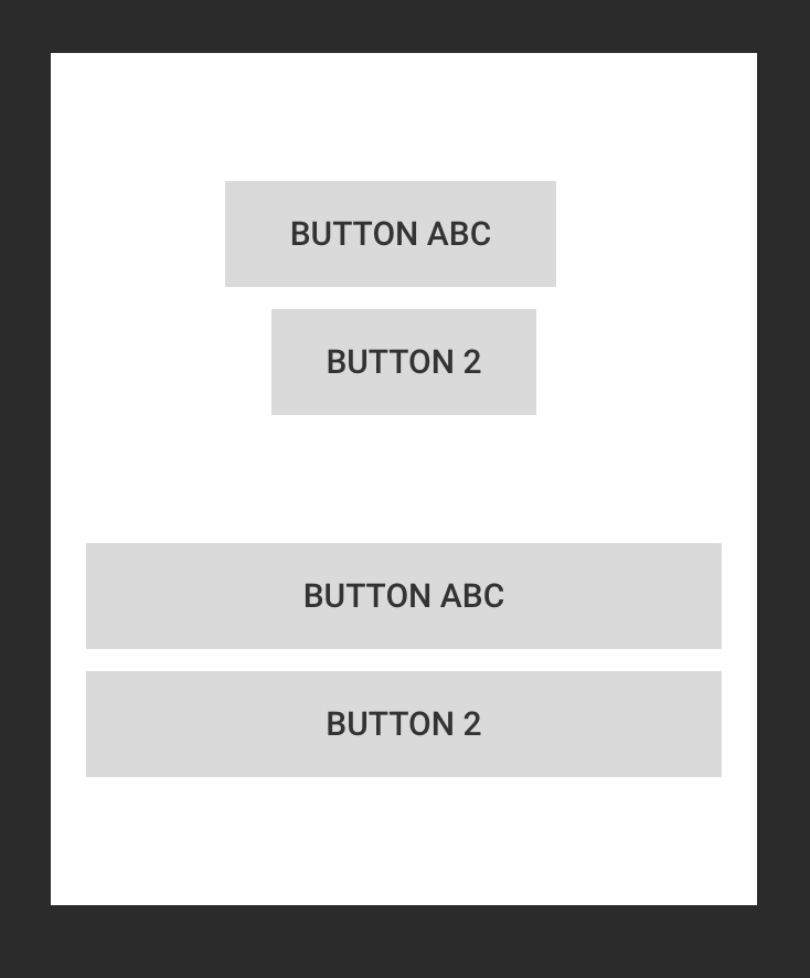
Allow buttons to be inline or stacked depending on the screen size
The CSS below for adding margin-left to the second button doesn't look good on smaller screens since the second button is not left aligned with the first button.
as a general rule buttons should have spacing applied and it should be up to the content author to determine when that’s not needed. - @scurker
[class*='Button--'] + [class*='Button--'] {
  margin-left: var(--space-smallest);
}
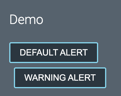
Example from Cauldron docs:
Potential Solutions
- From @schne324: Create a basic wrapper for having inline buttons with margins. Take the margins off the buttons and use the wrapper to declare the margins.
<InlineButtonWrapperThing><Button /><Button /></InlineButtonWrapperThing>
Using grid or flex it'd be easy to make the buttons look good inline as well as when they wrap to one button per "row"
- From @bobbyomari:
There's probably a discussion about when stacked buttons should be full width vs "normal" and the ability to turn that on/off depending on the use case
My recommendation here is that we take a hybrid approach.
To address the immediate concern with buttons, we should use :has to progressively style the first element that is followed by a button as opposed to using the adjacent selector:
[class*='Button--'] + [class*='Button--'] {
  margin-left: var(--space-smallest);
}

@supports selector(:has(*)) {
  [class*='Button--'] + [class*='Button--'] {
    margin-left: initial;
  }

  [class*='Button--']:has(+ [class*='Button--']) {
    margin-right: var(--space-smallest);
  }
}
This would work everywhere aside from Firefox, which currently has not shipped support of :has as of May 2023.
I'm in favor of adding some utility that would allow for some kind of flexible rendering/layout of children but not sure it needs to be scoped specifically to buttons and may have utility elsewhere. We can handle that on a separate ticket when we want to address that enhancement.