cyclosm-cartocss-style
 cyclosm-cartocss-style copied to clipboard
suggestion for more gradual smoothness differentiation
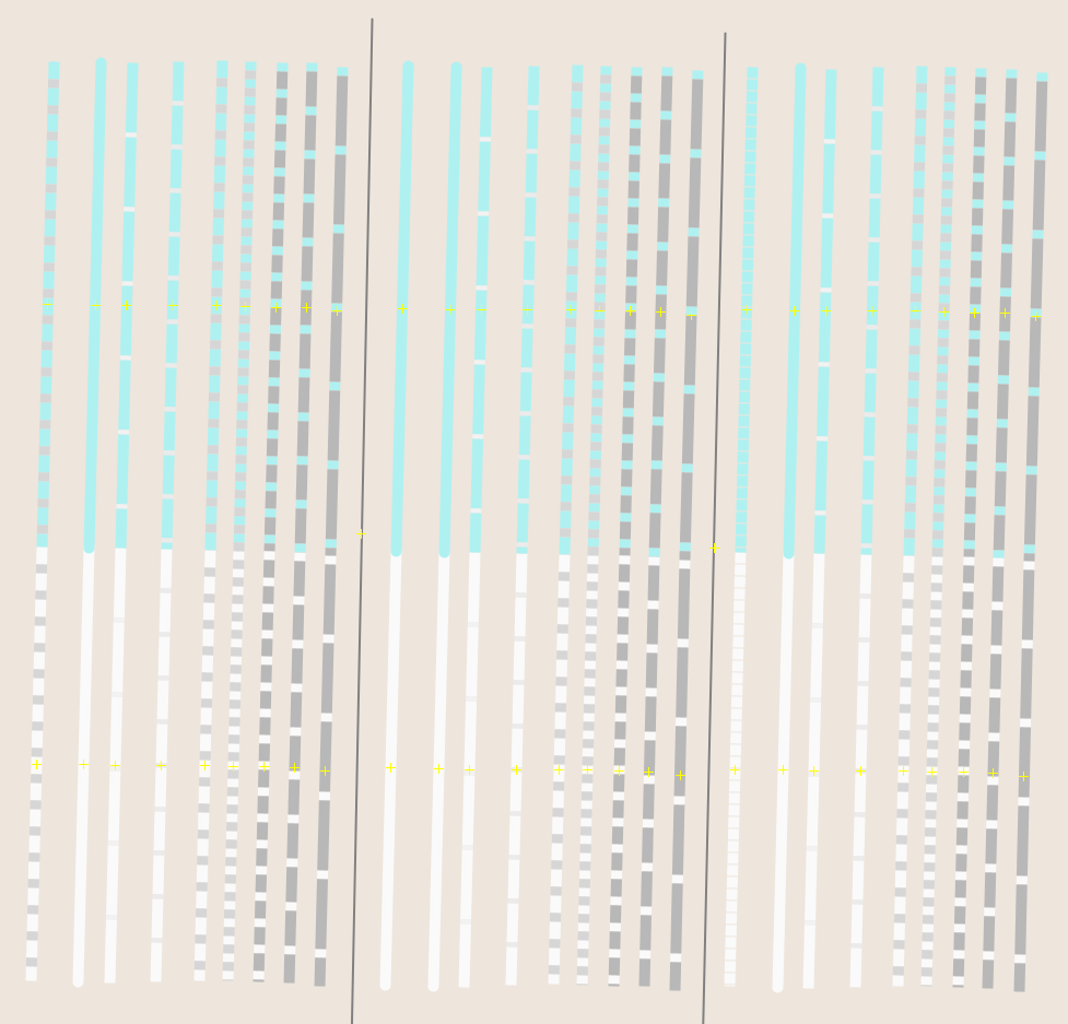
all with highway=residential
top with maxspeed=30
from left to right:
first group: surface=sett,
second group: surface=asphalt
third group: no surface tag
in each of the 3 groups: no smoothness set, excellent, good, intermediate, bad, very_bad, horrible, very_horrible, impassable
The yellow pluses are because of josm.
Overall this mainly uses the smoothness tag. I am not sure if the styles I chose for the trackgrades are applicable, nor how this would translate to other types of ways.
I have done this with a mapcss style in josm and some test roads
Overall the Problem with dashed lines could be, that one confuses them with the property of cycle lanes or shared lanes, which also are dashed. So either one could show the make up of the way differently and keep the lane dash, or show the shared lane via another mechanism to avoid this confusion altogether.
an option is to use width for the smoothness scale and keep the dashing like it is now:
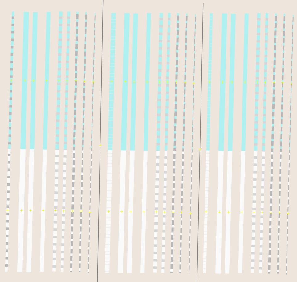
however that could very easily be confused with the actual width of the street, so i would not do this
another option is to vary the thickness of the dashes:
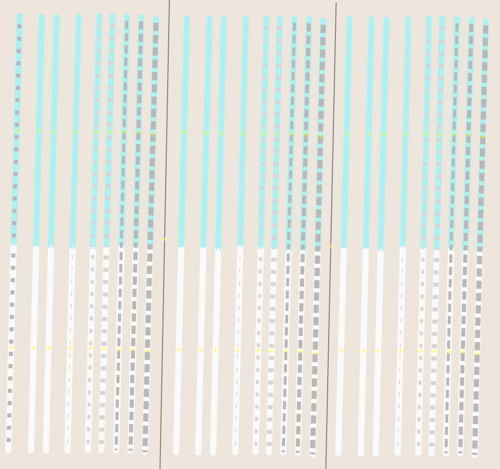
though this could also lead to the same confusion as the original idea
Thanks for the ideas.
I like the idea of varying the width of the dashes.
The problem with having lot of grades is it's difficult to distinguish when you have only one way. Even with current two grades I sometimes misinterpret them.
yeah, varying the grades only such a little such that they are not easily distinguishable is not the best. One could use a more clear colour scale like  , but that would go against all other colour choices.
Again:
Overall the Problem with dashed lines could be, that one confuses them with the property of cycle lanes or shared lanes, which also are dashed. So either one could show the make up of the way differently and keep the lane dash, or show the shared lane via another mechanism to avoid this confusion altogether.
Overall the Problem with dashed lines could be, that one confuses them with the property of cycle lanes or shared lanes, which also are dashed.
Maybe surface quality could be rendered with dots instead of dashes for this reason. Dots would somehow symbolise obstacles on the road
Overall the Problem with dashed lines could be, that one confuses them with the property of cycle lanes or shared lanes, which also are dashed.
Maybe surface quality could be rendered with dots instead of dashes for this reason. Dots would somehow symbolise obstacles on the road
For reference, there was the same idea, but conversely: use dots for infrastructure. https://github.com/cyclosm/cyclosm-cartocss-style/issues/357
Overall the Problem with dashed lines could be, that one confuses them with the property of cycle lanes or shared lanes, which also are dashed.
Maybe surface quality could be rendered with dots instead of dashes for this reason. Dots would somehow symbolise obstacles on the road
For reference, there was the same idea, but conversely: use dots for infrastructure. #357
Right, implementing both would be a bad idea then.
My person impression is that dashing is very intuitive for road quality, most printed maps for example dashed lines to indicate gravel roads as opposed to asphalted roads.
After wrapping my brain around this, let me outline some ideas:
- Distinguish cycling lanes from cycling tracks and cycleways by thickness of the blue line: cycling lane = thin line, cycling track and cycleway and bicycle=designated = thick line (about the thickness of a residential road).
- Type of cycling lane could be indicated by color: exclusive lane = clear blue, advisory lane = blue-ish purple, shared lane = red-ish purple (meaning the less exclusive the lane is, the more the line turns red). This would also solve #514
- This frees the dashing for being linked to smoothness.
- I would suggest to indicate the smoothness only for the explicitly marked bicycle infrastructure, using different dashings of the blue/purple line. Can also be used on other road colorings like speed 30 or no motorized traffic by dashing the greenish filling of the road.
- Since we're talking about bicycles, I would use only 4 levels of dashing for smoothness: excellent+good = solid line, intermediate = dashed line, bad = dash-dotted line, very_bad and worse = dotted line
- Of course cycleway:lane:smoothness or cycleway:track:smoothness should be priorized over the plain smoothness.
My personal impression is that dashing is very intuitive for road quality, most printed maps for example dashed lines to indicate gravel roads as opposed to asphalted roads.
After wrapping my brain around this, let me outline some ideas:
- Distinguish cycling lanes from cycling tracks and cycleways by thickness of the blue line: cycling lane = thin line, cycling track and cycleway and bicycle=designated = thick line (about the thickness of a residential road).
- Type of cycling lane could be indicated by color: exclusive lane = clear blue, advisory lane = blue-ish purple, shared lane = red-ish purple (meaning the less exclusive the lane is, the more the line turns red). This would also solve #514
- This frees the dashing for being linked to smoothness.
- I would suggest to indicate the smoothness only for the explicitly marked bicycle infrastructure, using different dashings of the blue/purple line. Can also be used on other road colorings like speed 30 or no motorized traffic by dashing the greenish filling of the road.
- Since we're talking about bicycles, I would use only 4 levels of dashing for smoothness: excellent+good = solid line, intermediate = dashed line, bad = dash-dotted line, very_bad and worse = dotted line
- Of course cycleway:smoothness should be priorized over the plain smoothness. See #506