 custom-cards
Create reusable javascript code
Is your feature request related to a problem? Please describe. I would like to be able to reuse some code in multiple places. Right now I'm using a lot of different conditions to decide what color to use for my lights (e.g. is it dark mode, does the bulb have color/temperature support, is the color too close to white). I'm using this logic in three different places to color three different elements so it ends up being a lot of copy-paste code.
Describe the solution you'd like Some way to reuse the code/conditions, either by being able to save it in a variable or by being able to call a custom Javascript function.
did you check the button card templates? thats exactly what you can do with templates, reuse code, any code really. for some real life examples, check my templates file
did you check the button card templates? thats exactly what you can do with templates, reuse code, any code really.
Yes! But as far as I understood it was if you were reusing elements rather than the JavaScript code itself. In my case, I'm using the same code to choose the colour of the card's icon and colour as well as the background color of another card. As far as I can tell, I can't use the templates to write that code in one place as it is being used for different elements of the cards...?
you can ofc use more than 1 template for a button, and use a template per function you need. but maybe I am not grasping what you want, so some code would be useful. not sure f that is allowed here, or we need to move to the community.... as long as no one complains... ;-)
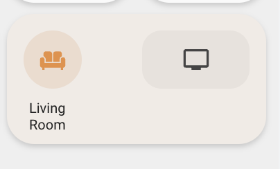
Ok, I'll see if I can show what I mean a bit more clearly! So I have these room cards with a card inside that controls the lighting (the round icon). I'm working now on how to show them when the lights in the room are RGB lights.
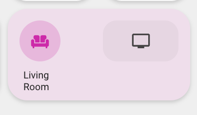
I want the colour of the icon, the light card's background colour and the room card's background colour to reflect the colour of the lights. The problem is, in light mode, if the lights are too close to white they disappear in the UI. So in those cases I want to use the yellow colour you see in this pic.
So I have this block of Javascript code that deduces whether to use the light's colour or yellow:
// Use yellow if the light doesn't have temp/colour
if (entity.attributes.color_mode != "brightness") {

  // Sum of RGB colour to see how close it is to white
  const colorSum = entity.attributes.rgb_color.reduce((partialSum, a) => partialSum + a, 0);

  var tooWhite = colorSum/(255*3) > 0.8;

  // Use white colour if in dark mode
  if (hass.themes.darkMode == true || tooWhite == false) {
    return "rgba(" + entity.attributes.rgb_color + ", 1)";
  }
}

return "rgba(var(--color-yellow), 1)";
It's relatively a lot of code and right now I have to copy-paste it in the styles for all the elements that I want coloured. Simplified:
custom_room_light:
  state:
  - value: "on"
    styles:
      icon:
        - color: >
            [[[
              // Insert lighting code from above here
            ]]]
      img_cell:
        - background-color: >
            [[[
              // Insert lighting code from above here
            ]]]
custom_room:
  state:
  - value: "on"
    styles:
      card:
        - background-color: >
            [[[
              // Insert lighting code from above here
            ]]]
So basically, whenever I want to tweak the code I wrote above, I have to remember to copy-paste it in all three places. Would be nice to be able to e.g. call a function or somehow reference the Javascript code from all the different areas instead.
Hope this makes more sense.
ok, that most certainly makes sense ;-)
you can use yaml anchors for that, if its all in one file. thats exactly what they do...
its like you already did: write the code in the first spot, and precede it with <<: &lighting_code (and dont forget to indent the code below the anchor) and then copy it in the next spot and next, and next, with <<: *lighting_code. Especially powerful I your case, when using the entity.
This is probably the easiest way.
if the code is required in more than 1 file and scattered throughout your config, you'd use the button-card-templates, which are in fact system global anchors..... they can be a single line, a more complex js template, or a whole set of button config options, and can nest. It does require some tinkering though, because of the key we need in the template. Have to give that some thought.
btw, a very interesting template you use...! Its one of the issues I didnt get around to yet, having the icon use the light color, except when too white (which practically makes then icon invisible indeed...) so thank you for that solution ;-)
Oh awesome, thanks so much for the thorough description! I hadn't heard of yaml anchors.
The code is required in more than 1 file, I'm not sure if I follow how you mean I could handle that. Are you suggesting I create a file with a yaml anchor in and then multiple templates that use the anchor? And then reuse those templates in the cards? E.g. icon_light_color, img_cell_light_color, card_background_light_color? And then use those in the different cards?
Thanks btw, feel free to use the code :) I also played around with some brightness and saturation filters to get strong colours even if it was a bit close to white. That worked pretty well :)
Are you suggesting I create a file with a yaml anchor in and then multiple templates that use the anchor? And then reuse those templates in the cards? E.g. icon_light_color, img_cell_light_color, card_background_light_color? And then use those in the different cards
yes, thats what I was trying to bring across ;-) and the way to do that (create a file) is in the button-card-templates file, where you can create those separates.
I have been fiddling about with this, and must admit it sounds easier than it is done, mostly because I have many other templates in place, and combining those state: templates can be challenging (because they dont replace, and must merge correctly)
also, the multiline indicator wont allow the anchor to be 1 line lower (I think), so this is an anchor for 'color', and you'd have to create one more for 'background-color'. But that would be it, and you'd call those I any button-card you like, I all of your config. If these would be the only 2, you could even ditch the anchor altogether and use those templates only
its a bit tricky, and I am not 100% certain this works, but try:
with anchor:
light_color:
  state:
    - value: "on"
      styles:
        icon:
          - <<: &light_color
              color: >
                [[[
                  // Use yellow if the light doesn't have temp/colour
                  if (entity.attributes.color_mode != "brightness") {

                    // Sum of RGB colour to see how close it is to white
                    const colorSum = entity.attributes.rgb_color.reduce((partialSum, a) => partialSum + a, 0);

                    var tooWhite = colorSum/(255*3) > 0.8;

                    // Use white colour if in dark mode
                    if (hass.themes.darkMode == true || tooWhite == false) {
                      return "rgba(" + entity.attributes.rgb_color + ", 1)";
                    }
                  }

                  return 'red';
                ]]]
without anchor:
light_color:
  state:
    - value: "on"
      styles:
        icon:
          - color: >
              [[[
                // Use yellow if the light doesn't have temp/colour
                if (entity.attributes.color_mode != "brightness") {

                  // Sum of RGB colour to see how close it is to white
                  const colorSum = entity.attributes.rgb_color.reduce((partialSum, a) => partialSum + a, 0);

                  var tooWhite = colorSum/(255*3) > 0.8;

                  // Use white colour if in dark mode
                  if (hass.themes.darkMode == true || tooWhite == false) {
                    return "rgba(" + entity.attributes.rgb_color + ", 1)";
                  }
                }

                return 'red';
              ]]]
and call that on a light like this:
          - type: custom:button-card
            template:
#              - button_light
              - light_color
            entity: light.kayon
            triggers_update: sensor.kayon_device_power
note I used red because I dont have that variable --color-yellow in place this does change to red when the visibility is not very good... ;
nvm the above, Ill leave for reference, but here's what does actually work, and allows the multiline to be used, so you can actually only have to write the template once, and repeat it via the anchor:
light_color:
  state:
    - value: "on"
      styles:
        icon:
          - color: &light_color
              >
                [[[
                  // Use yellow if the light doesn't have temp/colour
                  if (entity.attributes.color_mode != "brightness") {

                    // Sum of RGB colour to see how close it is to white
                    const colorSum = entity.attributes.rgb_color.reduce((partialSum, a) => partialSum + a, 0);

                    var tooWhite = colorSum/(255*3) > 0.8;

                    // Use white colour if in dark mode
                    if (hass.themes.darkMode == true || tooWhite == false) {
                      return "rgba(" + entity.attributes.rgb_color + ", 1)";
                    }
                  }

                  return 'red';
                ]]]
and then use that in
custom_room:
  state:
    - value: "on"
      styles:
        card:
          - background-color: *light_color
        img_cell:
          - background-color: *light_color
I think...
once you get the hang of it, you can see other opportunities, like above, where you have - background-color: *light_color twice.
that could be another (nested) anchor ....
custom_room:
  state:
    - value: "on"
      styles:
        card: &background
          - background-color: *light_color
        img_cell: *background
That's very similar to what I ended up doing. I realised I couldn't use anchors after all as I needed to break out the alpha value. Mine looks like this.
light_color.yaml
light_color_base:
  variables:
    light_color: >
      [[[
        const max_whiteness_factor = 0.95;

        if (entity.attributes.color_mode != "brightness") {
          if (typeof entity.attributes.rgb_color === "undefined") {
            return null;
          }
          const colorSum = entity.attributes.rgb_color.reduce((partialSum, a) => partialSum + a, 0);
          var tooWhite = colorSum/(255*3) > max_whiteness_factor;

          if (hass.themes.darkMode == true || tooWhite == false) {
            return entity.attributes.rgb_color;
          }
        }

        return "var(--color-yellow)";
      ]]]

light_color_img_cell:
  template: light_color_base
  state:
  - value: "on"
    id: light_color
    styles:
      img_cell:
        - background-color: "[[[ return 'rgba(' + variables.light_color + ', 0.2)'; ]]]"

light_color_card_bg:
  template: light_color_base
  state:
  - value: "on"
    id: light_color
    styles:
      card:
        - background-color: >
            [[[
              const alpha = hass.themes.darkMode === true ? 0.2 : 0.1;
              return 'rgba(' + variables.light_color + ', ' + alpha + ')';
            ]]]

light_color_icon:
  template: light_color_base
  state:
  - value: "on"
    id: light_color
    styles:
      icon:
        - color: "[[[ return 'rgba(' + variables.light_color + ', 1)'; ]]]"
I had to return it as a rgb since the alpha values are different for each usage. I tried passing the alpha as a variable but it got overriden if I used more than one of these templates on the same card (e.g. light_color_icon and light_color_img_cell).
The next issue I've run into is that I would like to reuse the const max_whiteness_factor = 0.95; in another Javascript template. You wouldn't happen to have any suggestions?
light_color_base:
  variables:
    light_color: >
      [[[
        // MATCH max_whiteness_factor below
        const max_whiteness_factor = 0.95;
        // MATCH max_whiteness_factor below

       ...

      ]]]

light_color_icon:
  template: light_color_base
  state:
  - value: "on"
    id: light_color
    styles:
      icon:
        - color: "[[[ return 'rgba(' + variables.light_color + ', 1)'; ]]]"
        - filter: >
            [[[
              // MATCH max_whiteness_factor above
              const max_whiteness_factor = 0.95;
              // MATCH max_whiteness_factor above

             ...

            ]]]
This template is going to adjust the saturation and brightness of the colours depending on how white they are, so I'd like it to match the same value that is used when choosing the yellow colour instead. I tried putting it as a variable in light_color_base but that doesn't work as you can't seem to have dependencies between variables (variables isn't defined). Any suggestions?
A quick comment to this issue, which may help others in the same situation. The issue at hand is that you have a block of JavaScript code which is used repeatedly in the same template - or not template. variable definitions are also evaluated even though the yaml is not a template.
It seems the variables are evaluated on page refresh or when the sensor updates, which is great.
Here is my example on how to reuse JS code in a custom_button-card:
          - type: custom:button-card
            entity: sensor.my_sensor
            variables:
              some_var: 100
              my_reused_js: |
                [[[
                  // "large" code block to be used below
                  // ...
                  return some_computed_result;
                ]]]
            styles:
              card:
                - background: |
                    [[[
                      // Here the first use of a variable with a constant is used.
                      if(entity.state <= variables.some_var) {
                        return "linear-gradient(90deg, rgba(162,255,162,1) 0%, rgba(90,209,52,1) 47%, rgba(0,255,59,1) 100%)"
                      } else {
                        return "linear-gradient(90deg, rgba(107,13,13,1) 0%, rgba(201,21,25,1) 47%, rgba(255,0,0,1) 100%)"
                      }
                    ]]]
            label: |
              [[[
               // Here the result of the reused code block is used
                const computed_result = variables.my_reused_js;
                return computed_result + " foo";
              ]]]
            name: |
              [[[
               // Here the result of the reused code block is used - again
                const computed_result = variables.my_reused_js;
                return computed_result + " bar";
              ]]]
In my case I use a construction like this to to compute the lowest and highest electricity prices for the next 12 hours including tariffs etc. and display these in a tabular form while coloring the whole card traffic light style with the 'now' status. It helps to know this when to delay stuff like the washing machine or dishwasher to a low-price period.