bevy-website
 bevy-website copied to clipboard
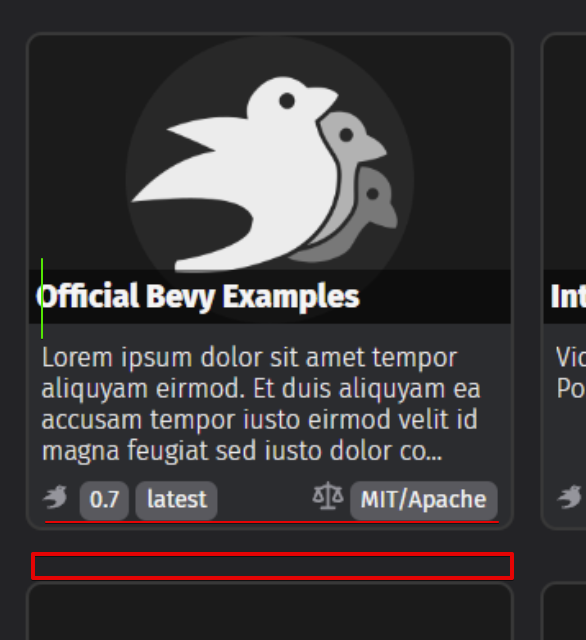
asset cards with more metadata
Objective
Update the asset cards to support more metadata. The main goal is to be able to show the supported bevy version. Everything else is secondary right now.
Solution
Support more metadata by using the styling from https://github.com/bevyengine/bevy-website/issues/231.
I'm missing a few things, like different colors for bevy versions, but that's because I don't know how to do that with zola templates. I also ignored the author name and crate version for now because it doesn't apply to every crate and it can be iterated on in the future.

Supported metadata:
bevy_versions: array of supported versionlicenses: array of licenses
The metadata currently doesn't exist, but the code is written in such a way to not break if it doesn't exist. I created #397 to generate the required metadata.
A lot of the values were just found by me playing around with values and finding something that looked good. I'm absolutely opened to changing them. To be clear, a lot of what I have right now are just values that ended up working, but there's probably a better way to do most of those things.
Remaining questions
- ~~What to do with assets without images.~~
- Solved: I added a gradient to make it a bit less empty.
- How to handle different color based on the value of the version tag by using zola templates
Notes
Until we add the required metadata, the cards will have a lot of empty space at the bottom, I already have a prototype ready to add the missing metadata, so that should be fixed pretty fast.
@TimJentzsch since I can't figure out how to request a review, hopefully this ping will do the job.
How it looks for me (Safari and Firefox):

- The icons seems to not be aligned with the centre of the tags
- The license icon is too close to the license tag
- If there are no version, the license is on the left
There is also an issue when there are too many bevy versions, this would hide the licenses. That could be solved later as it's unlikely to be an issue today
For the remaining questions, I would like this to move without solving them:
- Assets without an image: let's keep them empty for now, and take the time to find a good placeholder
- Colors for versions: colors are... too complicated. This info is needed now, even without colors
- The icons seems to not be aligned with the centre of the tags
- The license icon is too close to the license tag
- If there are no version, the license is on the left
There is also an issue when there are too many bevy versions, this would hide the licenses. That could be solved later as it's unlikely to be an issue today
We should be able to fix all of that with :sparkles: flexbox :sparkles:
The main ingredients:
display: flex: This is where the fun begins!justify-content: space-between: The first item goes to the start, the second item goes to the end.- Wrap the version and license each in a
div. Only the content of thedivis conditional, that way you keep the license to the right even if the version is not specified. align-items: center: Aligns the icons at the center of the tags.gap: 5px: Space between icon and tag name.flex-flow: row-wrap: If there are too many bevy versions, the license wraps in the next row.
That should be everything we need. In a couple of hours I might also have time to do a mockup with vanilla HTML and CSS if needed.
Since the new layout always expects an image (like a thumbnail), maybe add a default bevy image when there is no image on metadata?

The current layout adapts when there is no image.
Since the new layout always expects an image (like a thumbnail), maybe add a default bevy image when there is no image on metadata?
Yes, we'll need a placeholder, but not the Bevy logo
The current layout adapts when there is no image.
In my opinion that makes more sense than having a big gray box that is not used
If we look at other stores (https://assetstore.unity.com/tools or https://www.unrealengine.com/marketplace/en-US/content-cat/assets/codeplugins?count=20&sortBy=effectiveDate&sortDir=DESC&start=0) even plugins that are more related to code all have an image. Sometime, it's just the plugin name, or a logo.
I would prefer to make the image mandatory, and generate images with the asset name as text for those that don't have one yet. Allowing assets without images make the page a lot harder to "explore"
For the image thing, I was mostly questioning what to do right now, but yes in the future we should either make images mandatory or at the very least some sort of generated placeholder. I believe once cards are more clearly used to show case images we'll see more people submitting images. Could be worth explicitly calling out in the blog post.
For the bevy and license logo, that was me playing around with it and breaking it after making my original PR it was super late though so I stopped and went to bed. I'll try to fix it later today.
It's looking good!
For the image adding some light background image (maybe some grey cogs?) + the name of the asset on top should look good enough. I think that removing it, with this vertical layout, is going to look ugly as the title/text will be misaligned between cards.
I have a couple of minor nits on margins/padding/alignment. On top of what @mockersf already mentioned in https://github.com/bevyengine/bevy-website/pull/394#issuecomment-1187016606, I would say that the margins/padding would look better if they were more consistent:
- Reduce bottom gap of the card (on the current online version on both assets/examples cards the same gap is used for both axis). You probably have some
margin-bottom; just removing it should work as the parentgridcontainer is responsible for the gap. - Increase left padding on asset title to match description
- Increase bottom padding for de card
Also, on your screenshot it looks like the text is not vertically centered on the "pills":
Alright, I rewrote most of the styling, but this time I used css grid and it made everything way easier. I tried to apply most of the feedback that I saw here.
I also added a gradient for the assets without images just so it's less empty

@doup sorry I didn't see your feedback before committing, but I think I fixed all of that
@IceSentry this needs merge conflict resolution, but IMO we should ship this and iterate.
I'd rather shipping the metadata loading first. That way the cards will have actual data to show. Right they will just look weirdly empty.
The cards are pretty much ready at this point. They just need actual metadata to read.
Well, technically it isn't blocked, it could easily be merged without any issue, it would just look a bit empty at the bottom since there would be no license or bevy versions
The other PR is ready it just needs more reviews. it's just that most people don't look at bevy-website 😦
I think that we may have lost lazy-loading of the asset images in the rebase.
Pull request successfully merged into master.
Build succeeded: