bevy-website
 bevy-website copied to clipboard
Landing Page: Add a hero banner
Most marketing sites have some eye-catching hero banner/carousel nowadays. It should immediately grab the attention of the viewer and put direct followups (i.e. "Get Started", "Learn more", "Try Demo") in front of them.
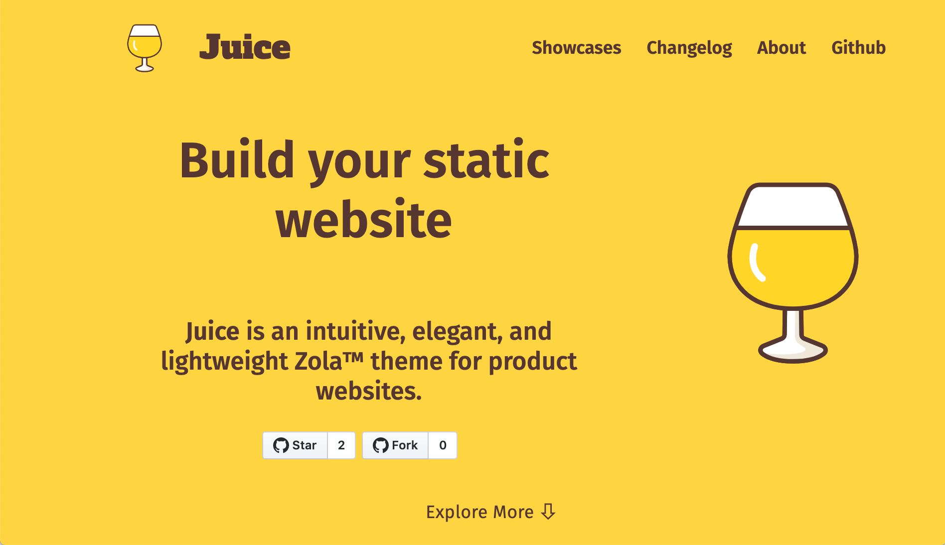
An example from Zola's theme page:
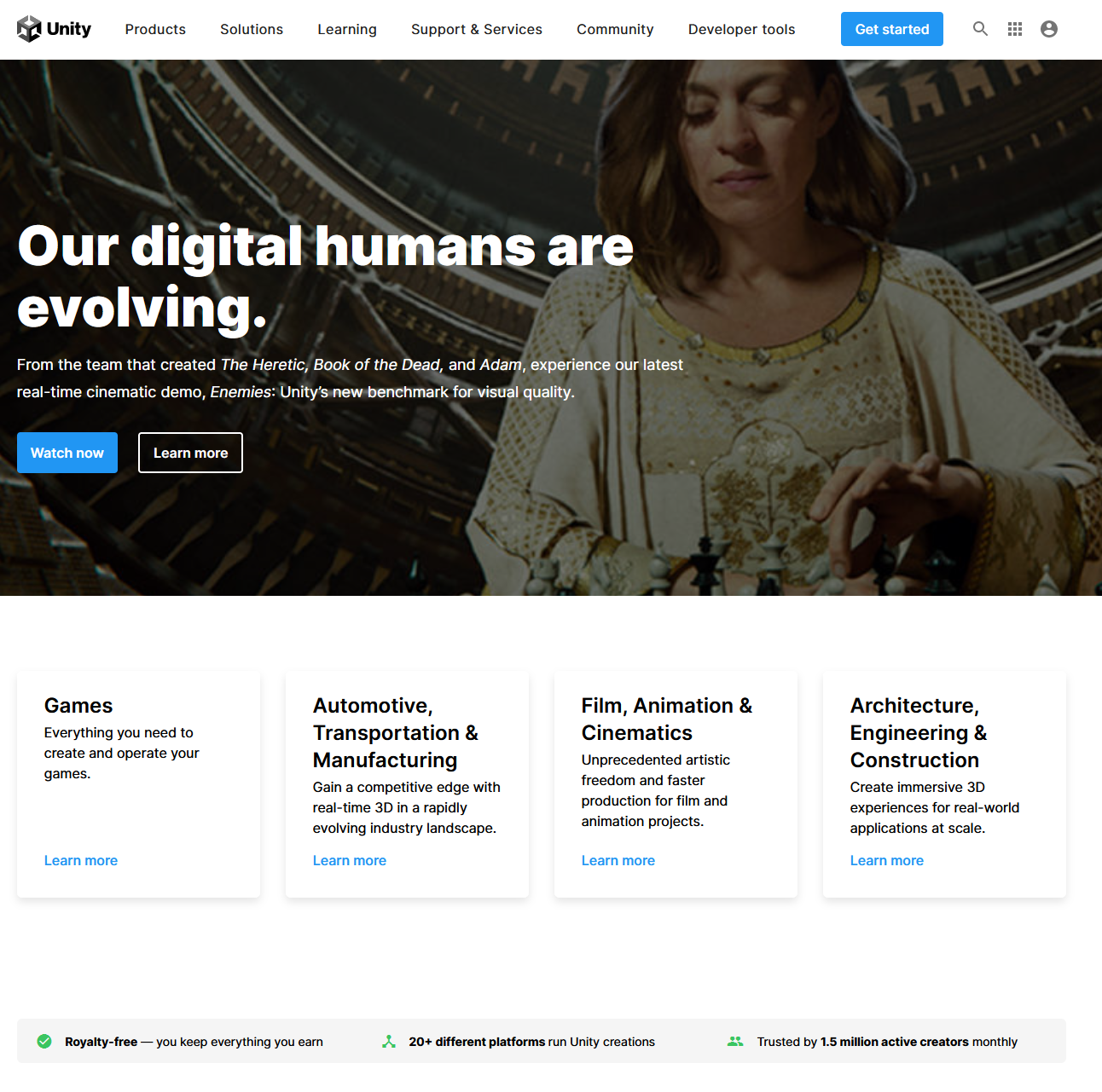
Or Unity's frontpage right now:
In my opinion this is one of the best examples out there: https://remix.run/
The "banner" (or intro, w/e) is simple but includes important links, a marketing pitch, and sample code. Scrolling down, the page has an series of animations to illustrate what the software can do.
Another great example that I ran into: https://www.meilisearch.com/
It seems like header + two column banner (left text, and right image/code) is a popular choice.
Just for fun, I decided to try out an alternate design for the home screen.
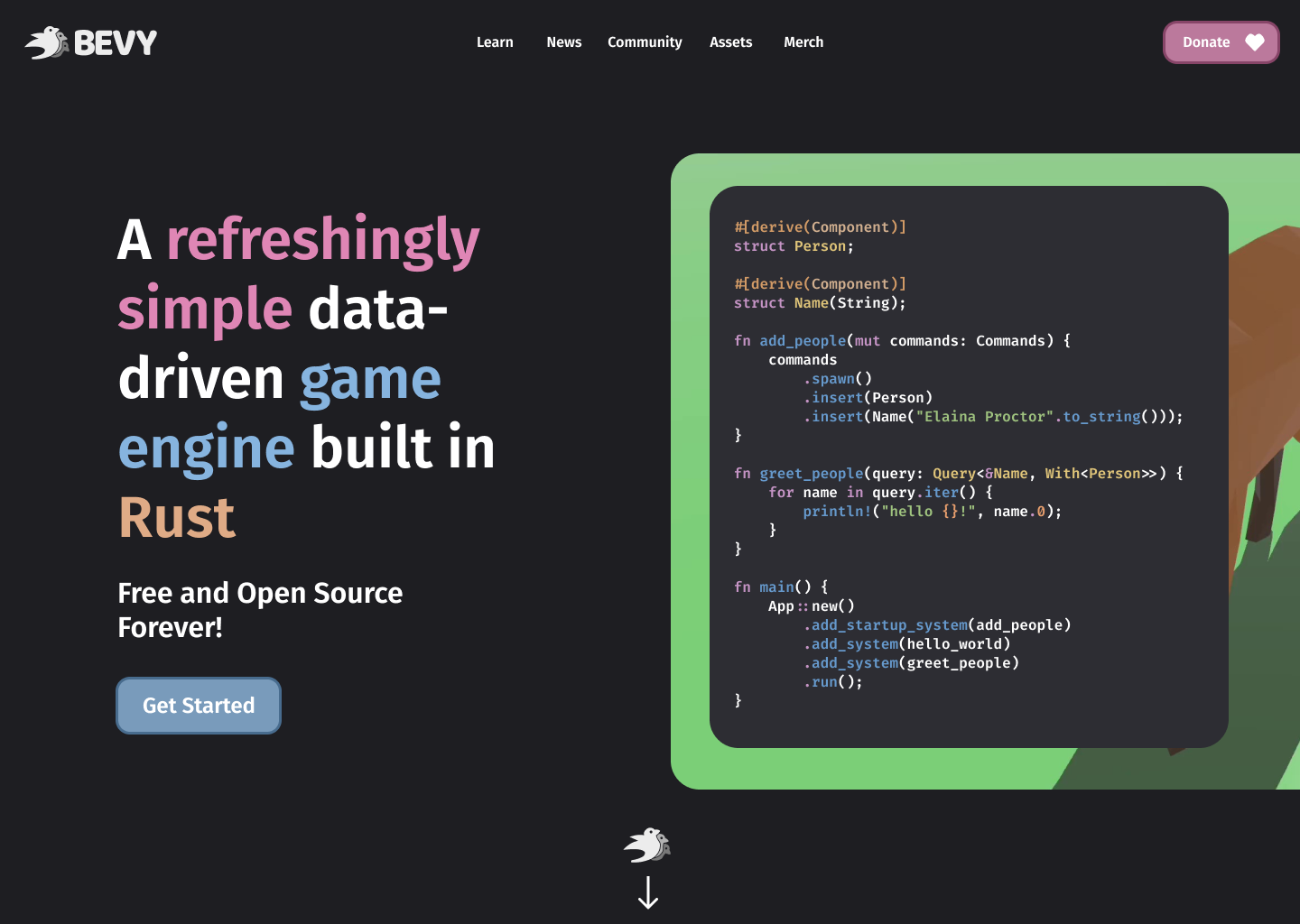
Edit: Basically, using the remix site as inspiration with some tweaks.
I do like the general idea here. Some notes:
- Despite our API UX being a very important selling point, idk if a wall of code should be the "face" of the engine. I think a pretty 3d scene might be the move for now. Ultimately it would be an editor screenshot, but obviously thats not an option yet :)
- This is so "inspired" by the remix layout that I feel a bit uncomfortable using it. I think we should "make this design our own" a bit more.
- The centered nav is an interesting move. I like the look of it, but combined with left aligned bevy logo and right aligned donate button, I dont like that this would look "different" based on screen width. If we go the "centered" route, I think we need to put bounds on the width headbar content (if the design doesn't already do that).
- Despite our API UX being a very important selling point, idk if a wall of code should be the "face" of the engine. I think a pretty 3d scene might be the move for now. Ultimately it would be an editor screenshot, but obviously thats not an option yet :)
Hard agree here. A lot of the other game engines (like the Unity one above) usually resort to eye-candy here instead. Showing the capacity of the renderer here is probably a good start.
The centered nav is an interesting move. I like the look of it, but combined with left aligned bevy logo and right aligned donate button, I dont like that this would look "different" based on screen width. If we go the "centered" route, I think we need to put bounds on the width headbar content (if the design doesn't already do that).
Isn't this already being shelved into a hamburger menu at mobile screen widths?
A few comments of my own on @CooCooCaCha's example above:
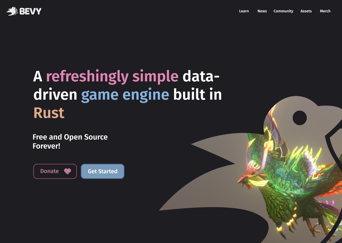
- I think a "Scroll down for more" over a bevy logo for near the bottom is better here.
- I really like the rounded look here that fills the sides with less negative space. It feels a lot more full than the current layout, but we may need to update the rest of the features page to be similarly full.
Isn't this already being shelved into a hamburger menu at mobile screen widths?
I'm most worried about the opposite direction, where it has awkward empty space on "wide" monitors.
Isn't this already being shelved into a hamburger menu at mobile screen widths?
I'm most worried about the opposite direction, where it has awkward empty space on "wide" monitors.
I think the move here would be to set a max-width on the page content and just let the sides be blank on wide monitors. Twitter does this for example.
Regarding being too similar to Remix, I totally agree and that was semi-intentional since it started as a fun exercise playing with the Remix layout. The reason I went with Remix is that I'm not a graphic designer so the text-heavy layout was easy for me to replicate.
Overall, I've noticed that 3 of the 4 examples listed here follow the same basic format. Plain color background + header + left column (with text and button) + right column graphic. What's interesting is that even though they follow the same structure they still feel unique to each project. Perhaps if we do some graphic design and/or created a cool demo graphic we could take this to the next level.
I think the move here would be to set a max-width on the page content and just let the sides be blank on wide monitors. Twitter does this for example.
This is what we already do with the current impl. This looked like a regression, which is why I brought it up :smile:
Regarding being too similar to Remix, I totally agree and that was semi-intentional since it started as a fun exercise playing with the Remix layout. The reason I went with Remix is that I'm not a graphic designer so the text-heavy layout was easy for me to replicate.
:+1: This was how I interpreted it. It was a good approach to illustrate whats possible.
Perhaps if we do some graphic design and/or created a cool demo graphic we could take this to the next level.
Yeah I think this deserves hyper-fixating on perfecting every detail, given that its the first thing people will see when they come across bevy.
Yeah I think this deserves hyper-fixating on perfecting every detail, given that its the first thing people will see when they come across bevy.
Totally agree. With that said, where would be the best place to discuss ideas/tweaks? It feels like a discord thread would be less noisy.
Imo this should still happen on Github, probably as a Discussion to allow for threading. Discord results in good content getting buried quickly, which I'd prefer to avoid.
Cool, in that case can you enable discussions for this repo?
Also, I tweaked the design a bit so that it's a bit more unique. Perhaps the static image in the bottom-right could be replaced with a looping video taken straight from a Bevy demo.
Cool, in that case can you enable discussions for this repo?
I think its better to make the main bevy repo the "hub" for all bevy Discussions. I worry about discoverability of content otherwise. Right now we share the main repo discussions link in a bunch of different places (and that repo gets way more attention, as evidenced by the star counts).
Curious what others think though.
It makes sense to me, but I would add a website category to make it a bit clearer.
I technically have the rights to do that, as a triage-team member, but I'd rather have a definitive conclusion on the subject before doing it.