recursive-code-config
 recursive-code-config copied to clipboard
Feature request: make line-height configurable
In the Recursive_Code/README.md included with the prebuilt release, the description for Rec Mono DuoTone states:
A personal favorite – this uses Linear styles for upright text and Casual styles for italic text.
But the included bold font is Casual and not Linear. In duotone.yaml, Bold has a CASL setting of 1. Is this intended? It looks like it was not originally this way until commit 0bcd36becfc578371715ce45f7b1b2c64e5dcfda.
Happy Holidays!
BTW, the instructions on how to roll your own were excellent. In less than 5 minutes I had my own version of DuoTone where Bold was using a CASL setting of 0.
Nicely spotted! This did indeed change, but I didn't adjust the README as I should have.
My themes only end up using bold in the terminal, so I like the casual to show up there. But I'm glad you found the instructions to make a custom family easy to follow!
I'll update that readme, and make sure it's easy for people to find the custom options.
Thanks for posting the issue!
Thanks for clarifying.
I've been trying Recursive in my emacs setup, which uses bold for several things (unread email messages, unread RSS feed articles, overdue tasks in agenda) where the switch from linear to casual doesn't look as good in my opinion. Admittedly, perhaps I didn't give it enough of a chance, so maybe I'll give it a try again.
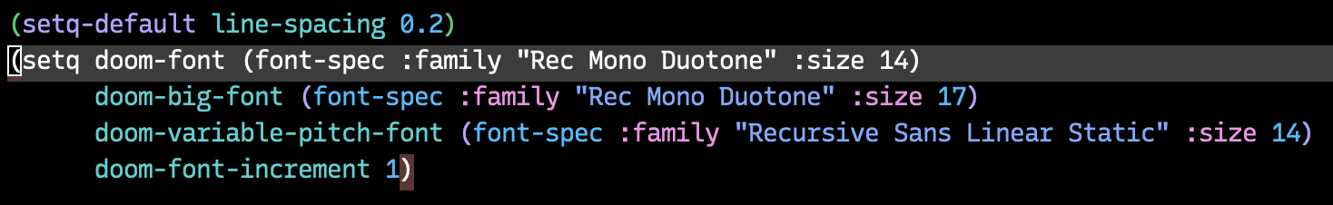
I'm really enjoying the font thus far. I only wish the vertical spacing was a little looser like Plex Mono or SCP (or configurable via the yaml file). Unfortunately, in emacs while I can add additional line spacing, it only adds the extra spacing at the bottom, so the cursor or selections look weird:
Sorry for the massive delay in response here! This repo is more of a fun side-project than anything, so I forget about it occasionally.
The font has the metrics is does to be fairly compact, which can be handy for graphic & UI design. But, I can definitely see why you’d want to increase the height by a bit.
This is an interesting idea, and would theoretically be doable without too much trouble ... Then again, I worry that it would be tricky to do in a way that made sense to people easily, and avoided unintended issues (like people making the line-height way too small, or even just making it a bit smaller and triggering weird OS or app-specific issues around line heights).
Basically, I think this could be done by changing the typo, hhea, and win ascent & descent metrics. But, I’m not sure when I could get to it. I am open to PRs, if someone else wants to make this change, but obviously no pressure at all.
To be honest, Plex Mono is a very good font, and the simplest solution for you might be to just use that one!
I don’t think I’ll do this. I’m not really sure exactly how I would approach it, and more than that, I don’t know how I would describe the configuration option very well in the simplified format of this repo.
If you (or anyone else) does want to adjust the metrics, as I said above, I believe this could be done by changing the typo, hhea, and win ascent & descent metrics, either with a FontTools script, by using ttx and editing the fonts in XML, or possibly via a GUI like FontForge.
Closing this now, but I appreciate the idea and discussion here!