archweb
 archweb copied to clipboard
 archlinux
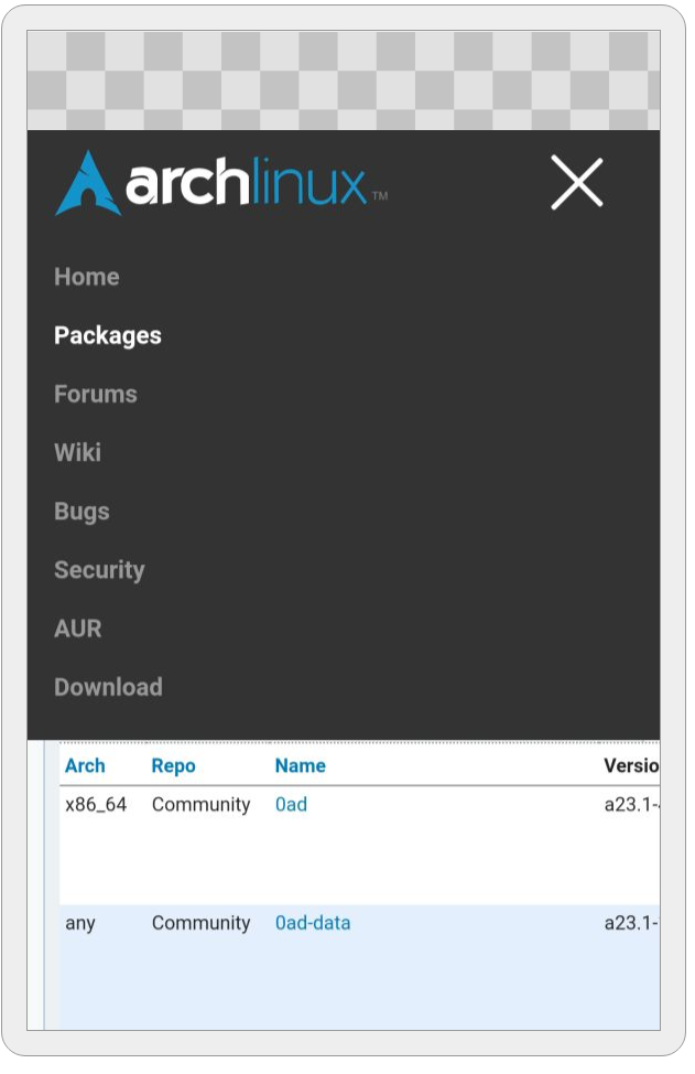
Add mobile friendly layout
So far I've only done a hamburger button menu but I thought I'd better get early feedback so I don't have to change everything later.
I'll edit here to keep track of what has been done and what I'm working on.
- [x] Hamburger button menu
- [x] Responsive layout for home page
- [x] Responsive layout for packages page
- [x] Replace floats in navbar and use flexbox instead, also confine navbar items to a max-width
Rel: #212
Thanks for the PR, playing with it right now. As a right handed I have a hard time selecting the right menu. I think it should be possible to make the whole "width" clickable.
Good point, fixed it in cbd3079. Also made the nav bar stick to the top on mobile and overall more user friendly.
I think I'm mostly done... there are still a few rough edges here and there like the package detail page but for the most part things are kinda looking good on mobile. Please note that I also changed the desktop view a bit: I gave the entire page a maximum width so it won't span the entire screen width on (ultra)wide monitors (it even makes a difference on 1920x1080 already).
@jelly are there any plans to merge this or work on a mobile friendly layout? The current site really isn't a pleasure on mobile right now.
@jelly are there any plans to merge this or work on a mobile friendly layout? The current site really isn't a pleasure on mobile right now.
I'll have to check this out after a rebase, the navbar menu should be made responsive in this project as that is now the "upstream" for it. Although archweb does not use it yet.
The other changes I'll have to rebase and review.