vim-css-color
 vim-css-color copied to clipboard
Feature Request: Gutter Colors
Having seen this feature in IntelliJ just now, it is so cool!
In every line that contains a parsed color value, it also inserts a "█" in the gutter/sign-column, of the same color. In fact, if there are multiple colors mentioned on one line, it displays the first few colors, e.g. █ █
With this feature, visually you can just scan down the gutter for a certain color of interest, without even looking at the code. Additionally, if you are tweaking a color palette then adjacent lines will get the colors displayed right next to each other in the gutter, so you can evaluate the look (without this feature, you have to get lucky with your variable naming or white-space that the #colors are near each other in the code).
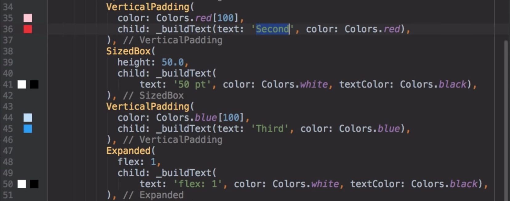
Here is a sample:
 IntelliJ docs/info:
https://www.jetbrains.com/help/idea/style-sheets.html#ws_css_change_color_values https://www.jetbrains.com/help/idea/settings-gutter-icons.html (color is basically an icon of "█")
Looks pretty cool, and makes a lot of sense.
I’m not certain I follow regarding multiple colours in one line – can you post a screenshot?
The gutter might even be a good place to address the longest standing feature request, #37. Does IntelliJ do anything smart about foreground vs background colours?
I haven’t done anything real with the gutter before so I don’t know how hard this would be, and so I can’t say if/when I’ll get around to it – but I like the idea.
Sure, here's a screenshot from a YouTube vid where I saw the feature originally (I'm not actually an IntelliJ user myself)
 > https://www.youtube.com/watch?v=RJEnTRBxaSg
In this screenshot, it is a fg/bg type situation -- not sure if that's the ideal UX, but I do like that it shows there is an intent to have two colours working together (fg/bg, but also other cases like complementary palette). Personally I consider that an advanced feature, or at least in my code the fg/bg colors are on different lines.
(I think that with a different glyph, even just a regular letter for reference, you could address the fg/bg situation by setting the gutter bg color, too. IMO, I think that would be better than what IntelliJ does above -- I don't think next-to-each-other would be as visually convincing of what fg/bg would actually look like, in that specific case)
even just a regular letter for reference
I think A is the closest thing to a convention in this space, though, usually, people have room to use Aa for compact previews instead.