altair
 altair copied to clipboard
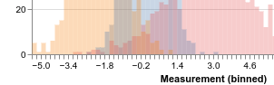
Inconsistent draw order for layered histograms
When bar charts (histograms) are drawn stacked with transparency, as in the following gallery example,
https://altair-viz.github.io/gallery/layered_histogram.html,
then, in the areas where the histograms intersect, the drawing order for each set of bars appears to be inconsistent leading to inconsistent coloring where colors dominate alternatingly, as in the crop below:
 This can look pretty weird in some scenarios:
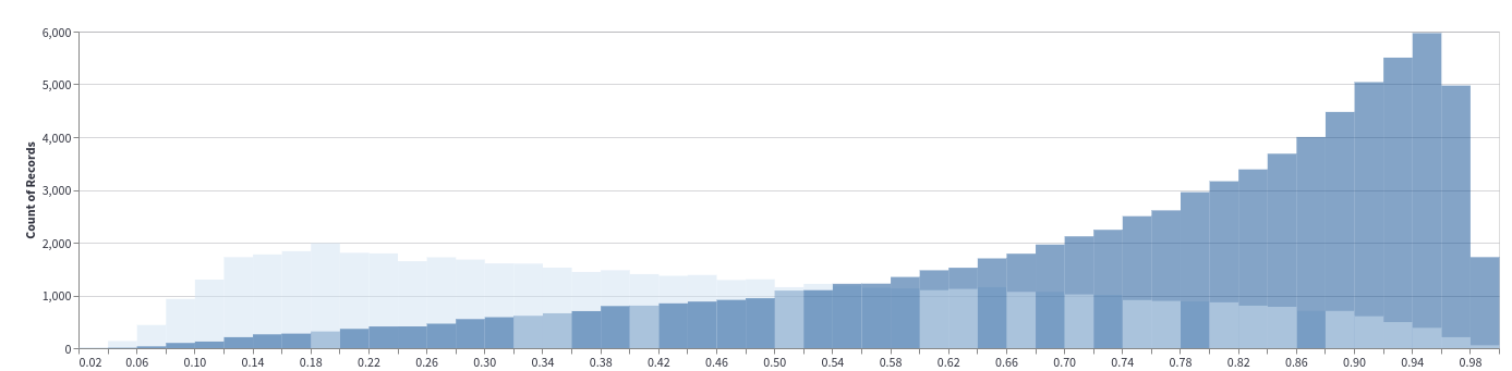 which was generated with code inspired by the example above:
chart = (
    alt.Chart(df)
    .mark_bar(opacity=0.5, binSpacing=0)
    .encode(alt.X('x_col', bin=alt.BinParams(maxbins=50)), alt.Y("count()", stack=False), color='group_col')
)
I don't know if I'm missing some option? In this old issue where they use mark_area, the problem does not seem to occur.
I assume using explicit layering with + might fix it, but then a lot of the convenience is lost
The problem is not immediately apparent in the vega-lite examples I have been able to find: https://vega.github.io/vega-lite/docs/stack.html#layered-bar-chart
This is unfortunately a bug in Vega-Lite https://github.com/vega/vega-lite/issues/6991. Vega-Lite plots the data in the observations in the order they appear in the data, so a workaround is to sort the data according to groups first.
Closing this as nothing can be done on the Altair side. After the vega-lite issue has been fixed this will automatically be included in a following altair release.