altair
 altair copied to clipboard
Color and Shape Legends Not Combined in Line Chart or Multiple Charts
Code to reproduce:
In line chart:
df = pd.DataFrame(
    data=[[0, 10, "a"], [1, 20, "a"], [0, 15, "b"], [1, 25, "b"]],
    columns=["x", "y", "c"]
)
alt.Chart(df).mark_line().encode(
    x="x",
    y="y",
    color="c",
    shape="c"
)

Multi Charts:
df = pd.DataFrame(data=[[0, 10, "a"], [1, 20, "a"], [0, 15, "b"], [1, 25, "b"]], columns=["x", "y", "c"])
points = alt.Chart(df).mark_point().encode(x="x", y="y", color="c", shape="c")
lines = alt.Chart(df).mark_line().encode(x="x", y="y", color=alt.Color("c", legend=None))
points + lines

Expected behaviour
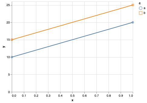
The legend should be like this:

I think the behavior of the first chart is expected, because lines don't have a shape, and therefore the line legend is separate from the shape legend.
The second example is unexpected to me. You can work around it by making the legend scales independent:
alt.layer(
    points, lines
).resolve_scale(
    color='independent',
    shape='independent'
)

But I would not expect this to be necessary when the line legend is set to None. It may be worth reporting this as a bug or feature request within the Vega-Lite repository.
For a sufficiently complicated diagram (layered & faceted), the workaround makes things worse. Before the workaround, I was in the same situation as the OP. After the workaround, I get:

It also depends on where to put the resolve_scale. Putting it after the faceting has no effect at all, putting it before the faceting results in the screenshot above. (Sorry I don't have a nice minimal example at this point).
If I may add, regarding the comment:
I think the behavior of the first chart is expected, because lines don't have a shape, and therefore the line legend is separate from the shape legend.
it does seem altair's mark_line() treats different property-channels differently, although they are common to all types of marks. This can create a rather inconsistent behavior, especially when combining multiple property-channels.
For example, let's take mark_line and examine the following data:
import numpy as np
import pandas as pd
import altair as alt

n = 10
x = np.arange(n)
squared = x ** 2
cubed = x ** 3
squared_shifted = squared + 200
cubed_shifted = cubed + 200

source = pd.DataFrame(
    {"x": np.concatenate([x, x, x, x]),
     "operation": (['squared'] * n + ['cubed'] * n) * 2,
     "shifted": [False]*(n*2) + [True]*(n*2),
     "values": np.concatenate([squared, cubed, squared_shifted, cubed_shifted])}
)
which baiscally creates 4 combinations of operation (squared/cubed) and shifted (shifted/non-shifted).
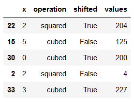
print(source.sample(n=5, random_state=2020)) gives:

Now plotting the data, we can use operation and shift as property-channels.
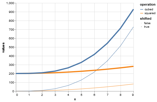
My intuition is that the chart should result in 4 curves, 1 for each operation-shift combination.
This is indeed the case when using common properties that are "inherent" to lines, such as color and size (and also opacity):
alt.Chart(source).mark_line().encode(
    x='x:Q',
    y='values:Q',
    color='operation:N',
    size='shifted:N'
)

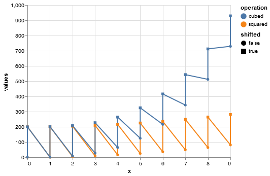
However, when using properties that you claim to not be inherent to lines (although mark_lines can still use them), such as shape, it results in only 2 curves, with a line connecting between different kinds of shapes:
alt.Chart(source).mark_line().encode(
    x='x:Q',
    y='values:Q',
    color='operation:N',
    shape='shifted:N'
)

At first I thought it was a bug, but given Jake's answer I suspect it is by-design, in which case I think better documentation may be needed.
These are probably questions to raise in the Vega-Lite forums.
One note: the last chart will work as expected if you use a detail encoding as well, which controls how data is grouped without adding a visual attribute:
alt.Chart(source).mark_line().encode(
    x='x:Q',
    y='values:Q',
    color='operation:N',
    shape='shifted:N',
    detail='shifted:N'
)

For reference, the corresponding Vega-Lite issue is here https://github.com/vega/vega-lite/issues/5996
Closing as this is tracked in the VL issue linked above and there is nothing that can be done from the altair side of things to fix it.