clearml
 clearml copied to clipboard
[Feature] Support individual scalar reporting without plots
When using logger.report_scalar a plot is automatically generated to accommodate for a time-series axis.
There is no current way for the user to report a single scalar with a name (that is not a time-series) and have it both aesthetically pleasing and visible enough in the WebUI. Using iteration=0 just wastes space by creating a scatter plot with a single datum.
It would be great to have e.g. logger.report_scalar(name="MAE", value=mae), and have it visible as a table (or similar) with e.g.:
| Scalar name | value |
|---|---|
| MAE | 0.123 |
| NRMSE | 0.4 |
| My favorite scalar | and it's actually a string |
Even better, once these are in place, they can automatically be aligned between multiple experiments for comparison.
Hi @idantene ,
Did you try adding this single scalar to the leaderboard and filter with it? can this do the trick?
Hey, thanks for replying so quickly!
Adding it to the leaderboard is a good start (though requires some adjusting for column names).
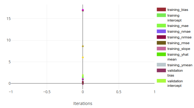
It's also the single experiment look that just looks... bad. This is unhelpful and hard to read:
 It would make sense to have these as a table instead, as some kind of "experiment final metric" or some metric that is not associated with a specific timepoint.
Interesting, @idantene are saying that maybe in the UI, when all the series on a graph have a single report, we should present it as table, is that it ?
@bmartinn I think that would make a lot of sense, yes. At the same time, I believe the user should have absolute control on how these are displayed. This could be some toggleable button in the UI or some specific set of instructions in the SDK, that separates between a graph and a table. For example, one can imagine a table also for multiple reports, with e.g.
| name | value | "iteration" |
|---|---|---|
| MAE | 0.5 | Full set |
| MAE | 0.45 | Some subset of samples |
| MAE | 0.44 | Other subset of samples |
etc (where iteration is just a pseudonym for "description" in this case)
@idantene Seems like this last example you provide steers further from the "default" scalars use case of value series.
For such specific use case, would not something like report_table be better suited?
(This while not discounting @bmartinn's suggestion for a more suited display in certain scenarios)
@ainoam Well, that depends. I would not expect these scalars to be reported as a single table. This is more of an extension of the original request, where an iteration does not really exist -- these are metrics that encapsulate the "end result".
The above example is just an illustration of a use case we have - there's the test set, but we also split it by various characteristics. It's then useful to calculate e.g. the overall MAE on the test set, but also the MAE on various subsets that represent these characteristics. So the "iteration" concept does not exactly exist, but there are several metrics with the same name but with different descriptions.
I see two ways to achieve this as of now - report_table (though that would put the result in plots rather than in scalars, plus one has to build the table as they calculate the metrics - adding some overhead), or abusing the current report_scalar (e.g. report_scalar(..., series='some_subset_mae'). Both of these seem... wrong?
What about something along the lines of report_table_scalar(title, name, value, **additional_columns)? (I'm guessing you can find a better name 😛)
That would allow a user to:
- Report a scalar without a plot, directly to the
scalarstab. - Group scalar in a single table corresponding to
title. - Choose name/value much like one does in the
report_scalars(thoughseriesis replaced byname). - Add any extra columns (empty for previous scalar if they did not have those columns) with any free-form information.
What do you think?
Hi @idantene
This could be some toggleable button in the UI
This could be a nice way to present an entire graph (multiple series) in a table as a summary view. A toggle button in the UI makes a lot of sense here, especially if only a single scalar was reported.
some specific set of instructions in the SDK,
Creating a nice interface for it in the SDK can definitely help users understand how to use this feature. That said, under the hood, I would not like to change the behavior and actually use scalar reporting as is. I would really like to avoid a default, show-as-table for graphs with a single value, as any running experiment starts with a single reported value, and switching between the views after another iteration would feel like a bug ...
I'm thinking we will find a way to signal to the UI that this scalar graph should start as a table (always an option to switch back to graph view), then add an interface to "report single value" to the SDK. wdyt?
Hey @bmartinn,
Sure, that sounds like a plan 👍🏻 Can't wait!
Just to clarify though - the report_table_scalar idea should not change anything with the scalar plotting. It's more of a suggestion to also allow tables in the Scalars tab, and letting the user decide if they want a plot or a table beforehand (without any UI interactions).
Hi, maybe this is the right topic for the issue we're currently facing -- right now we are using the workaround of "plotting" a table, with one scalar per row. However the table view doesn't support text selection / copying, so if we want to paste the results into a report, we need to still log the table to the console. Could you please enable text selection or a true html / TeX table copy/paste button? The JSON export is not very useful right now for this job.
@swigicat
Could you please enable text selection or a true html / TeX table copy/paste button? The JSON export is not very useful right now for this job.
I think the easiest would be to download as CSV, no? BTW: if you are reporting a single row (i.e. single value per key, wouldn't it make more sense to report a single scalar and display the values in the experiment table, pressing on the cogwheel you can add any scalar to the table)
Hi @idantene , thanks for the bump!
Recapping here:
- Report a single value (not time series), might be a single "key" (as opposed to the scalar pair title+series)
- Allow to show key/value in experiment Table as additional column (same thing as we already have with scalars)
- Create a "summary" table for all the "single key/values" reported for the Task ?
Question: If we do the following:
report_single_value(title='group', name='f1', value=0.5)
report_single_value(title='group', name='auc', value=0.75)
instead of plotting a "scalar graph" like we have here:
We should get a table:
| name | value |
|---|---|
| F1 | 0.5 |
| AuC | 0.75 |
So basically, if we actually report scalars (instead of report_single_value), and tell the UI to present a Scalar graph with a single entry, as a Table, we are good to go?
@bmartinn Yes that looks about right 👍🏻 Perhaps the title='group' can be used as a title for the graph/table as well in such cases?
Just jumping in as this would be a really useful feature - it would also be useful to think about how this appears when comparing experiments.
E.g if it was just a table you could have
| Name | Task1 | Task2 |
|---|---|---|
| F1 | 0.5 | 0.6] |
| AuC | 0.75 | 0.74 |
With perhaps some colouring to show which values are larger.
It would be even more useful to plot this data, e.g. a bar chart grouped by value name or even a radar chart with the values normalised against the base experiment.
With perhaps some colouring to show which values are larger.
Maybe an option to choose if a reported value is optimized to be maximal or minimal first (i.e. highlight larger F1 scores, but lower MSE scores...)
Maybe an option to choose if a reported value is optimized to be maximal or minimal first (i.e. highlight larger F1 scores, but lower MSE scores...)
i.e. sort the table by value? I would think this would make sense (imagine clicking on the titles to sort by value low/high):
| task | F1 | AuC |
|---|---|---|
| task 1 | 0.75 |
0.5 |
| task 2 | 0.15 |
0.25 |
Maybe an option to choose if a reported value is optimized to be maximal or minimal first (i.e. highlight larger F1 scores, but lower MSE scores...)
i.e. sort the table by value? I would think this would make sense (imagine clicking on the titles to sort by value low/high):
task F1 AuC task 1
0.750.5task 20.150.25
Sorting is nice if one is interested in a single metric, coloring is more convenient if one is looking at multiple metrics in a single table.
Hi @cpatrickalves @idantene @mmiller-max , while there isn't a solution yet, it is in the making!
The plan is to have a logger interface in which you can do something like logger.report_single_metric(name="my metric",value=123). In the scalars tab, you'll have a table with these reported metrics. This means there will be a single table per experiment with those values. The table will also appear in the comparison view, so you can compare values across experiments. As for coloring according to number, we'll take a look but not sure it'll be released in the first go (Let me know if this is critical and I can try and re-prioritize).
Anything I missed? I'll update here once there's something available
@erezalg you're saying "In the scalars tab, you'll have a table with these reported metrics.".
I would do one little modification to this design: instead of having "scalars" tab, I would do two tabs: "scalars (one value)" and "scalars (time series)".
Reason: I am just afraid that the table with the values may get lost in the charts of the "scalars" tab (if there will be a lot of them).
@ibobak , the plan is to make it appear first in the scalars tab. We actually are reluctant to add more tabs not to overcrowd the UI. We'll consider it if we see it really gets lost.
Makes sense?
Hey @idantene! v1.6.0 is now out supporting single-value scalar reporting. Single value scalars are aggregated into a summary table in the experiment’s Scalars UI tab.