xrpl-dev-portal
 xrpl-dev-portal copied to clipboard
Optimize column layout for "half-screen" window size
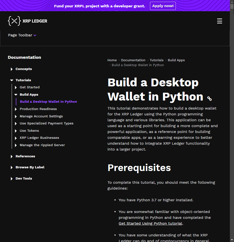
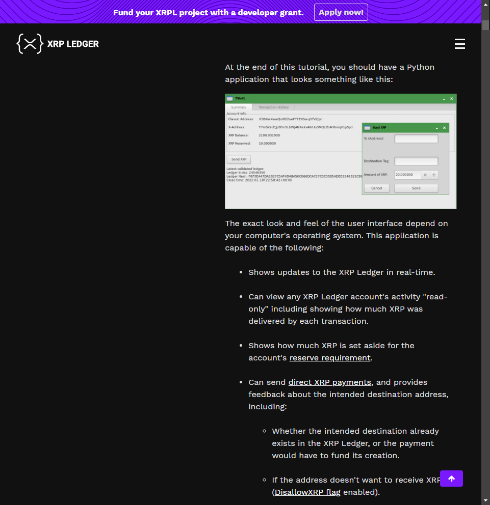
Most operating systems these days make it pretty easy to fit a window to exactly half your desktop size (horizontally—i.e. left half / right half) so you can have two things open at once. However, when users do this on a 1080p screen, the resulting layout for the documentation pages is pretty suboptimal:


It would be nice if we could adapt the breakpoints or even make the sidebar collapsible or something so that the documentation occupies closer to the whole window at this size. (At 1920×1080, a half-screen window is 960×1080.) We should also test 1440p and maybe whatever resolution the most popular iPad model(s) count as. Plus maybe look into variants factoring in display scaling for resolutions that often use that.