openverse-frontend
 openverse-frontend copied to clipboard
 WordPress
New header component
Problem
Since Openverse redesign, the current header was made to ease browsing content and have quick access to content actions and update the results. During the first weeks of the release, we noticed an improvement in shifting to this new version from the CC-Search era.
However, as time passed by, we encountered three main issues with the navigational component: usability, internationalization, and consistency.
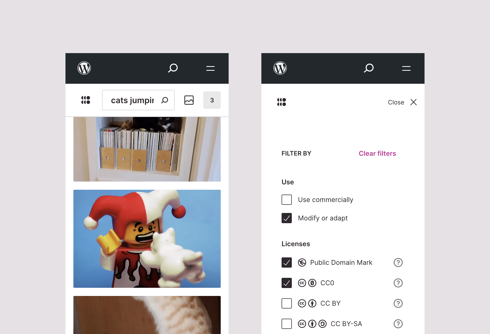
Usability
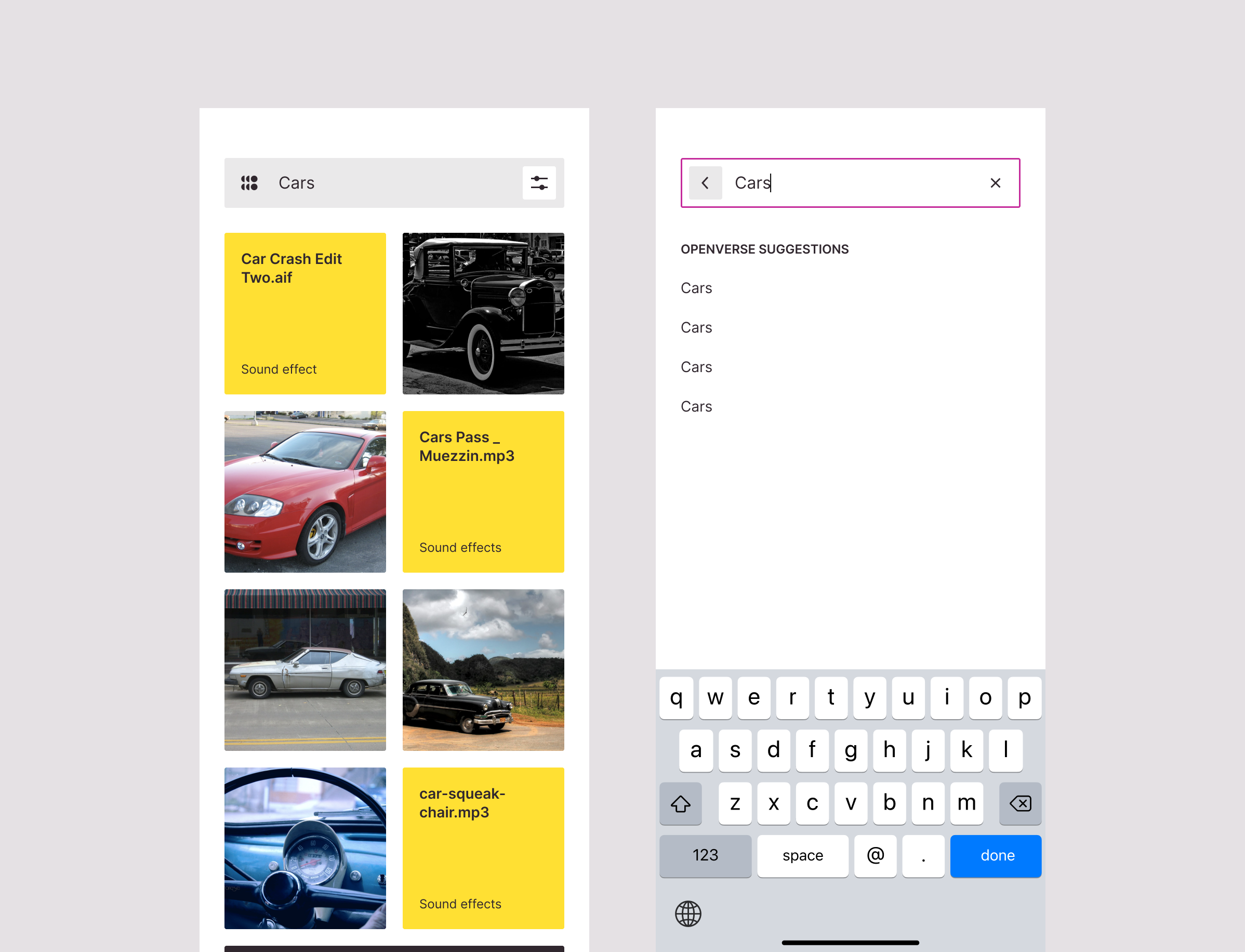
The existing component places a tight version of the search input as all actions are arranged in a row. Scrolling down the results on a 320px view makes the point clearer. With this version, the search input risks overlaying the search term and therefore, reducing its relevancy.
On the other hand, submitting a content switch and filters on mobile is not as intuitive as its desktop version. Issue #1363 reports how clumsy it feels.
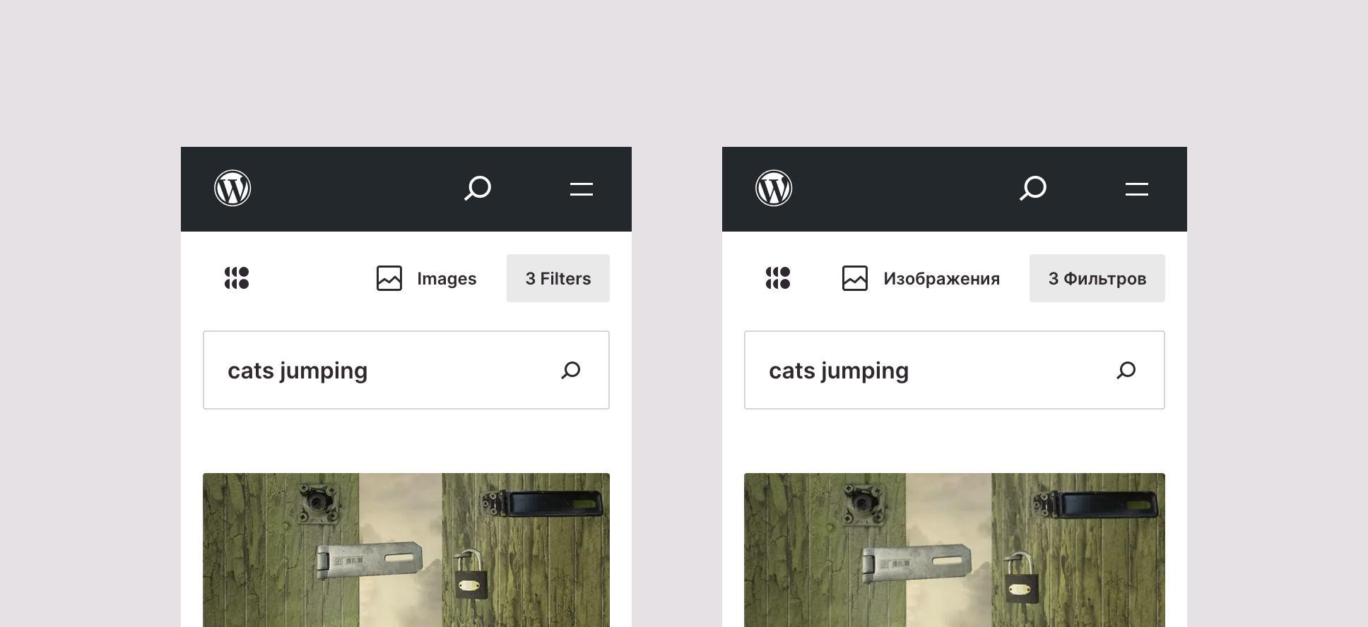
Internationalization
When using Openverse in languages other than English, label lengths can change significantly. The current header does not address this change correctly, and the outcome varies disorderly. Compare how English and Russian versions look like.
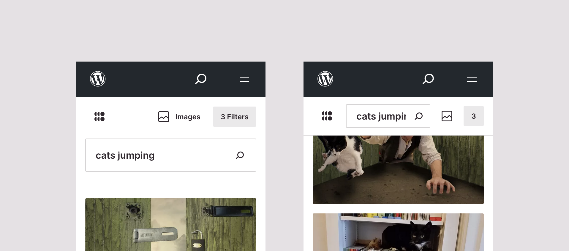
Note: For capturing the example above, I had to increase the viewport to 330px to reach one row of actions, otherwise would be two rows and the header looks broken.
Consistency
If you visit Openverse on desktop, you will see a header that changes slightly when scrolling down. But on mobile, the before-scroll and scroll versions have different distributions. The shifts arrange these elements unexpectedly as the search bar is placed between openverse logo and content actions.
Issues related
All the mentioned above can be found reported in the following issues
- Interacting with filters #1363
- Header on different screens #1212
- Recent searches feature #479
- Visibility of internal menu #1305
Proposal
To show clearly all changes proposed, I split the prototype into four searching stages.
Searching
https://user-images.githubusercontent.com/895819/184720776-5f1790b4-58ff-4cee-86af-2e2e5b91e743.mp4
Switching content
https://user-images.githubusercontent.com/895819/184720817-815e7525-5576-4179-b6f6-58242033b582.mp4
Applying filters
https://user-images.githubusercontent.com/895819/184720840-14aa7cce-bca6-4f0f-9de4-99b37282ad36.mp4
Clear filters
https://user-images.githubusercontent.com/895819/184720906-a2e9cd31-382c-4943-88bc-76f80dfcbe9a.mp4|
md breakpoint
https://user-images.githubusercontent.com/895819/184724022-e365dc85-f68f-4b64-be2a-fa888920d031.mp4
Description
An expandable component
The main change in this proposal is treating the header as an expandable element that shows content actions as it has available space. At first sight it looks like a single component, but it is divided into three areas that change as breakpoint increases: a link to the homepage, interacting with the search bar to change the search query, and toggling the content settings. All of them in 48px size to meet a11y requirements.
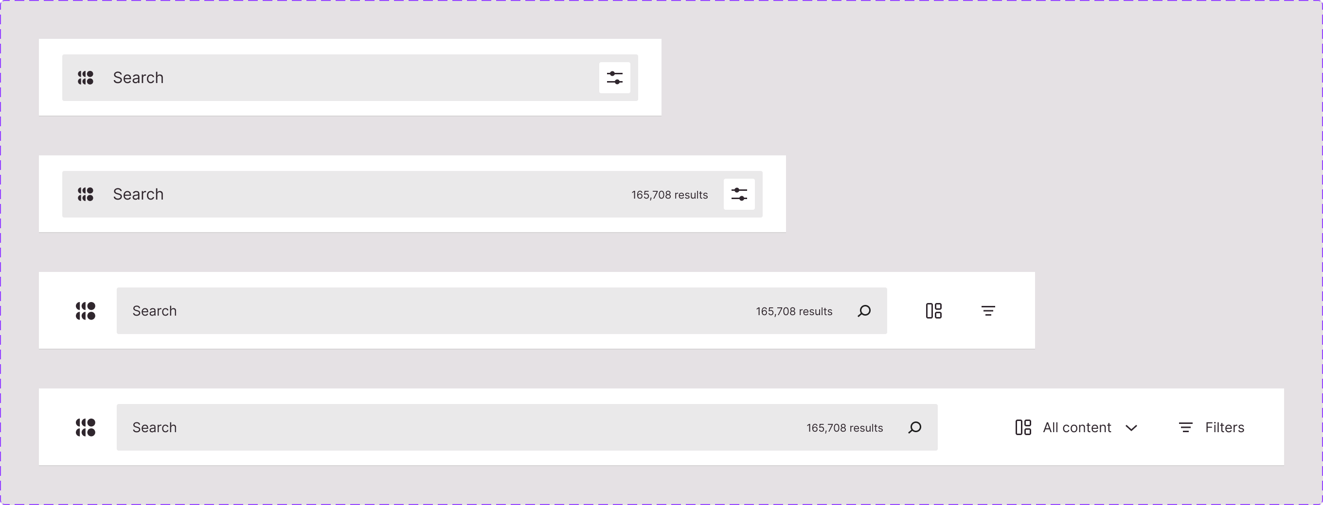
On smaller breakpoints, the search icon is replaced with a content settings button that opens a modal popover to switch the content type and filter the results. Nonetheless, this icon removal should not get rid of submitting the search from the onscreen keyboard on touch devices and the physical keyboard.
Changing the search term
As you can see in the recording, the component’s main interaction is changing the search term. When selecting the search bar, the openverse symbol shifts to a back button and the cross icon placed on the right side clears the search term. The full-screen view gives more space to show the recent searches and, in the future, suggest similar searches.
Content settings toggle
To get new results, the content settings toggle mirrors the desktop interaction: every change updates the results immediately. This interaction takes place in a scrollable popover of two-thirds of the screen while it shows the background updates. This effect gives the idea of not leaving the page to change the results.
Since submitting changes is instant, the “see results” and closing the popover buttons do the same. The CTA reinforces the flow of closing the modal at any time.

Internal pages displayed on every page
In the current header, internal pages were always present in an ellipsis menu due to Openverse lives inside the WordPress site and the header competed with its parent header. Having two navigational elements present at the same time was confusing, so we ended up prioritizing the WordPress one.
However, we plan to move Openverse to a standalone site and treat it as a separate product. For this new scenario, I propose having all internal pages always visible on the footer and not mixing the content action area with an internal navigation.
Mockups
Figma: New header component.
I love the new header design, @panchovm! It is very clean and clear, has all the necessary details but is also much simpler in its layout and implementation.
The mobile version of the menu feels like it's a native app. It also solves the problem of focus order, when on mobile tabbing through the header was in the wrong order.
There are two things I'm not sure about:
- Having the pages menu only at the bottom. As a user, I would look for it in the top row, maybe in some 'settings' menu. But I might get used to it.
- Using the pink dot to show that some filters have been applied. Usually, when I have a dot above a menu button, it means there are some notifications that I have to read to clear it. And for the filters, it shows that some filters are applied, not that we have to read some notification.
And I just wanted to confirm that we do not have the "Openverse" name written anywhere in the header, just the logo, on all breakpoints, right?
This is so beautiful, and I only have a few questions/comments:
- Big ➕ to having a footer with all the pages listed. I would prefer if we had a menu in the top-level navigation as well, but I'm struggling to see where to put it.
- The design of the searchbar being-full width and containing all other elements is gorgeous. I really love it. I wonder if we could keep it that way on desktop by keeping filters and content types combined as one button, which remains inside of the search bar.
- On that note, I am starting to wonder...why isn't 'content type' just another filter? The list of content types makes sense to me on the homapage, and with the large buttons above the result grid, but it might make more sense to users to have the content types just be the first filter in the filter sidebar instead of using the header content type switcher. This would also allow us to eliminate the concept of 'tabs' inside the mobile drawer, which would save development time. The content type 'filter' could use checkboxes or continue to use our chooser component. The filters drawer will already require vertical scrolling inside to view all available choices, so making it longer by adding the 'content type' filter at the top wouldn't make it much longer.
- Will filters remain as a sidebar/drawer on desktop?
- Can you mock up the homepage/404 page with the new search bar? What will it look like there?
Overall, this is beautiful work. I'm wondering how we can get more feedback from WordPress design contributors, as well.
Also a question, what will the hover/interaction states for the logo and search icons look like. The same as they are now, or different?
One more, how will this look with the single results with their grey backgrounds?
This is such a beautiful design @panchovm 🤩 The rationale & intentions all make sense to me. A couple of thoughts:
- I personally love the dot that appears on the filter page when filters are selected, it makes it clear to me that the filters have been "altered" and are not in their original state. Perhaps there's some other way to represent this beyond a dot (@obulat's point about that meaning there's something to address makes sense), but I do like having a marker there of change.
- +1 to the "more becomes available on the search bar if there's more space", I like the distinctions you've made at each level.
- I also prefer the content types being a separate "tab" as you have it set up now, rather than just another filter. Our filters will change with the various content types, so it seems like it could be jarring/confusing if one filter is changed and all of the rest of them change (rather than switching tabs and seeing new filter sets after changing content types)
Overall this feels so intuitive and natural!
I personally love the dot that appears on the filter page when filters are selected, it makes it clear to me that the filters have been "altered" and are not in their original state. Perhaps there's some other way to represent this beyond a dot (@obulat's point about that meaning there's something to address makes sense), but I do like having a marker there of change.
To clarify my point about the dot above the filters. I do like the idea of showing that something about the filters has been changed. Using a dot of the accent color, however, makes me feel that there's something that I need to address. I liked this description of badge indicators (apparently, that's what the pink dot in the corner of the icon can be called) from the Carbon design system:
Badge indicators let the user know that something is new or updated. A badge status is displayed over a ghost icon button, usually in the header, to indicate an active notification and is cleared after the user acknowledges the notification. Depending on your use case, the icon button can open a new page or launch a modal, pane, or flyout.
An article on Toptal also shows the examples of badge indicators as used on LinkedIn. They all show that something new has happened that needs to be read and then the status will change.
Since the clearing of the filters' selected status is not the intended action when you click on the icon button in the header, I feel like "showing that the number of selected filters changed" can be shown differently. I'm not sure how, though :) Some ideas I had were 1) the same dot, but in charcoal color 2) small number (charcoal, too) showing the number of filters selected 2) change of the icon color to a darker one.
To @obulat questions
The app feeling was very intentional, and because of that, the component only has actions that impact the content. This also relates to the potential of embedding the header in other touchpoints like the browser extension and Media in Core. That being said, I don’t see a risk of missing the internal pages as they are visible every time when browsing, especially when reaching the end of the page. As a search engine, I wanted to make very clear three sections: Navigation, results, and internal pages.
Shared by @AetherUnbound too.
The filter notification is definitely opinionated so thanks for sharing your thoughts. I tried several versions for interaction and am still hesitant between the dot indicator or showing the number of filters applied, as Facebook recently started doing.
I tried different colors for the dot, and pink has the highest contrast. It is also associated with primary actions and, in this case, with the "see results" button. Keeping that visual relationship is key.
Both solutions are becoming standard, and both have pros and cons, therefore the safest way is to pick one and see how visitors interact with this area.
To @zackkrida points
I wonder if we could keep (the search bar) in that way on desktop by keeping filters and content types combined as one button, which remains inside of the search bar.
I considered this option, but since users can navigate a keyboard on desktop, it adds an extra step to jump between the switcher and filters. This point also relates to an idea sparked by Sara about integrating shortcuts and easing the browsing experience. For instance, pressing s to focus on the search bar, c for opening the switcher, f for opening the filter sidebar, and so on.
On that note, I am starting to wonder...why isn't 'content type' just another filter?
This question is tough, and I agree with you on the benefits of making openverse more simple. Nonetheless, there are two reasons that make me doubt this change:
- Browsing experience: From previous user research insights, image and audio visitors browse and interact with the content differently, and value different features. Audio users value having quick access to similar tracks from the same author, whereas image users value seeing similar content, as user-created collections do. Therefore, it makes sense to explore features per content type in the future since switching content means switching the browsing experience.
- Filter criteria dependency: Switching to another content needs to refresh somehow the available filters. If you’re browsing image results with "image type" and "aspect ratio" filters, switching to audio will reboot them, making the experience odd and buggy.
Despite the above, I tried blending both interactions in one solution when designing the first header. And every time I encountered the same odd feeling of switching and rebooting the experience.
Will filters remain as a sidebar/drawer on desktop?
Yes
Can you mock up the homepage/404 page with the new search bar? What will it look like there?
I have something in mind. I will work on it.
What will the hover/interaction states for the logo and search icons look like. The same as they are now, or different?
For the logo, same on the version out of the search bar and with a different background when it’s inside the search bar. For the search icon, we should keep the search button separately as we have it on the two biggest header versions.
One more, how will this look with the single results with their grey backgrounds?
That design should change once we have the modal integrated. From the audio release design, we defined two views of the single result: modal and page. The modal is for when you search and browse back and forth among results directly in openverse, and the page is for when you land in openverse from a link without searching. For the latter, there is no “back to search results.” However, I need to test on the page version how the gray background behaves, especially with the audio view.
I hope I answered all your comments. I keep with pending tasks to solve other uses cases but generally speaking, very happy that you like the proposal.
Thanks @panchovm! Everything you've explained makes sense. Thanks for responding to so much feedback so thoroughly.
I recorded the following video giving more details about the header and how it works with the new footer (#1809)
Closing this issue as the header implementation is done. Excellent work folks 🎉