openverse-frontend
 openverse-frontend copied to clipboard
Image results grid improvement
Problem
The current image result view does not display the CC-license icons on sm breakpoint. The last mockup shared showed the icons below each image in a 2 columns grid, but there is an ongoing proposal for supporting 3d model content that needs to be taken into account.
Issues related
- Problem detected: #1366
- 3d model support proposal: #1432
- #1395
Proposal
Mobile
https://user-images.githubusercontent.com/895819/172160157-e260adfb-9c50-4d92-aee5-757fff81b26f.mp4
Desktop
https://user-images.githubusercontent.com/895819/172160850-0b90336b-a6d8-4502-9c29-d3814126c3cd.mp4
Description
On mobile, the layout displays images on a single column grid where each image has its cc-license icons below. The image component has three states: resting, hover, and focus. The video attached above shows the first and third ones, and the style changes are the focus ring and a color shift in the icons area from dark-charcoal-70 to dark-charcoal.
Since #1432 proposal suggests new hover styles, the image component inherits the cc-icons area change. On the other hand and time ago, I had the idea of reviewing the row height of the current grid as it looks good on big screens but tight on laptop sizes. See the image below of the current layout.
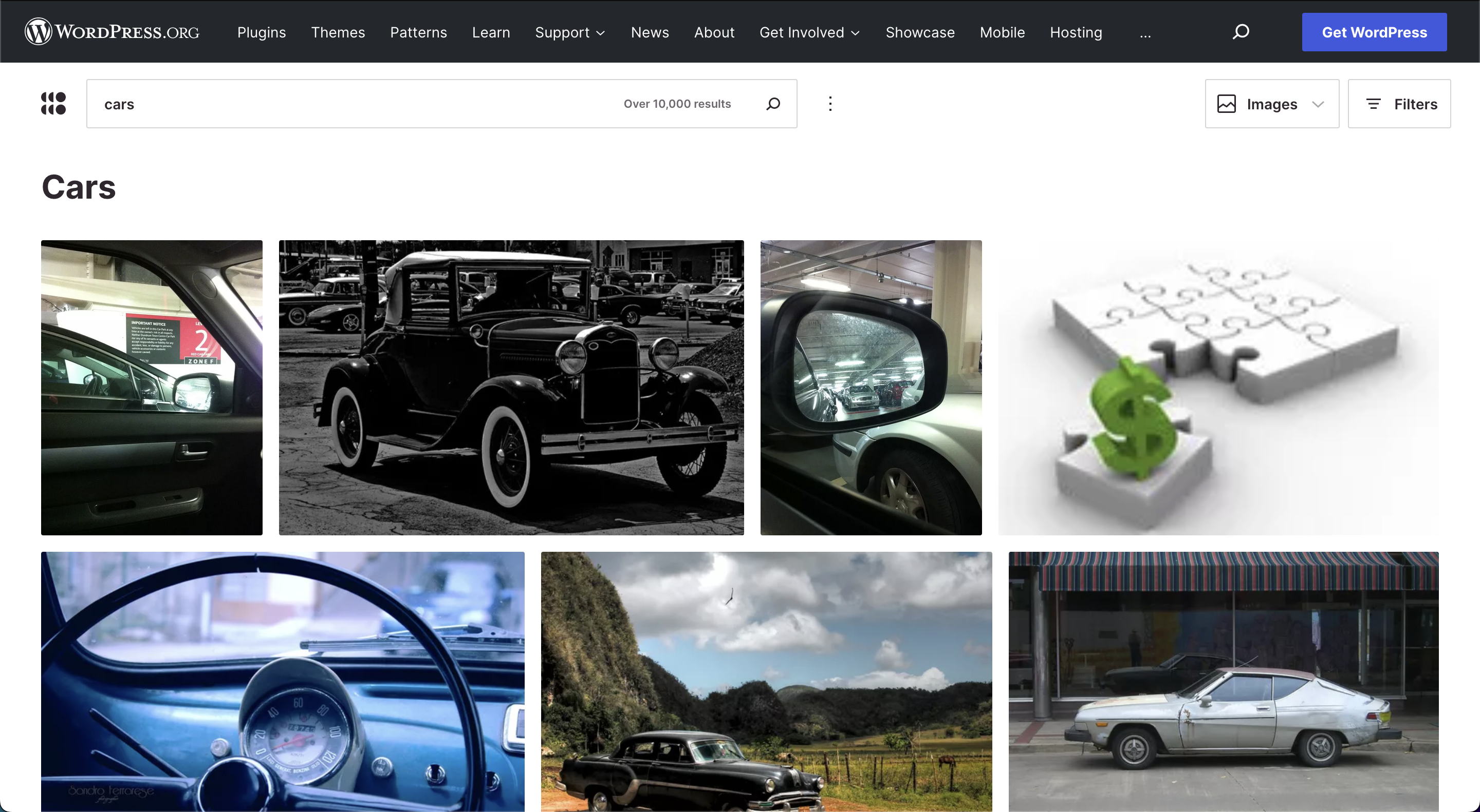
I was playing with different heights, and I like how 200px for the row height looks like. It will show three full rows, acknowledging its relativity due to device sizes, and considering that the WordPress header will be removed, the page will look clean and highlights more the content results.
See the image below and please share your thoughts.
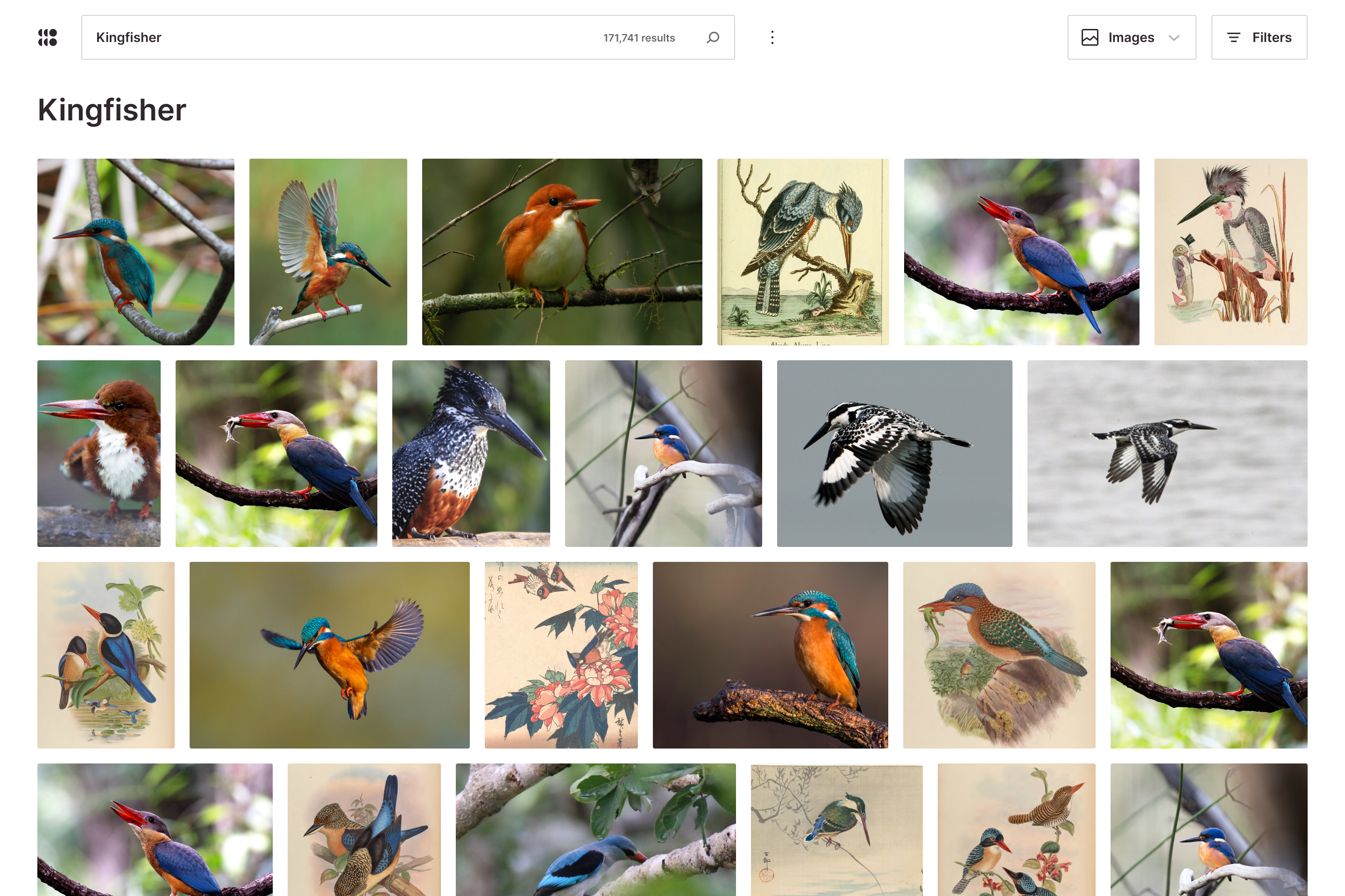
Design file
I think this looks quite nice. You don't have to mock it up, but I'm personally really curious what it would look like to show the icons on the desktop grid all of the time, below each image as on mobile.
It looks good to me too. Does this address the perceived header button 'misalignment' by keeping the button borders in the header when the page is scrolled?
@zackkrida, It will break the white space balance between rows since there will be more space for the license icons row. I am following a desktop consistency approach for all big screen breakpoints, the hover style in All results page is the same.
@sarayourfriend, This is the approach I am following:
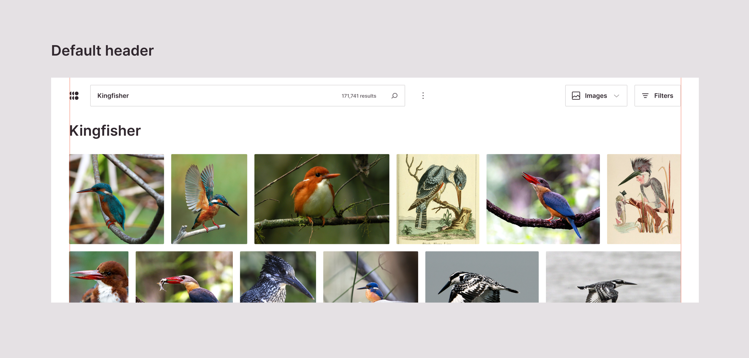
- The default header has the same left and right paddings as the content grid. The filters button wraps the header area through its borderline.
- The scrolled header has fewer left and right padding values since the openverse, content switcher, and filters buttons outline the header differently. In this case, the bottom border of the header makes it feel outer and above the grid layout. This effect is intentional to highlight the content area and link the filter sidebar visually. It is a nav component placed above everything.
| Default header | Scrolled header |
|---|---|
 |
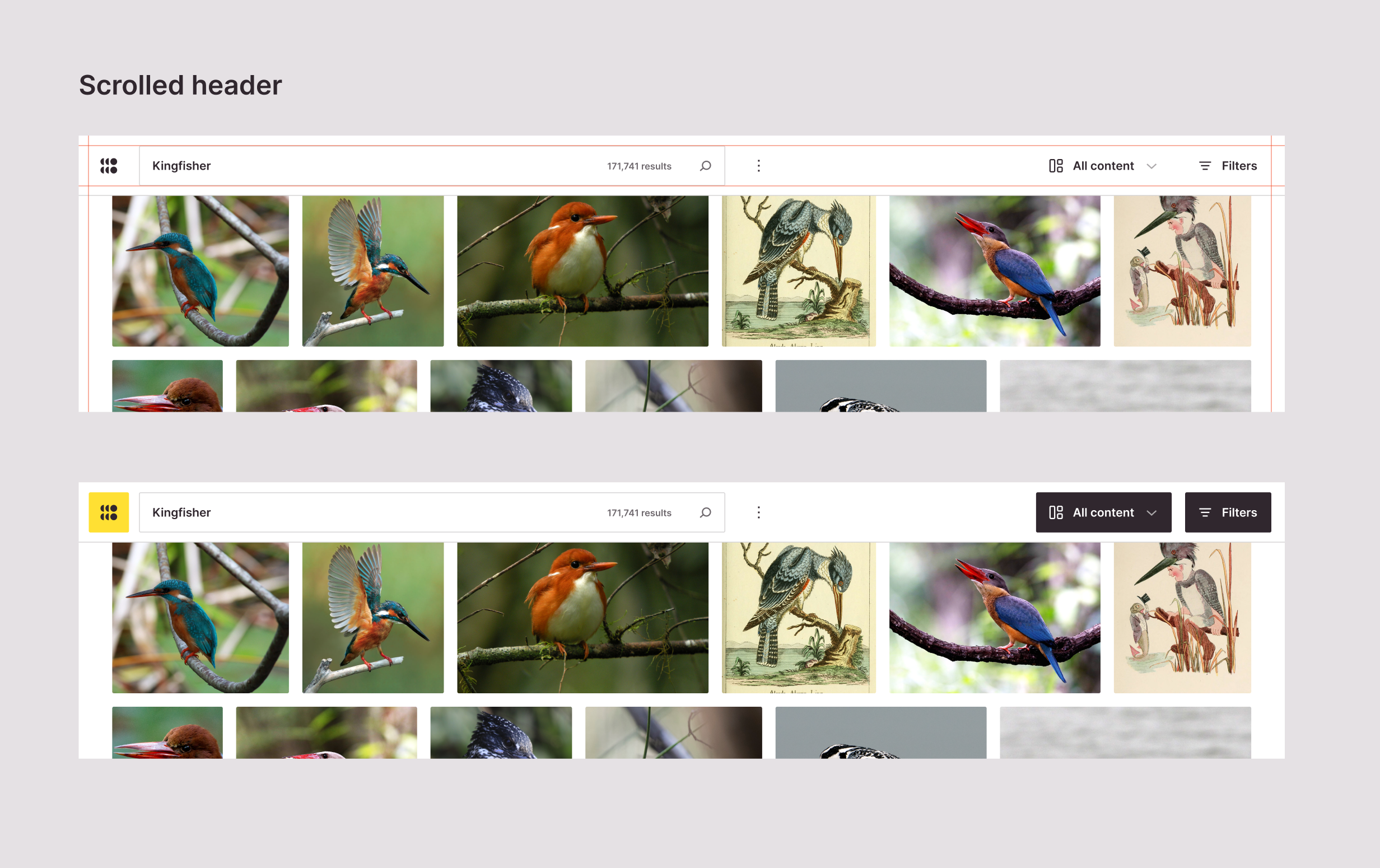 |
Does this mean the header will shift "outwards" when you scroll? I worry that will be a lot of auxiliary movement in addition to the scrolling movement that someone is already trying to focus on.
I like that there is a border between the nav and the content below it but, as @sarayourfriend pointed out, the horizontal expansion would be very strange considering the main vertical movement occurring during the scroll.
I tested different versions of the scroll behavior, with and without the spacing change, and the cleanest direction is no change at all of the paddings. Here is a prototype.
https://user-images.githubusercontent.com/895819/175322413-c1078f56-6556-4d91-86cf-6530fa40772f.mp4
The only change I am keeping is the border change for the content switcher and filter buttons. Nonetheless, in parallel, I am working on the new header, and this input is crucial for defining the new spacings.
Even when this issue is for the image grid, I am glad that we are touching the nav component so I tackle both design improvements.
@panchovm have we thought about the search result / header alignment issued discussed here as it relates to the new header in #1669 ?
Yes. Here is a quick update of the image results with the new header.
