react-svg-map
 react-svg-map copied to clipboard
 VictorCazanave
A set of React.js components to display an interactive SVG map
react-svg-map


A set of React.js components to display an interactive SVG map.
Demo
Installation
npm
npm install --save react-svg-map
yarn
yarn add react-svg-map
Usage
:warning: Breaking change from v1
This package does not include maps anymore!
You have to install the map you need from svg-maps or you can use your own map. See maps section for more details.
If you are still using the 1.x.x version, look at the v1 documentation.
:earth_africa: Simple SVG Map
This is the base component to display an SVG map.
- Import
SVGMapcomponent fromreact-svg-map - Import the map you want
- Optionally, import
react-svg-map/lib/index.cssif you want to apply the default styles
import React from "react";
import ReactDOM from "react-dom";
import Taiwan from "@svg-maps/taiwan";
import { SVGMap } from "react-svg-map";
import "react-svg-map/lib/index.css";

class App extends React.Component {
  constructor(props) {
    super(props);
  }

  render() {
    return <SVGMap map={Taiwan} />;
  }
}

ReactDOM.render(<App />, document.getElementById("app"));
API
| Prop | Type | Default | Description |
|---|---|---|---|
| map | Object | required | Describe SVG map to display. See maps section for more details. |
| className | String | 'svg-map' |
CSS class of <svg>. |
| role | String | 'none' |
ARIA role of <svg>. |
| locationClassName | String|Function | 'svg-map__location' |
CSS class of each <path>. The function parameters are the location object and the location index. |
| locationTabIndex | String|Function | '0' |
Tabindex each <path>. The function parameters are the location object and the location index. |
| locationRole | String | 'none' |
ARIA role of each <path>. |
| locationAriaLabel | Function | location.name |
ARIA label of each <path>. The function parameters are the location object and the location index. |
| onLocationMouseOver | Function | Invoked when the user puts the mouse over a location. | |
| onLocationMouseOut | Function | Invoked when the user puts the mouse out of a location. | |
| onLocationMouseMove | Function | Invoked when the user moves the mouse on a location. | |
| onLocationClick | Function | Invoked when the user clicks on a location. | |
| onLocationKeyDown | Function | Invoked when the user hits a keyboard key on a location. | |
| onLocationFocus | Function | Invoked when the user focuses a location. | |
| onLocationBlur | Function | Invoked when the user unfocuses a location. | |
| isLocationSelected | Function | Executed to determine if a location is selected. This property is used to set the aria-checked HTML attribute. |
|
| childrenBefore | Node | "Slot" before all the locations (<path>). |
|
| childrenAfter | Node | "Slot" after all the locations (<path>). |
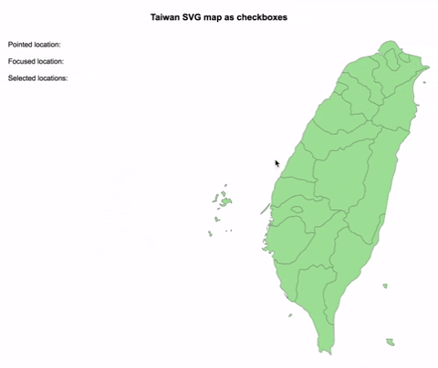
:ballot_box_with_check: Checkbox SVG Map
This is an implementation of SVGMap that behaves like a group of checkboxes.
It is based on this WAI-ARIA example to support keyboard navigation and be accessible.
- Import
CheckboxSVGMapcomponent fromreact-svg-map - Import the map you want
- Optionally, import
react-svg-map/lib/index.cssif you want to apply the default styles
import React from "react";
import ReactDOM from "react-dom";
import Taiwan from "@svg-maps/taiwan";
import { CheckboxSVGMap } from "react-svg-map";
import "react-svg-map/lib/index.css";

class App extends React.Component {
  constructor(props) {
    super(props);
  }

  render() {
    return <CheckboxSVGMap map={Taiwan} />;
  }
}

ReactDOM.render(<App />, document.getElementById("app"));
API
| Prop | Type | Default | Description |
|---|---|---|---|
| map | Object | required | Describe SVG map to display. See maps section for more details. |
| className | String | 'svg-map' |
CSS class of <svg>. |
| locationClassName | String|Function | 'svg-map__location' |
CSS class of each <path>. The function parameters are the location object and the location index. |
| locationAriaLabel | Function | location.name |
ARIA label of each <path>. The function parameters are the location object and the location index. |
| selectedLocationIds | String[] | List of ids of the initial selected locations. It is used only when the component is mounted and is not synchronized when updated. |
|
| onChange | Function | Invoked when the user selects/deselects a location. The list of selected locations is passed as parameter. | |
| onLocationMouseOver | Function | Invoked when the user puts the mouse over a location. | |
| onLocationMouseOut | Function | Invoked when the user puts the mouse out of a location. | |
| onLocationMouseMove | Function | Invoked when the user moves the mouse on a location. | |
| onLocationFocus | Function | Invoked when the user focuses a location. | |
| onLocationBlur | Function | Invoked when the user unfocuses a location. | |
| childrenBefore | Node | "Slot" before all the locations (<path>). |
|
| childrenAfter | Node | "Slot" after all the locations (<path>). |
:radio_button: Radio SVG Map
This is an implementation of SVGMap that behaves like a group of radio buttons.
It is based on this WAI-ARIA example to support keyboard navigation and be accessible.
- Import
RadioSVGMapcomponent fromreact-svg-map - Import the map you want
- Optionally, import
react-svg-map/lib/index.cssif you want to apply the default styles
import React from "react";
import ReactDOM from "react-dom";
import Taiwan from "@svg-maps/taiwan";
import { RadioSVGMap } from "react-svg-map";
import "react-svg-map/lib/index.css";

class App extends React.Component {
  constructor(props) {
    super(props);
  }

  render() {
    return <RadioSVGMap map={Taiwan} />;
  }
}

ReactDOM.render(<App />, document.getElementById("app"));
API
| Prop | Type | Default | Description |
|---|---|---|---|
| map | Object | required | Describe SVG map to display. See maps section for more details. |
| className | String | 'svg-map' |
CSS class of <svg>. |
| locationClassName | String|Function | 'svg-map__location' |
CSS class of each <path>. The function parameters are the location object and the location index. |
| locationAriaLabel | Function | location.name |
ARIA label of each <path>. The function parameters are the location object and the location index. |
| selectedLocationId | String | id of the initial selected location. It is used only when the component is mounted and is not synchronized when updated. |
|
| onChange | Function | Invoked when the user selects a location. The selected location is passed as parameter. | |
| onLocationMouseOver | Function | Invoked when the user puts the mouse over a location. | |
| onLocationMouseOut | Function | Invoked when the user puts the mouse out of a location. | |
| onLocationMouseMove | Function | Invoked when the user moves the mouse on a location. | |
| onLocationFocus | Function | Invoked when the user focuses a location. | |
| onLocationBlur | Function | Invoked when the user unfocuses a location. | |
| childrenBefore | Node | "Slot" before all the locations (<path>). |
|
| childrenAfter | Node | "Slot" after all the locations (<path>). |
Maps
Existing maps
Since v2.0.0 this package does not provide maps anymore. All the existing maps have been moved to the independant svg-maps project because they may be useful for other components/projects.
Custom maps
You can modify existing maps or create your own.
Modify a map
- Import the map to modify
- Create a new object from this map
- Pass this new object as
mapprop of<SVGMap />component
import React from "react";
import Taiwan from "@svg-maps/taiwan";
import { SVGMap } from "react-svg-map";

class App extends React.Component {
  constructor(props) {
    super(props);

    // Create new map object
    this.customTaiwan = {
      ...Taiwan,
      label: "Custom map label",
      locations: Taiwan.locations.map(location => {
        // Modify each location
      })
    };
  }

  render() {
    return <SVGMap map={this.customTaiwan} />;
  }
}
It is recommended to not modify the SVG properties (viewBox, path), because it may break the map's display.
Create a map
If you create a new map (other country, city...), feel free to contribute to svg-maps project!
Metadata
Owner
 VictorCazanave
Metadata
A set of React.js components to display an interactive SVG map