theodinproject
 theodinproject copied to clipboard
Published
20 hours ago •
 TheOdinProject
Dark Mode Low Contrast Elements
Description
Certain elements in dark mode don't have enough contrast with their backgrounds:
-
The
tracking-wide underlineclass on the home page
-
The
course-card-header__sub-titleclass on the Ruby and JS path pages
-
The
card-main profile-cardon the user dashboard.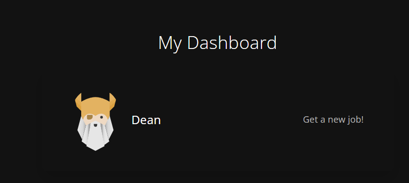

-
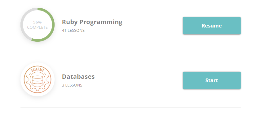
The bottom borders dividing the
skills on the user dashboard.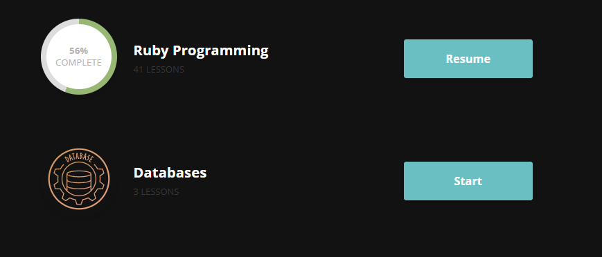
Steps to Reproduce
Viewing the content in dark mode.
Expected Behavior
The content should have more contrast with its background
Thanks to everyone who contributed with reports. All of these have now been fixed by updates in the Tailwind conversion