NewPipe
 NewPipe copied to clipboard
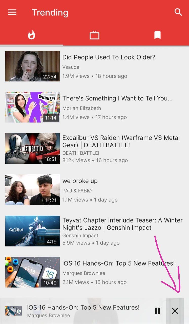
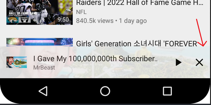
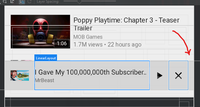
There is a gap at bottom-left of miniplayer near close button
Checklist
- [X] I made sure that there are no existing issues - open or closed - which I could contribute my information to.
- [X] I have taken the time to fill in all the required details. I understand that the question will be dismissed otherwise.
- [X] I have read and understood the contribution guidelines.
What is/are your question(s)?
Recently i got to know that there is little gap near botton-left of miniplayer (collapsed video player) near the close button, sometime when we try to press close button, the gap get clicked causing miniplayer to expand to full player which is annoying. So i want to ask if this gap is there for some obvious reason or just a bug that left out unnoticed ?
Additional information
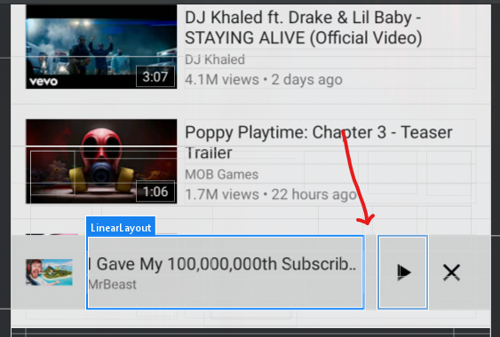
Here are some images:

App version 0.23.1 Android: 11
I don't think there's any good reason for that gap to exist. PRs to remove it are welcome.
I think this is needed for rounded screens, else a big portion of the button would be cut off, which would look weird.
I think this is needed for rounded screens, else a big portion of the button would be cut off, which would look weird.
Yes, this may be the reason. But i don't think there would be any major problem with rounded corners (considering still most of the part of close button will be touchable).
I don't think the solution to this is removing the padding.
Without the padding:
- the button looks off, see the image below and the screenshots in #8743
- as tsiflimagas said, maybe there could be problems with rounded screens
- it is difficult to reach the bottom right of the screen with the finger and press a small rectangle near the edge of the screen

I think instead the X's clickable portion of the screen should just be extended to the right up to the edge of the screen, without modifying the position of anything. This way the X would be simpler to tap and there would be no click-throughs like the issue opener reported.
I have tested the X's view on a rounded screen and found it to be working fine. The X's view clickable portion extended to the right without excluding any space. Please correct me if I misunderstood something. The video is attached for reference.
https://user-images.githubusercontent.com/32548153/183278031-94ddb752-ac4a-4ad5-8d68-6be5259e04c4.mp4
I think instead the X's clickable portion of the screen should just be extended to the right up to the edge of the screen, without modifying the position of anything. This way the X would be simpler to tap and there would be no click-throughs like the issue opener reported.
Agreed, I think this is the best solution. Keep the current UI as-is, but just make the currently non-clickable gap clickable.
Made the changes as suggested in PR #8743
- Made the X button right gap portion clickable.
- Needed to remove the gap from the left side of the play button. Otherwise, clicking that gap will close the minimized player.
Hello all, I want to work on this issue
Hello all, I want to work on this issue
Hey, you can fork this project and push your commits there and open a pull request later.
There's an open PR for this already, though.
Whoops. Forgot about that. Thanks, @tsiflimagas!
@Manishpandey11 You can work on the other PR I assigned to you.

