blog
 blog copied to clipboard
 SunshowerC
[译] Flutter: 图解 BoxDecoration
- 基本介绍
-
属性
- color (背景颜色)
-
gradient (背景渐变色)
-
LinearGradient (线性渐变)
- LinearGradient.colors
- begin (默认 Alignment.centerLeft)
- end (默认 Alignment.centerRight)
-
tileMode 平铺模式
- TileMode.clamp (默认)
- TileMode.mirror
- TileMode.repeated
-
stops
- stops 默认值
- 自定义 stops 值
- RadialGradient (径向渐变)
-
LinearGradient (线性渐变)
-
image
- DecorationImage.alignment
- DecorationImage.centerSlice
- DecorationImage.colorFilter
-
DecorationImage.fit
- BoxFit.contain
- BoxFit.cover
- BoxFit.fill
- BoxFit.contain
- BoxFit.fitHeight
- BoxFit.fitWidth、
- BoxFit.none
- BoxFit.scaleDown
-
DecorationImage.repeat
- ImageRepeat.noRepeat
- ImageRepeat.repeat
- ImageRepeat.repeatX
- ImageRepeat.repeatY
- DecorationImage.matchTextDirection
-
border
- Border.all
- Border Class
- BorderDirectional
-
borderRadius
- BorderRadius.all
- BorderRadius.circular
- BorderRadius.horizontal
- BorderRadius.vertical
- BorderRadius.only
- boxShadow
- shape
- padding
基本介绍
BoxDecoration 类提供了几种方式来绘制一个容器,主要用于绘制更加复杂的样式。
容器有 border(边框),body(主体),可能还有 boxShadow(阴影)
容器的形状可以是圆形或者矩形,如果是矩形,可以设置 borderRadius 控制角的弧度。
容器主体背景分为多个层级,最底层是填充满容器的背景颜色,再上一层是填充容器的渐变色,最后是图像,由 DecorationImage 类控制,
也就是说背景优先级: 图像 > 渐变色 > 纯色
属性
color (背景颜色)
new Center(
  child: new Container(
    decoration: new BoxDecoration(
      color: Colors.purple,
    ),
    child: new FlutterLogo(
      size: 200.0,
    )
  ),
);
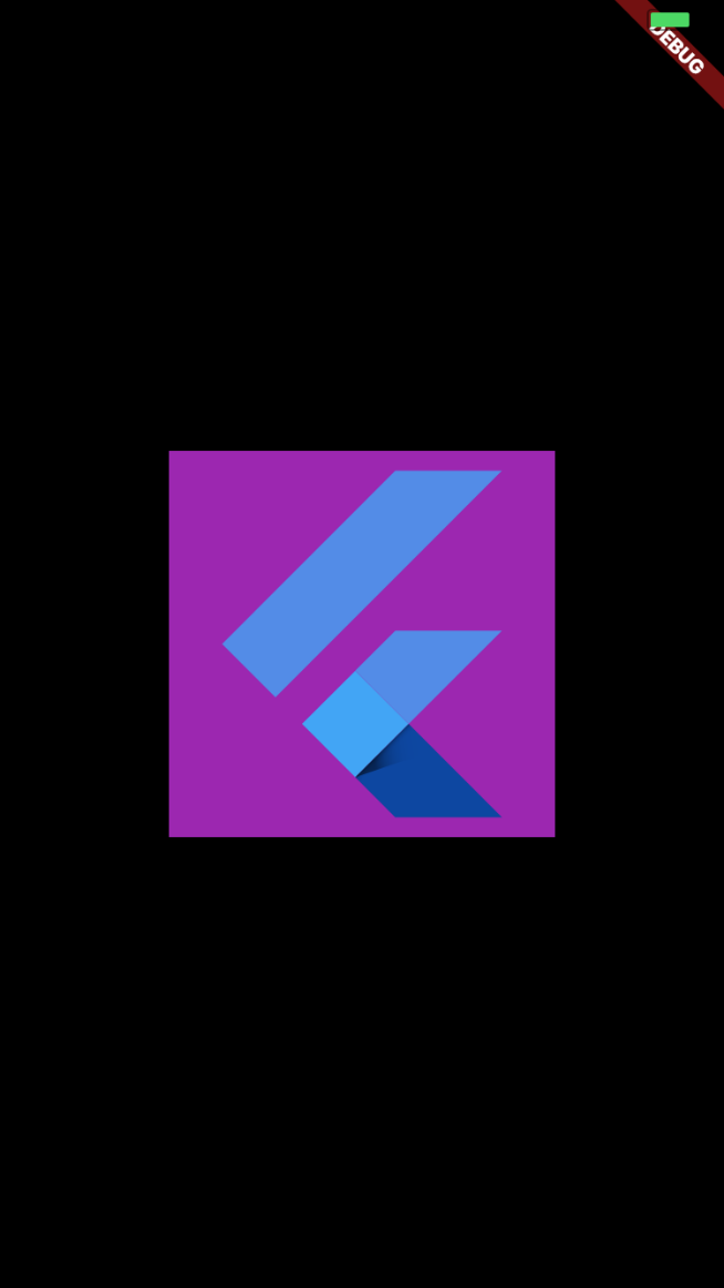
PS: Container 部件的 color 属性不能和 decoration 属性同时使用
事实上,
Container(
  color: Colors.purple
)
是以下 decoration 的简写:
Container(
  decoration: new BoxDecoration(color: Colors.purple)
)
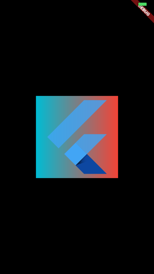
gradient (背景渐变色)
LinearGradient (线性渐变)
LinearGradient.colors
线性渐变颜色列表
begin (默认 Alignment.centerLeft)
线性渐变的起始点
end (默认 Alignment.centerRight)
线性渐变的终止点
Center(
  child: new Container(
    decoration: new BoxDecoration(
      color: Colors.purple,
      gradient: new LinearGradient(
        colors: [Colors.red, Colors.cyan],
        begin: Alignment.centerRight,
        end: Alignment.centerLeft
      ),
    ),
    child: new FlutterLogo(
      size: 200.0,
    )
  ),
);
 =
=
由于是线性渐变,所以
    begin: Alignment.centerRight,
    end: Alignment.centerLeft
    begin: Alignment.topRight,
    end: Alignment.topLeft
    begin: Alignment.bottomRight,
    end: Alignment.bottomLeft
这几种都是等价的
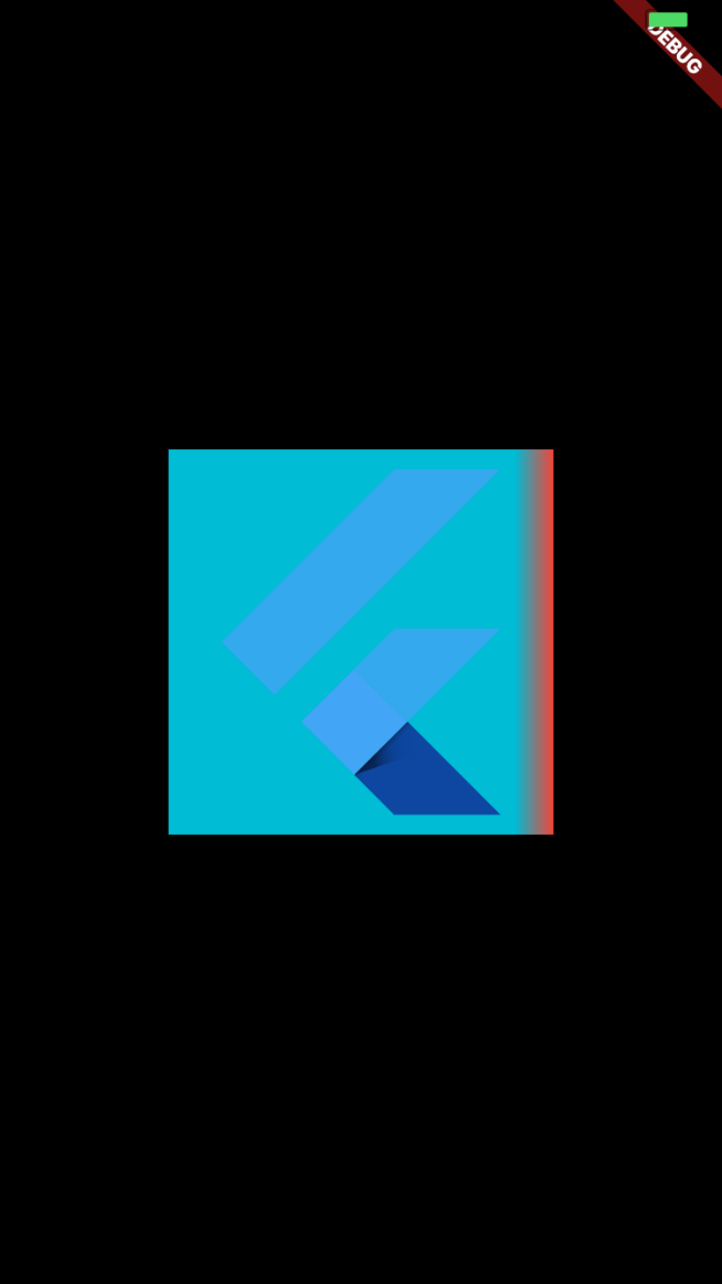
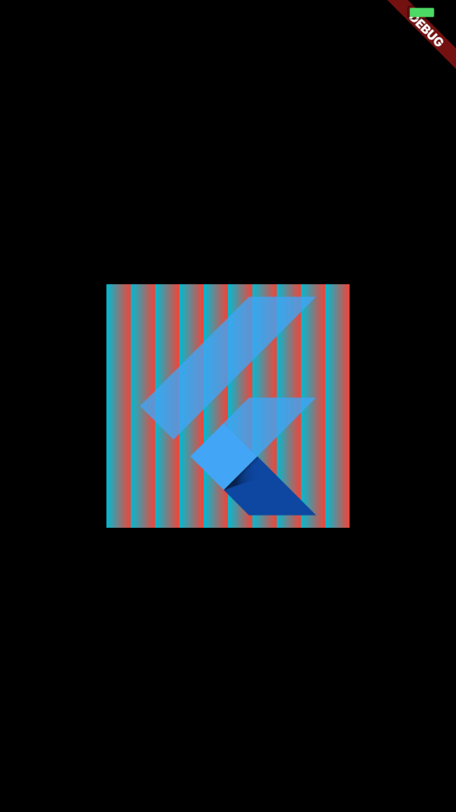
tileMode 平铺模式
定义了在 指定的 begin 和 end 之外的区域,渐变色应该如何渲染
TileMode.clamp (默认)
TileMode.clamp 表明在 begin - end 区域外,渐变色应该保持 colors 列表内指定的颜色。
new Center(
  child: new Container(
    decoration: new BoxDecoration(
      color: Colors.purple,
      gradient: new LinearGradient(
        colors: [Colors.red, Colors.cyan],
        begin: Alignment.centerRight,
        end: new Alignment(0.8, 0.0),
        tileMode: TileMode.clamp
      ),
    ),
    child: new FlutterLogo(
      size: 200.0,
    )
  ),
);
TileMode.mirror
在 begin - end 区域外,应该保持镜像的渐变色。
new Center(
  child: new Container(
    decoration: new BoxDecoration(
      color: Colors.purple,
      gradient: new LinearGradient(
        colors: [Colors.red, Colors.cyan],
        begin: Alignment.centerRight,
        end: new Alignment(0.8, 0.0),
        tileMode: TileMode.mirror
      ),
    ),
    child: new FlutterLogo(
      size: 200.0,
    )
  ),
);
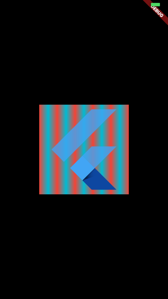
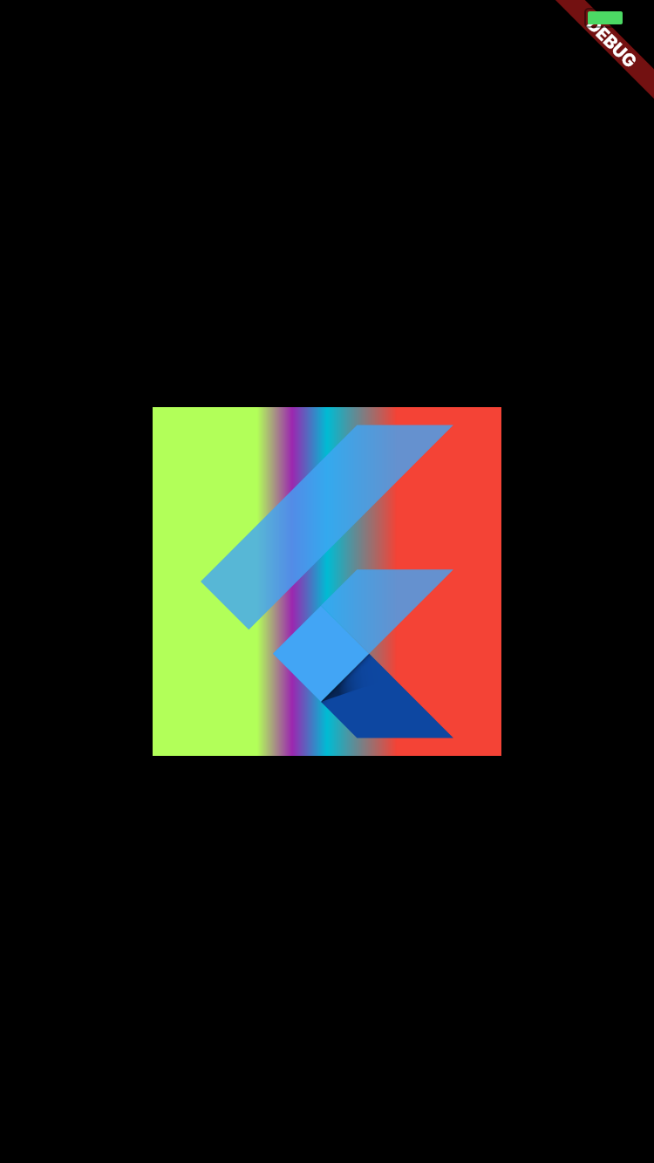
TileMode.repeated
在区域外重复进行渐变色的渲染
new Center(
  child: new Container(
    decoration: new BoxDecoration(
      color: Colors.purple,
      gradient: new LinearGradient(
        colors: [Colors.red, Colors.cyan],
        begin: Alignment.centerRight,
        end: new Alignment(0.8, 0.0),
        tileMode: TileMode.repeated
      ),
    ),
    child: new FlutterLogo(
      size: 200.0,
    )
  ),
);
stops
- 值为 0.0 ~ 1.0 之间的 的列表
-
- 如果赋值了,stops 值列表长度必须和 colors 列表长度相等。
- 值必须为升序
stops 默认值
如果没有给 stops 赋值, 渐变色区域将会根据颜色数量均匀分割。 即:
  gradient: new LinearGradient(
    colors: [Colors.red, Colors.cyan, Colors.yellow ],
    begin: Alignment.centerRight,
    end: Alignment.centerLeft,
    // stops 默认值为
    // stops: [0, 0.5, 1]
  ),
自定义 stops 值
new Center(
  child: new Container(
    decoration: new BoxDecoration(
      color: Colors.purple,
      gradient: new LinearGradient(
        colors: [Colors.red, Colors.cyan, Colors.purple, Colors.lightGreenAccent],
        begin: Alignment.centerRight,
        end: Alignment.centerLeft,
        tileMode: TileMode.clamp,
        stops: [0.3, 0.5, 0.6, 0.7]
      ),
    ),
    child: new FlutterLogo(
      size: 200.0,
    )
  ),
);
这里表示:假定宽度长 100%,从右往左进行 Colors.red(红), Colors.cyan(青), Colors.purple(紫), Colors.lightGreenAccent(绿) 这 4 种颜色的渐变。
- 其中从右往左 30% 的点是 红色,50% 的点是青色,60% 的点是紫色,70% 的点是 绿色
- 根据上述配置,所以从右往左,0~30%是纯红色,30% ~ 50% 是 红到青的渐变色,50% ~ 60% 是青到紫的渐变色,60%~70% 是紫到绿的渐变色,70%~100% 是纯绿色。
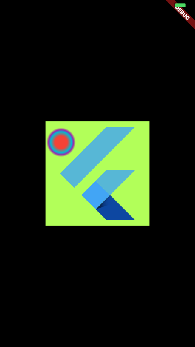
RadialGradient (径向渐变)
RadialGradient 有 5 个主要属性:
- center 默认值:Alignment.center
径向渐变的中心,值为 Alignment - radius 默认值 0.5
径向渐变的半径,即如果容器半径是 200px,那么 radius=0.5,默认 绘制 半径为 100px 的径向渐变圆。 - colors
同上述的线性渐变,不再赘述 - stops
同上述的线性渐变,不再赘述 - tileMode
同上述的线性渐变,不再赘述
new Center(
  child: new Container(
    decoration: new BoxDecoration(
      color: Colors.purple,
      gradient: new RadialGradient(
        colors: [Colors.red, Colors.cyan, Colors.purple, Colors.lightGreenAccent],
        center: Alignment(-0.7, -0.6),
        radius: 0.2,
        tileMode: TileMode.clamp,
        stops: [0.3, 0.5, 0.6, 0.7]
      ),
    ),
    child: new FlutterLogo(
      size: 200.0,
    )
  ),
);
image
绘制图片背景,图片通常是 AssetImage (应用配置的图片资源),或者是 NetworkImage (网络图片资源)
new Center(
  child: new Container(
    decoration: new BoxDecoration(
      color: Colors.purple,
      gradient: new RadialGradient(
        colors: [Colors.red, Colors.cyan, Colors.purple, Colors.lightGreenAccent],
        center: Alignment(0.0, 0.0),
        radius: 0.5,
        tileMode: TileMode.clamp,
        stops: [0.3, 0.5, 0.9, 1.0]
      ),
      image: new DecorationImage(
          image: new NetworkImage("http://jlouage.com/images/author.jpg")
      )
    ),
    child: new FlutterLogo(
      size: 200.0,
    )
  ),
);
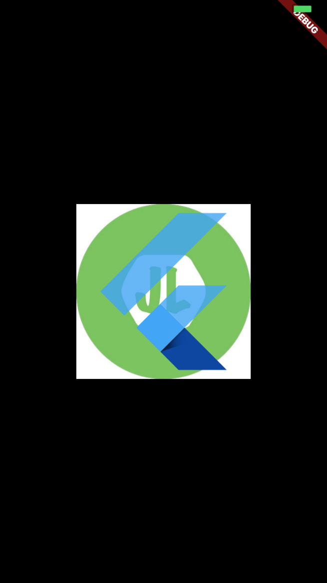
可以看到,由于图片优先级比较高,渲染在最上层,图片背景绘制覆盖了渐变背景和 纯色背景。
DecorationImage.alignment
同 Container 部件的 alignment,不再赘述
DecorationImage.centerSlice
centerSlice 决定以哪一种方式,按区域对图像进行缩放处理。
例如,我们有一张图片,可以设置其四个角的区域不进行缩放,其他区域进行缩放(这么说可能有点抽象,以下实例再详细说明)
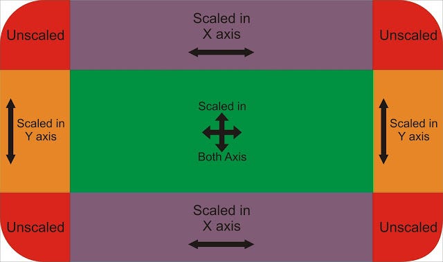
centerSlice 属性的值为 Rect 类,也就是一个矩形。
- Rect.fromLTWH(double left, double top, double width, double height)
假如我们有一张这样尺寸的图片
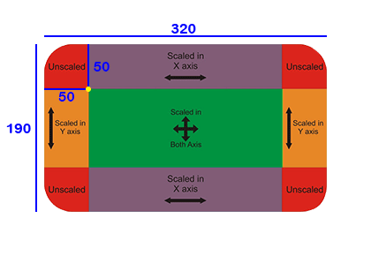
当我们的 centerSlice 值为 Rect.fromLTWH(50.0, 50.0, 220.0, 90.0) 时,即
new Center(
    child: new Container(
      decoration: new BoxDecoration(
        image: new DecorationImage(
            image: new AssetImage('assets/images/9_patch_scaled_320x190.png'),
            centerSlice: new Rect.fromLTWH(50.0, 50.0, 220.0, 90.0),
            fit: BoxFit.fill,
        )
      ),
      child: new Container(
        //color: Colors.yellow,
        width: 110.0,
        height: 110.0,
      )
    ),

  );
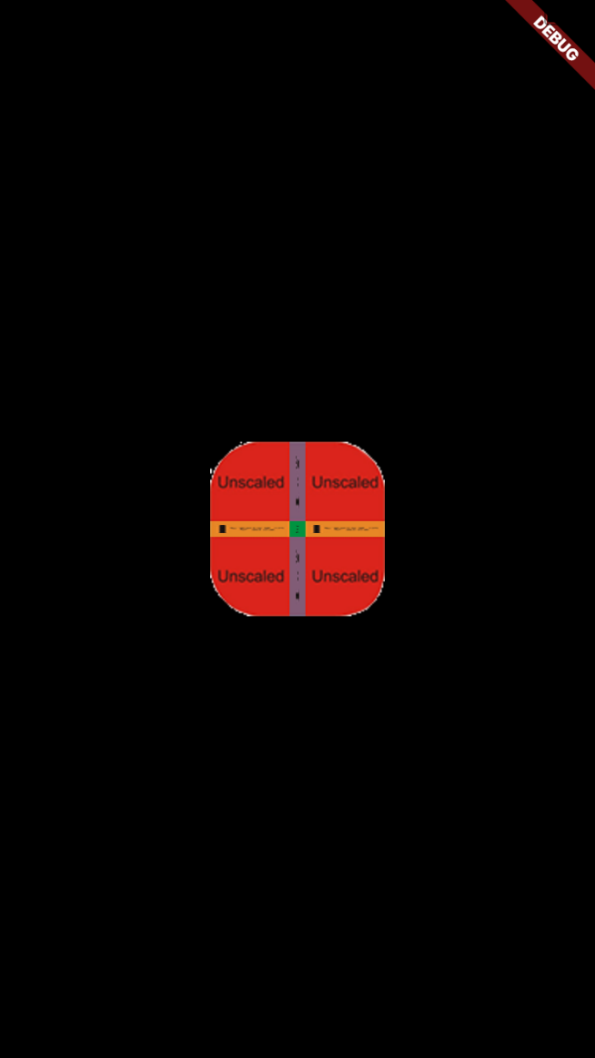
得到的效果如下(将 320 x 190 尺寸大小的图片拉伸在 110 x 110 的容器中,其中图片四个角 50 x 50 的区域不进行拉伸,其他区域进行拉伸):
扩大容器的大小后:
new Center(
    child: new Container(
      decoration: new BoxDecoration(
        image: new DecorationImage(
            image: new AssetImage('assets/images/9_patch_scaled_320x190.png'),
            centerSlice: new Rect.fromLTWH(50.0, 50.0, 220.0, 90.0),
            fit: BoxFit.fill,
        )
      ),
      child: new Container(
        //color: Colors.yellow,
        width: 350.0,
        height: 450.0,
      )
    ),

  );
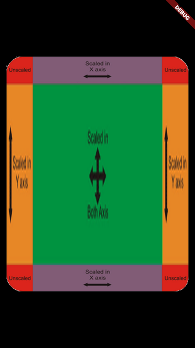
得到的效果如下(将 320 x 190 尺寸大小的图片拉伸在 350 x 450 的容器中,其中图片四个角 50 x 50 的区域不进行拉伸,其他区域进行拉伸):
这个属性的效果一般比较少用,其中的值大家可以随便测试看看效果。
DecorationImage.colorFilter
给背景图片加上颜色滤镜。值一般为 ColorFilter.mode(颜色, 混合模式)。
我们将给以下图片
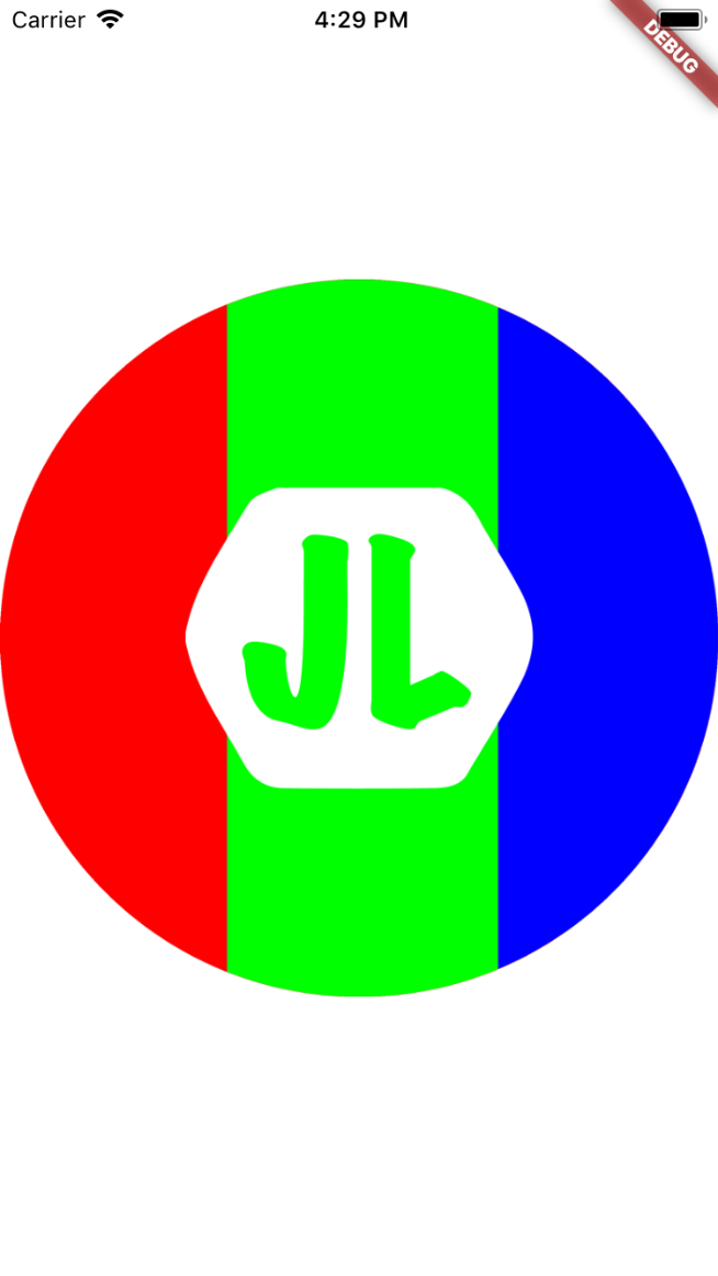 加上粉色滤镜
colorFilter: new ColorFilter.mode(Colors.red.withOpacity(0.5), BlendMode.color), 并以不同的模式进行混合。
new Center(
    child: new Container(
      width: double.infinity,
      height: double.infinity,
      color: Colors.white,
      child: new Container(
        decoration: new BoxDecoration(
          image: new DecorationImage(
              image: new AssetImage('assets/images/JL-Logo-empty.png'),
              colorFilter: new ColorFilter.mode(Colors.red.withOpacity(0.5), BlendMode.color),
          )
        ),
      ),
    ),
  );
- BlendMode.color
提取指定颜色的色调和饱和度,给目标图片着色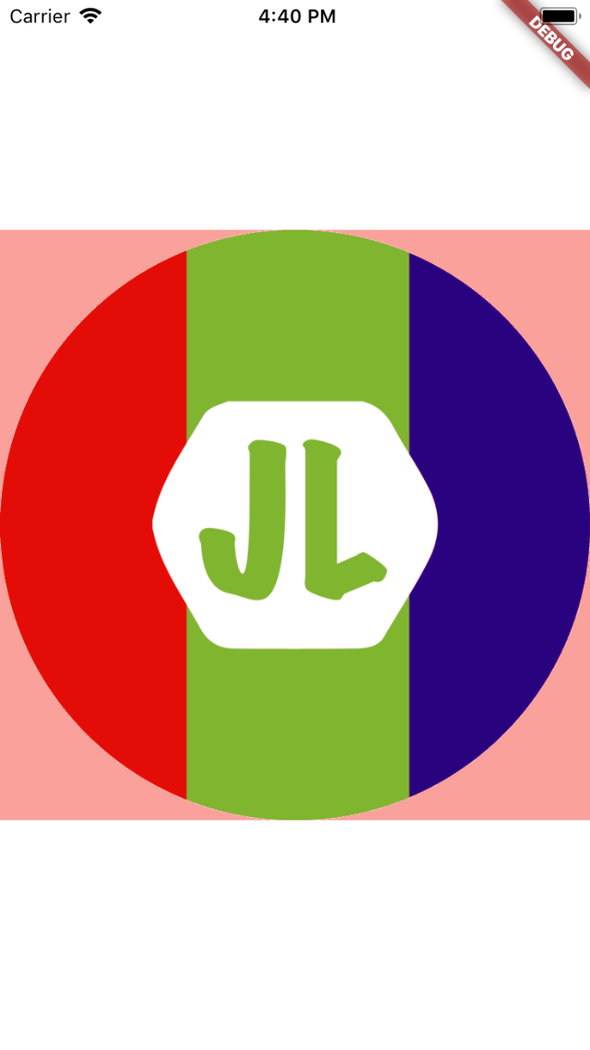
- BlendMode.darken
通过从每个颜色通道中选择最低值来合成源图像和目标图像。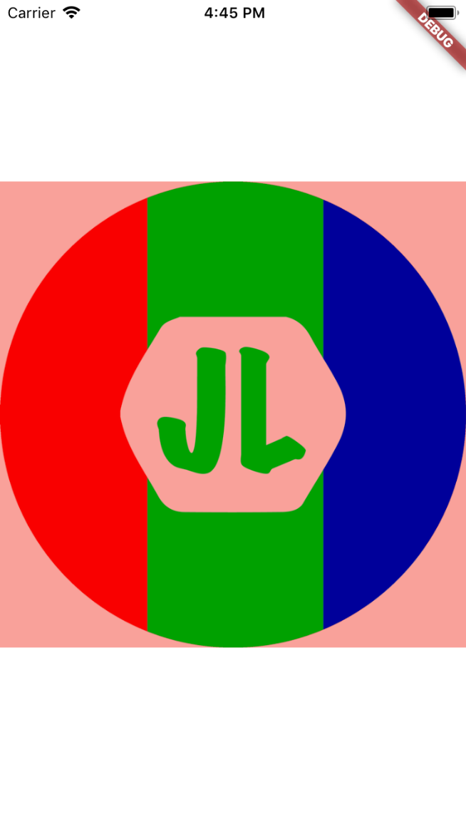
- BlendMode.clear
- BlendMode.src
- BlendMode.colorBurn
- BlendMode.colorDodge
- BlendMode.difference
- BlendMode.dst
- BlendMode.dstATop
- BlendMode.dstIn
- BlendMode.dstOut
- BlendMode.dstOver
- ......
滤镜的混合模式很多,这里就不一一解读了,有兴趣的可以看原文详细解读
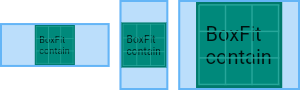
DecorationImage.fit
如何渲染图像到盒子中,(PS: 不同于 DecorationImage.centerSlice 作用于图片本身,DecorationImage.fit 是作用于画布的)
值为 BoxFit 的枚举值
Center(
    child: new Container(
      width: double.infinity,
      height: double.infinity,
      color: Colors.white,
      child: new Container(
        decoration: new BoxDecoration(
          image: new DecorationImage(
              image: new NetworkImage('http://jlouage.com/images/author.jpg'),
              fit: BoxFit.contain
          )
        ),
      ),
    ),
  );
BoxFit.contain
图片尽可能大,并且容器依然包含整个图片资源
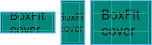
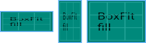
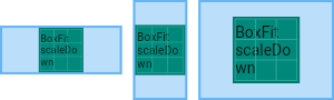
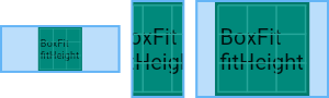
以下图片为同一图片资源在不同尺寸的容器中的展示方式。
BoxFit.cover
图片尽可能小,且必须覆盖满整个容器。
BoxFit.fill
通过拉伸图片来覆盖满整个容器
BoxFit.contain
BoxFit.fitHeight
确保图片资源的全部高度都可见,无论图片资源的宽度是不是溢出容器
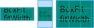
BoxFit.fitWidth、
类似上,确保图片资源的全部宽度都可见,无论图片资源的高度是不是溢出容器
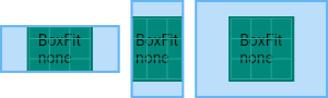
BoxFit.none
居中对齐图片资源,不缩放大小,丢弃容器之外的部分。
BoxFit.scaleDown
类似于 BoxFit.contain,居中对齐图片资源,并在必要的时候,缩小图片资源以确保整个资源都在容器啊,
DecorationImage.repeat
渲染图片到图片大小之外的容器其他区域。
值为 ImageRepeat 枚举值
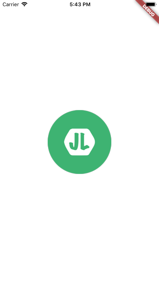
ImageRepeat.noRepeat
其他区域保持透明
Center(
    child: new Container(
      width: double.infinity,
      height: double.infinity,
      color: Colors.white,
      child: new Container(
        decoration: new BoxDecoration(
          image: new DecorationImage(
              image: new AssetImage('assets/images/JL-Logo-150.png'),
              repeat: ImageRepeat.noRepeat
          )
        ),
      ),
    ),
  );
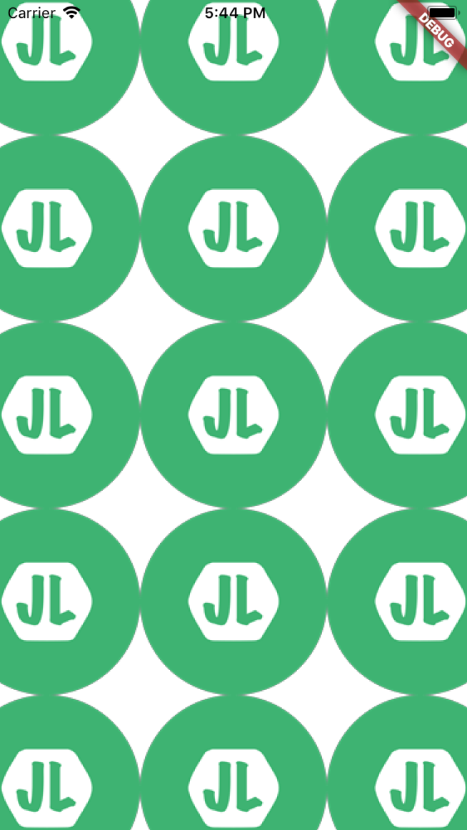
ImageRepeat.repeat
在x和y方向上重复图像,直到填充满容器。
ImageRepeat.repeatX
在x轴上重复图像,直到水平填充满容器。
ImageRepeat.repeatY
在y轴上重复图像,直到垂直填充满容器。
DecorationImage.matchTextDirection
是否以 TextDirection 的方向渲染图片,值为 true/false;
如果是 true。 那么在 TextDirection.ltr 的环境下,图片将会以左上角为原点开始绘制(一般情况下的绘制方向),如果是在TextDirection.rtl 的环境下, 图片将会以右上角为原点开始绘制。
border
在背景颜色(color),渐变色背景(gradient)或图像背景(image)上方绘制的边框。
值为 Border 类,Border.all 和 BorderDirectional 类
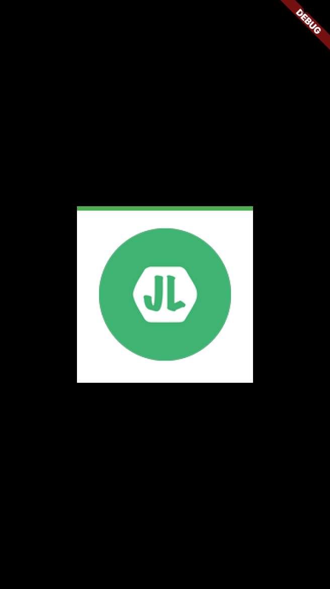
Border.all
设置4边的边框:
参数如下:
- color: 边框颜色
- width: 边框打下
- style: 边框样式,值为 BorderStyle.solid 或者 BorderStyle.none
new Center(
    child: new Container(
      width: 200.0,
      height: 200.0,
      color: Colors.white,
      child: new Container(
        decoration: new BoxDecoration(
          border: new Border.all(
            color: Colors.green,
            width: 5.0,
            style: BorderStyle.solid
          ),
          image: new DecorationImage(
              image: new AssetImage('assets/images/JL-Logo-150.png'),
          )
        ),
      ),
    ),
  );

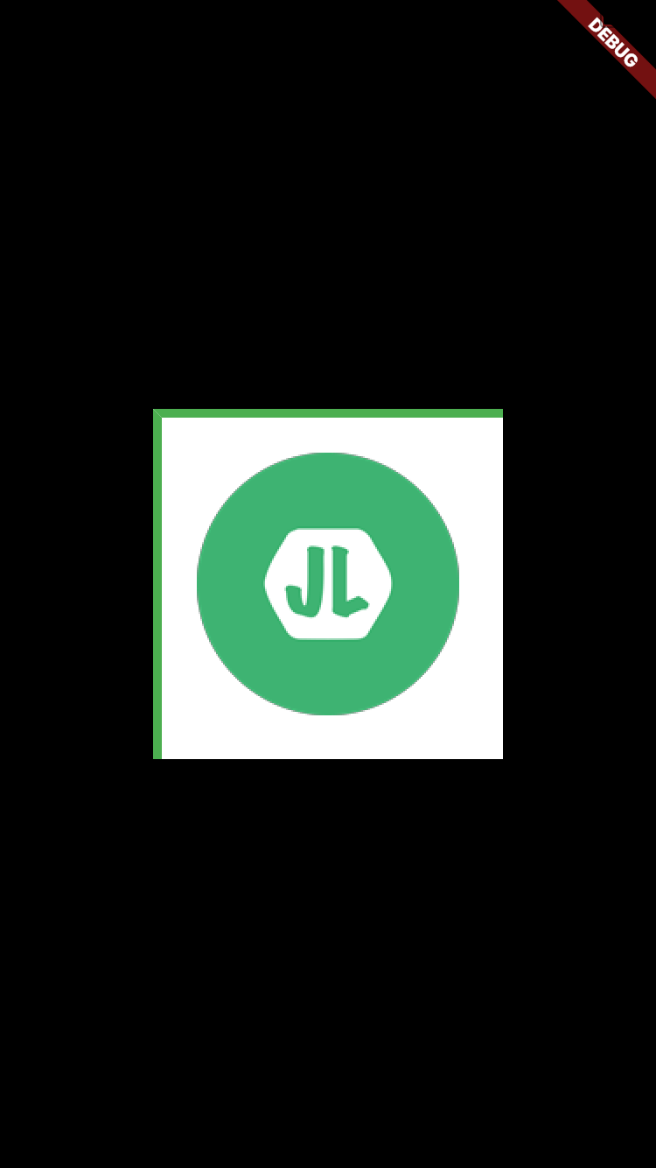
Border Class
指定边的边框, 参数分别为 top, bottom, right, left; 值为 BorderSide 类(参数同Border.all).
border: new Border(
    top: new BorderSide(
      color: Colors.green,
      width: 5.0,
      style: BorderStyle.solid
    ),
  ),
BorderDirectional
BorderDirectional 类似 Border , 同样有 4 个参数(top, bottom, start, end),其中的 start/end 对应Border 的 left/right。
border: new BorderDirectional(
    top: new BorderSide(
      color: Colors.green,
      width: 5.0,
      style: BorderStyle.solid
    ),
    start: new BorderSide(
        color: Colors.green,
        width: 5.0,
        style: BorderStyle.solid
    ),
  ),
  ima
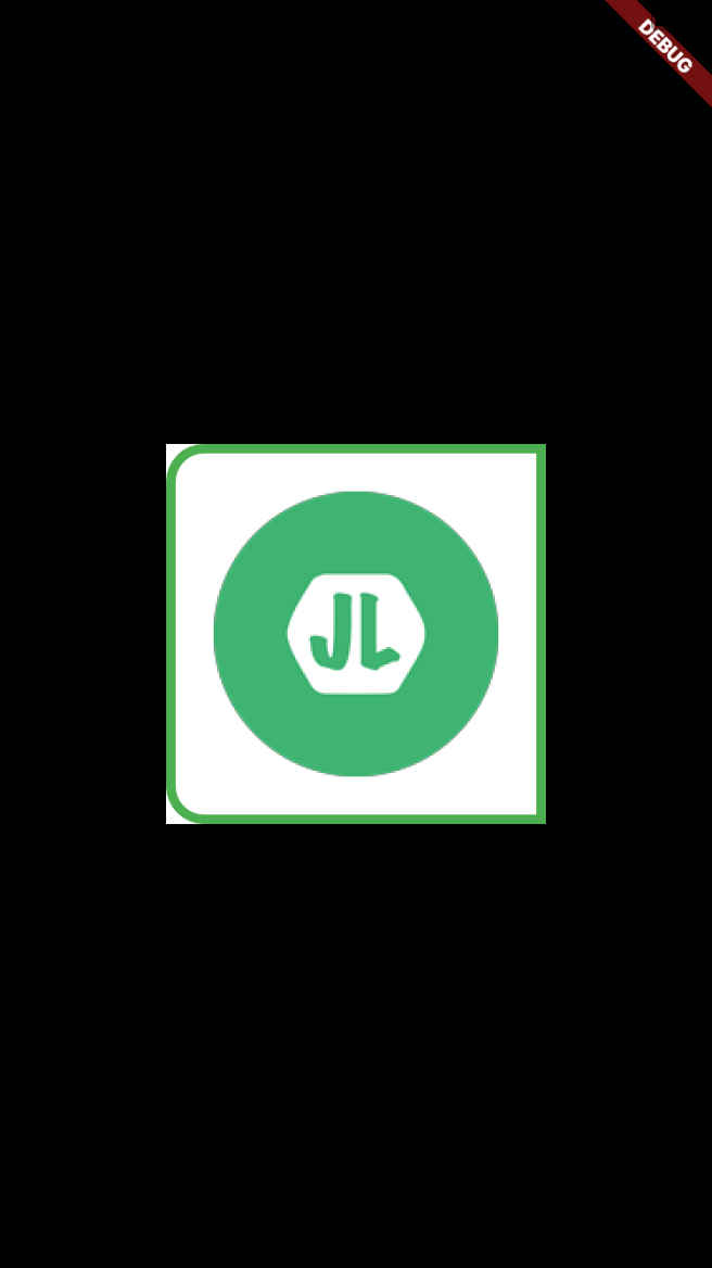
borderRadius
设置圆角。(仅在 shape: BoxShape.rectangle 时有效)。
值可以为: BorderRadius.all, BorderRadius.only, BorderRadius.circular, BorderRadius.horizontal, BorderRadius.vertical.
BorderRadius.all
new Center(
    child: new Container(
      width: 200.0,
      height: 200.0,
      color: Colors.white,
      child: new Container(
        decoration: new BoxDecoration(
          border: new Border.all(
              color: Colors.green,
              width: 5.0,
              style: BorderStyle.solid
          ),
          borderRadius: new BorderRadius.all(new Radius.circular(20.0)),
          image: new DecorationImage(
              image: new AssetImage('assets/images/JL-Logo-150.png'),
          )
        ),
      ),
    ),
  );

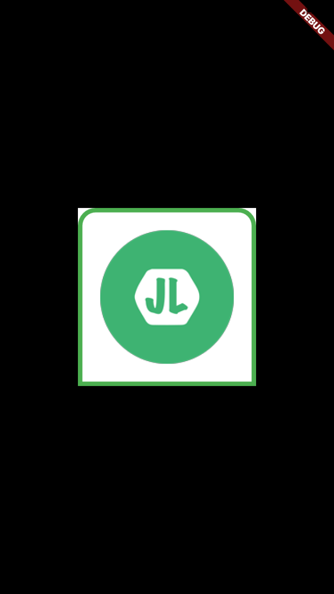
BorderRadius.circular
BorderRadius.circular(20) 等价于 BorderRadius.all(new Radius.circular(20.0))
BorderRadius.horizontal
设置水平方向一边的边框
borderRadius: new BorderRadius.horizontal(
    left: new Radius.circular(20.0),
    //right: new Radius.circular(20.0),
  ),
BorderRadius.vertical
设置垂直方向一边的边框
borderRadius: new BorderRadius.vertical(
    top: new Radius.circular(20.0),
    //bottom: new Radius.circular(20.0),
  ),
BorderRadius.only
指定角的圆角弧度
borderRadius: new BorderRadius.only(
    // 设置椭圆
    topLeft: new Radius.elliptical(40.0, 10.0),,
    //topRight: new Radius.circular(20.0),
    //bottomRight: new Radius.circular(20.0),
    bottomLeft: new Radius.circular(20.0),
  ),

boxShadow
在容器后设置阴影。
值是一个 list , 也就是说可以设置多个阴影的值
值为 BoxShadow 类, 参数为:
- color : 阴影颜色
- offset: 阴影的偏移值
- blurRadius: 高斯模糊值
- spreadRadius: 模糊扩散的偏移范围
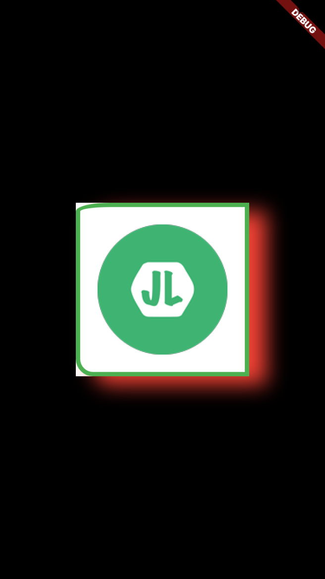
仅设置偏移值
new Center(
    child: new Container(
      width: 200.0,
      height: 200.0,
      color: Colors.white,
      child: new Container(
        decoration: new BoxDecoration(
          color: Colors.white,
          border: new Border.all(
              color: Colors.green,
              width: 5.0,
              style: BorderStyle.solid
          ),
          borderRadius: new BorderRadius.only(
            topLeft: new Radius.elliptical(40.0, 10.0),
            bottomLeft: new Radius.circular(20.0),
          ),
          boxShadow: [
            new BoxShadow(
              color: Colors.red,
              offset: new Offset(20.0, 10.0),
            )
          ],
          image: new DecorationImage(
              image: new AssetImage('assets/images/JL-Logo-150.png'),
          )
        ),
      ),
    ),
  );

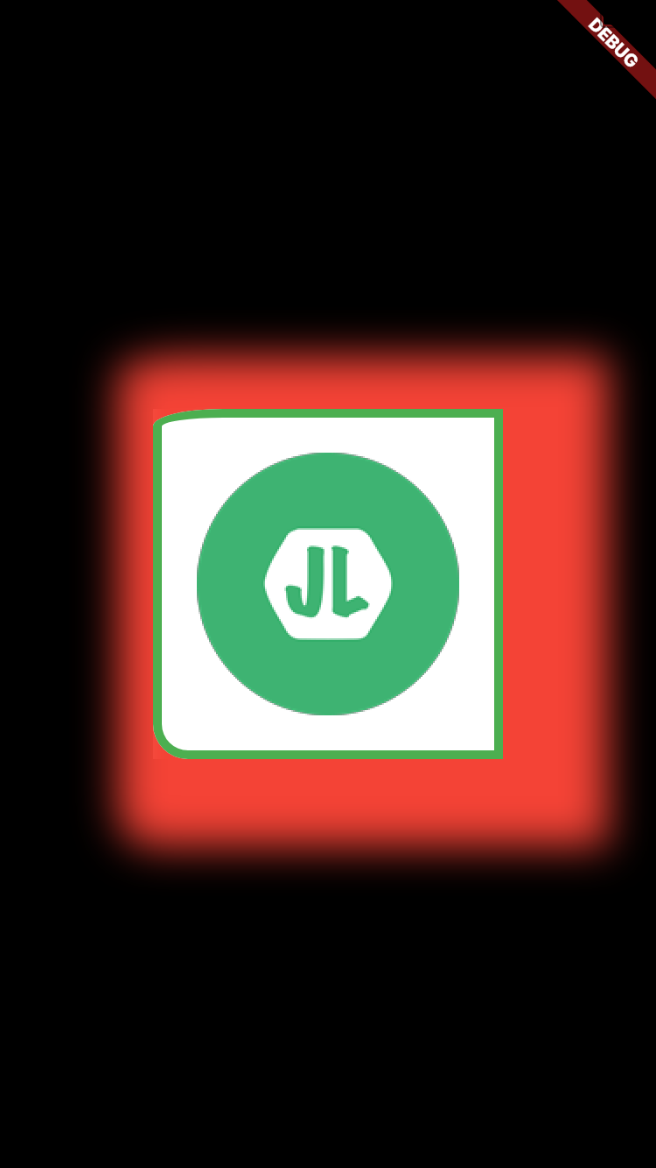
设置高斯模糊值
boxShadow: [
    new BoxShadow(
      color: Colors.red,
      offset: new Offset(20.0, 10.0),
      blurRadius: 20.0,
    )
  ],
高斯模糊的扩散范围 spreadRadius
boxShadow: [
    new BoxShadow(
      color: Colors.red,
      offset: new Offset(20.0, 10.0),
      blurRadius: 20.0,
      spreadRadius: 40.0
    )
  ],
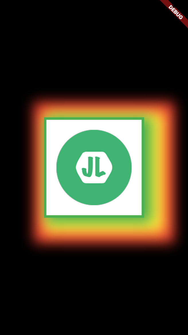
多个阴影值(由外向内)
boxShadow: [
    new BoxShadow(
      color: Colors.red,
      offset: new Offset(20.0, 10.0),
      blurRadius: 20.0,
      spreadRadius: 40.0
    ),
    new BoxShadow(
        color: Colors.yellow,
        offset: new Offset(20.0, 10.0),
        blurRadius: 20.0,
        spreadRadius: 20.0
    ),
    new BoxShadow(
        color: Colors.green,
        offset: new Offset(10.0, 5.0),
        blurRadius: 20.0,
        spreadRadius: 5.0
    )
  ],
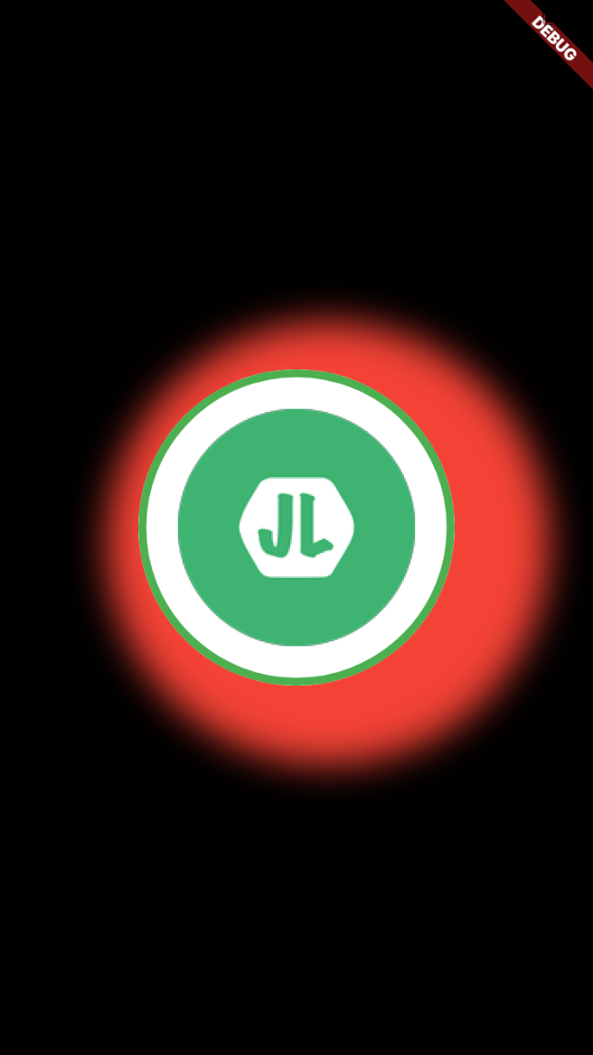
shape
形状,只有矩形和圆形两种
- BoxShape.rectangle(默认)
- BoxShape.circle
new Center(
    child: new Container(
      width: 200.0,
      height: 200.0,
      child: new Container(
        decoration: new BoxDecoration(
          color: Colors.white,
          border: new Border.all(
              color: Colors.green,
              width: 5.0,
              style: BorderStyle.solid
          ),
          boxShadow: [
            new BoxShadow(
              color: Colors.red,
              offset: new Offset(20.0, 10.0),
              blurRadius: 20.0,
              spreadRadius: 40.0
            )
          ],
          shape: BoxShape.circle,
          image: new DecorationImage(
              image: new AssetImage('assets/images/JL-Logo-150.png'),
          )
        ),
      ),
    ),
  );
padding
同 Container 中的 padding 值,参考 Flutter: 图解 Container 部件