polaris
 polaris copied to clipboard
Published
20 hours ago •
 Shopify
Shopify
[Layout foundations] Prototype `Box` usage in existing components
WHY are these changes introduced?
Resolves #7055.
Tests implementation of the alpha Box component in existing Polaris components.
WHAT is this pull request doing?
Uses Box in the Toast, ContextualSaveBar, and Banner components.
- Removes all custom
div/button/spanelements from above components to useBoxinstead
Adds API support for:
buttonon theasprop inBoxclassNameprop inBoxand as a result, removesBoxfrom exports to have it as an internal component- aria attributes
- events (
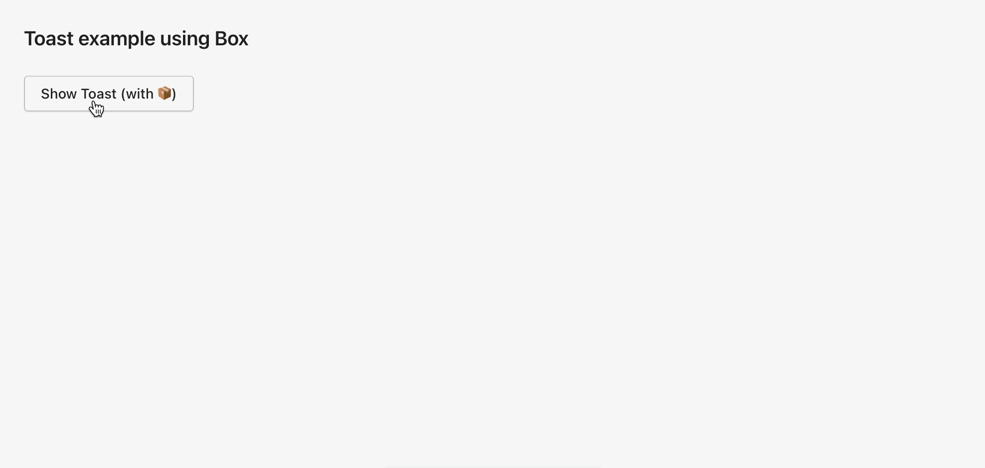
onBlur,onClick,onKeyUp,onMouseUp) disabledstateididentifiertabIndexToast example using Box
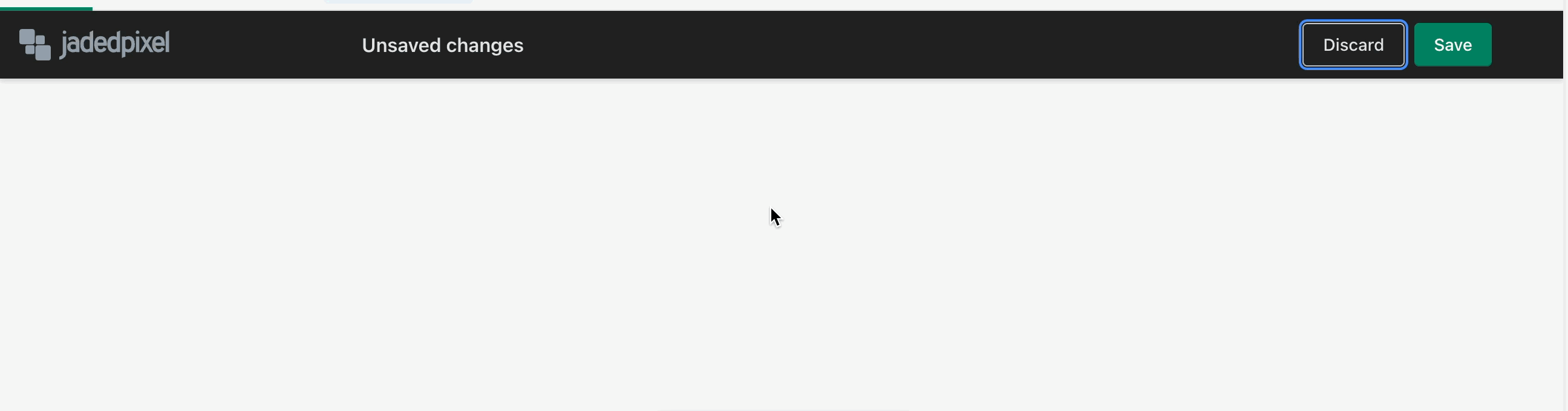
ContextualSaveBar example using Box
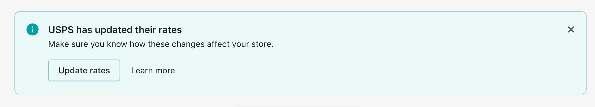
Banner example using Box
How to 🎩
🖥 Local development instructions 🗒 General tophatting guidelines 📄 Changelog guidelines
Copy-paste this code in playground/Playground.tsx:
import React, {useState, useCallback} from 'react';

import {
  Page,
  Frame,
  Toast,
  Button,
  ContextualSaveBar,
  Link,
  Banner,
} from '../src';

export function Playground() {
  // Uncomment the below to test the Toast component
  // const [active, setActive] = useState(false);

  // const toggleActive = useCallback(() => setActive((active) => !active), []);

  // const toastMarkup = active ? (
  //   <Toast content="It's toasty" onDismiss={toggleActive} />
  // ) : null;

  return (
    // Uncomment the below to test the Toast component
    // <Frame>
    //   <Page title="Toast example using Box">
    //     <Button onClick={toggleActive}>Show Toast (with 📦)</Button>
    //     {toastMarkup}
    //   </Page>
    // </Frame>

    // Uncomment the below to test the ContextualSaveBar component
    // <Frame
    //   logo={{
    //     width: 124,
    //     contextualSaveBarSource:
    //       'https://cdn.shopify.com/s/files/1/0446/6937/files/jaded-pixel-logo-gray.svg?6215648040070010999',
    //   }}
    // >
    //   <ContextualSaveBar
    //     message="Unsaved changes"
    //     saveAction={{
    //       onAction: () => console.log('save action clicked'),
    //       loading: false,
    //       disabled: false,
    //     }}
    //     discardAction={{
    //       onAction: () => console.log('discard action clicked'),
    //     }}
    //   />
    // </Frame>

    // Uncomment the below to test the Banner component
    <Page>
      <Banner
        title="USPS has updated their rates"
        action={{content: 'Update rates', url: ''}}
        secondaryAction={{content: 'Learn more'}}
        status="info"
        onDismiss={() => {}}
      >
        <p>Make sure you know how these changes affect your store.</p>
      </Banner>
    </Page>
  );
}
🎩 checklist
- [ ] Tested on mobile
- [ ] Tested on multiple browsers
- [ ] Tested for accessibility
- [ ] Updated the component's
README.mdwith documentation changes - [ ] Tophatted documentation changes in the style guide
size-limit report 📦
| Path | Size |
|---|---|
| polaris-react-cjs | 203.49 KB (+0.1% 🔺) |
| polaris-react-esm | 130.41 KB (+0.12% 🔺) |
| polaris-react-esnext | 185.24 KB (+0.1% 🔺) |
| polaris-react-css | 41.12 KB (+0.02% 🔺) |
![github-actions[bot] avatar](https://avatars.githubusercontent.com/in/15368?v=4 "Published by a pub.dev verified publisher")
Closing this in favor of the second prototype where we explored using Box in Toast without the className prop on Box. We preferred that prototype over this one due to the complexity that having a className escape hatch would introduce to the component.