dots_indicator
 dots_indicator copied to clipboard
 Pyozer
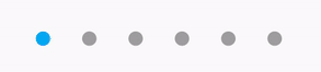
Add an indicator for a progression. You can customize indicators (shape, color, ..)
dots_indicator
Widget to display dots indicator to show a position (for a PageView for example).
Installation
You just need to add dots_indicator as a dependency in your pubspec.yaml file.
dependencies:
  dots_indicator: ^2.1.0
Example
In these examples, pageLength is the total of dots to display and currentIndexPage is the position to hightlight (the active dot).
A simple dots indicator
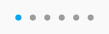
new DotsIndicator(
  dotsCount: pageLength,
  position: currentIndexPage,
);
Custom colors
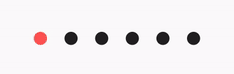
new DotsIndicator(
  dotsCount: pageLength,
  position: currentIndexPage,
  decorator: DotsDecorator(
    color: Colors.black87, // Inactive color
    activeColor: Colors.redAccent,
  ),
);
Use specific color for each dot
You can choose to have one color for inactive dots and one color the active dot.
But you can also define one color by inactive dots (colors) and one color by active dot (activeColors).
If you have a total of 3 dots, you must provide an array of 3 colors.
new DotsIndicator(
  dotsCount: pageLength,
  position: currentIndexPage,
  decorator: DotsDecorator(
    colors: [Colors.grey[300], Colors.grey[600], Colors.grey[900]], // Inactive dot colors
    activeColors: [Colors.red[300], Colors.red[600], Colors.red[900]], // Àctive dot colors
  ),
);
Custom size and shape
You can change the default size of dots and also shape.
So you can choose to have a shape for inactive dots and another shape for the active dot for example.
By default, the shape of dots are CircleBorder, so to have a rounded rectangle for active one, you need to change activeShape
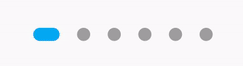
new DotsIndicator(
  dotsCount: pageLength,
  position: currentIndexPage,
  decorator: DotsDecorator(
    size: const Size.square(9.0),
    activeSize: const Size(18.0, 9.0),
    activeShape: RoundedRectangleBorder(borderRadius: BorderRadius.circular(5.0)),
  ),
);
Custom size for each dot
You can customize the size of each dot, for inactive and/or active dots.
For that, use sizes and/or activeSizes params.
new DotsIndicator(
  dotsCount: pageLength,
  position: currentIndexPage,
  decorator: DotsDecorator(
    sizes: [
      const Size.square(10.0),
      const Size.square(15.0),
      const Size.square(20.0),
    ],
    activeSizes: [
      const Size.square(25.0),
      const Size.square(25.0),
      const Size.square(35.0),
    ],
  ),
);
Custom shape
You can change the default shape of dots. By default it's a CircleBorder.
You can change the no active and active dot shape.
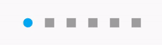
new DotsIndicator(
  dotsCount: pageLength,
  position: currentIndexPage,
  decorator: DotsDecorator(
    shape: const Border(),
    activeShape: RoundedRectangleBorder(borderRadius: BorderRadius.circular(5.0)),
  ),
);
Custom shape for each dot
You can customize the shape of each dot, for inactive and/or active dots.
For that, use shapes and/or activeShapes params.
new DotsIndicator(
  dotsCount: pageLength,
  position: currentIndexPage,
  decorator: DotsDecorator(
    shapes: [
      RoundedRectangleBorder(borderRadius: BorderRadius.circular(5.0)),
      RoundedRectangleBorder(borderRadius: BorderRadius.circular(10.0)),
      RoundedRectangleBorder(borderRadius: BorderRadius.circular(15.0)),
    ],
    activeShapes: [
      RoundedRectangleBorder(borderRadius: BorderRadius.circular(10.0)),
      RoundedRectangleBorder(borderRadius: BorderRadius.circular(10.0)),
      RoundedRectangleBorder(borderRadius: BorderRadius.circular(25.0)),
    ],
  ),
);
Change the space between dots
By default a dot have a margin of 6 pixels on his left and right. It's EdgeInsets.symmetric(horizontal: 6.0).
But if you want you can change it, for example to increase the space between dots or to add top margin.
new DotsIndicator(
  dotsCount: pageLength,
  position: currentIndexPage,
  decorator: DotsDecorator(
    spacing: const EdgeInsets.all(10.0),
  ),
);
Axis and reverse property
There is two other property, axis and reversed.
Axis is to display dots indicator horizontally (default) or vertically.
Also, you can set reversed: true to reverse the order of dots. (default: false).
For example, if you want to display the dots indicator vertically, but with the first dots on bottom :
Set axis: Axis.vertical and reversed: true.
Obviously, you can use reversed with Axis.horizontal.
onTap property
You can add onTap property, to listen when a dot has been pressed.
Exemple:
onTap: (position) {
  setState(() => _currentPos = position);
}
 Pyozer