tomviz
 tomviz copied to clipboard
Small things that help with the user's learning curve
Hey! I'm new to Tomviz and I've been playing around it for a couple of days. There're many features that I wish are better documented, and I still find some of them a little confusing. I'm writing down all the thoughts and suggestions on small UX details in this thread. They are generally not on the critical path of development and really easy to fix.
Highlight Color of the Scale Cube
When a scale cube is grey by default, it's highlighted as nearly white when it's picked up by the mouse. If the background color is white, it becomes really hard to position the scale cube because of the little color distinction between the two.
Labeling of Zoom to Data and Reset
These two features are really helpful, but I don't quite understand what exactly they're doing. If there's one simple line of explanation in the description that appears after mouse hover, that'd be nice!
the VCR toolbar appears by default
For new users, the VCR toolbar (play, next frame, etc.) appears by default, while the animation panel is not. When we're exploring the toolbars, the VCR toolbar seems useless and buggy when it's certainly not. If the animation panel can appear each time the VCR toolbar is clicked on, this confusion ends. Or, we can make the VCR toolbar appear only after the animation panel is turned on.
the Histogram/ Color Map
It's not immediately obvious to users that data points can be deleted by pressing "delete," and data points for color information can be changed by double clicking. I hope there's a small drop-down menu for deleting/ selecting/ manipulating data points that appears when right-clicking/ commend-clicking, just to give the interactions more obvious. Also, the data points are really hard to pick up sometimes: the mouse has to be really close to an existing data point to pick it up, or else a new data point is created. Meanwhile, the new data point is often overlayed by the existing ones and limits the range how the points can be moved, which is frustrating for users. I think it'd be nice if picking up existing points is made easier and creating new ones made harder.
Little bug in the "Adjust Camera" pop-up window
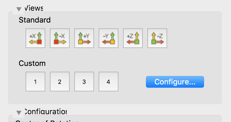
This might be a MacOS thing, but a small downside arrow is blocking the type:
