PipelineC
 PipelineC copied to clipboard
Better visualization of function data flow
For example: Yosys can produce images of logic / dataflow /wires like below
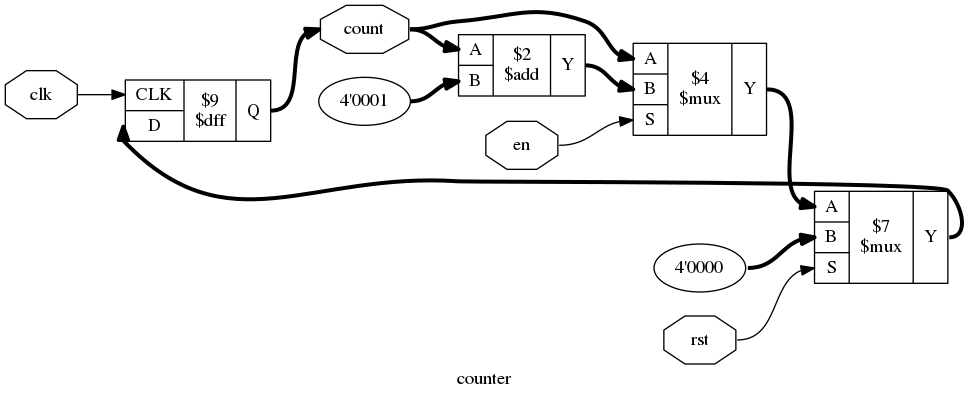
But for PipelineC I want to show the delay of operations too.
Ex. would want in the above picture image the add rectangle to be wider than the others - trying to show it takes more logic delay flowing from left/input -> right/output to do an add than, mux etc.
PipelineC can produce a ~netlist looking thing of modules and connections. But each module also comes with this 'delay' value.
Currently that info is used to write a very bad ASCII attempt at a 'picture'. This would replace that.
Want to be able to draw nice pictures like yosys produces - but that also include the PipelineC logic delay info...
Oh also a starter version using https://stackoverflow.com/questions/29572623/plot-networkx-graph-from-adjacency-matrix-in-csv-file https://github.com/JulianKemmerer/PipelineC/blob/5685a873caebfc3b46454640617108684783cbe7/src/C_TO_LOGIC.py#L1294
exists but looks worse than yosys example above so didnt use