web-stories-wp
 web-stories-wp copied to clipboard
Custom Calendar Styling
Feature Description
This is a followup to #789 which is a short term solution for the Beta Release. Once a calendar is implemented we will need to style it according to the designs
Do not alter or remove anything below. The following sections will be managed by moderators only.
Acceptance Criteria
- The calendar should match the designs in Figma
QA Instructions
Note: It would be good to confirm if we're going to reuse the WordPress calendar style again (as it is in Figma currently), or use something custom -- since we're going to use a custom calendar anyway now and not a copy of WP implementation.
Pinging @samitron7 to confirm, but I don't think it makes sense to use WordPress styling anywhere in the editor.
Yeah, no WP styling but this is probably a low priority thing. Adding to visual design request.
@samitron7 after review the eng team requests that the other views to also be included:
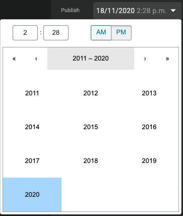
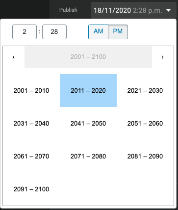
- Year view
- Month view
- Century view
Here are the 4 views of the current calendar component, that all need a design. Note that the first is designed at the three latter are very similar:
| Month | Year | Decade | Century | |
|---|---|---|---|---|
| Current design | 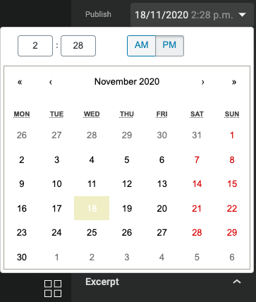 |
 |
 |
 |
| New design | 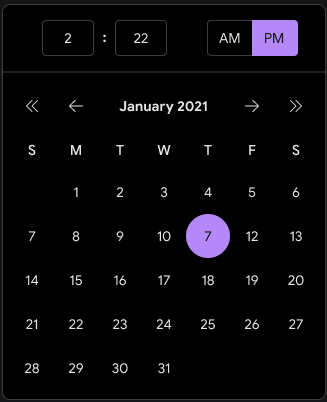 |
missing | missing | missing |
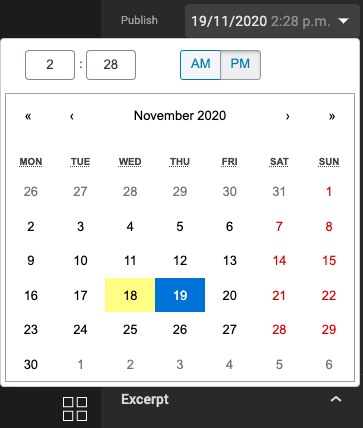
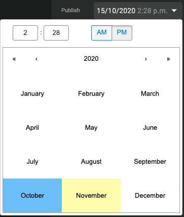
Also, what do the highlights for today and current selection look like? In the current editor, current selection is the blue background, where today is the yellow background. This is present in all views:
Monthly view with current selection as 19th where today is 18th:
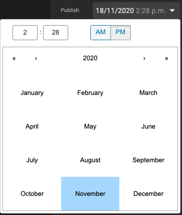
Yearly view with current selection as October where today is November:
The above design only has a single color for highlight - is that supposed to represent current selection only and no highlight for today?
OMG...not trying to defend myself here, but I had NO idea to click on the month to get to the other view. Do we know if users actually use the other views? UI is not too friendly plus you can use the inner arrow to navigate month and outer arrow to navigate year. I prefer to hide that functionality and avoid additional work. @o-fernandez thoughts and for context, this is a pure visual restyle of the WP calendar?
I added the current selection state to Figma (also fixed the active color. FYI @BrittanyIRL is implementing the design language so the normal, hover, focus and active state should apply to the calendar. Only button state that is special to the calendar design is the outline circle. This pattern does not exist elsewhere. Please ping her for details on button states.)
OMG...not trying to defend myself here, but I had NO idea to click on the month to get to the other view.
It is a bit secret, yes.
Do we know if users actually use the other views?
I have no idea. I don't think we log that.
UI is not too friendly plus you can use the inner arrow to navigate month and outer arrow to navigate year. I prefer to hide that functionality and avoid additional work. @o-fernandez thoughts and for context, this is a pure visual restyle of the WP calendar?
We can definitely disable the year, the decade, and the century view, if desired. I don't think people often schedule posts for next decade, so we're probably in the clear for this one. As long as we don't use it for birthdates or similar, month-only view is probably fine.
@barklund Let's just start with the view that I provided (ie month). We can disable year, decade and century. If request comes in for year we can react to that later.