reagent-table
 reagent-table copied to clipboard
 Frozenlock
A table component with all the usual features you would expect
Reagent-table
A table component with all the usual features you would expect.
- Sort rows by multiple columns
- Resizable columns
- Re-order columns
- Hide/show columns
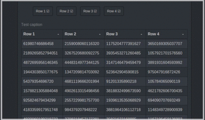
Contrary to most React.js table components, this one uses the correct HTML tags (table, thead, th, tr...) to be compatible with your favorite CSS. This also means the data can easily be copied from the table.
Usage
Add this to your project dependencies:

Require Reagent-table in your namespace:
(ns my-ns
  (:require [reagent-table.core :as rt]))
Then, simply use it as a normal component:
[rt/reagent-table table-data config]
table-data is an atom containing a vector, each child being a row. How this data is rendered is determined by
the :column-model and :render-cell configuration elements. config is a map containing various
options described below.
There is a distinction between view and model coordinates for
column numbers. A column's view position may change if it is
reordered, whereas its model position will be that of its index
into :column-model
:column-model is a vector of so-called render-info maps containing
:headerA string for the header cell text:keyThe reagent key for the column position in any rows. If absent defaults to the model index:sortable falseWhen:sortis present (see below) by default all columns are sortable. Otherwise any column can be excluded and no glyph will appear in its header. Other entries are as required by the client. The map is passed to the:render-cellfunction when cells are painted.
:render-cell a function that returns the hiccup for a table cell
(fn [render-info row row-num col-num] (...))
where render-info is the column entry, row is the vector child from
data-atom, row-num is the row number and col-num is the column number
in model coordiates.
:table-state an atom used to hold table internal state. If supplied by
the client this is a way to see table state at the repl, and to allow the
client to modify column order and sorting state.
:row-key A function that returns a value to be used as the regaent key
for rows
(fn [row row-num] (...))
where row is the vector child from data-atom, row-num is the row number.
:sort a function to sort data-atom when a header cell sort arrow is clicked.
Returns the newly sorted vector. If absent, the table is not sortable and no
glyphs appear in the header.
(fn [rows column-model sorting] (...))
where rows is the vector to sort, column-model is the :column-model and sorting
is a vector of vectors of the form [column-model-index :asc|:desc]. If the
column-model entry includes :sortable false the individual column is excluded
from sorting. Select multiple columns for sorting by using ctrl-click. Repeat
to toggle the sort direction.
:table The attributes applied to the [:table ... ] element. Defaults
to {:style {:width nil}}} If using fixed headers include :border-collapse "separate"
to ensure any border on the header cells remains fixed to them.
:table-container Attributes applied to the <div> used to contain the table. For example
if you want a decorative border place it here, so that any scrolling does not affect it.
Internally, this container has the class reagent-table-container so you may style it
externally.
:thead The attributes applied to [:thead ...]
:tbody The attributes applied to [:tbody ...]
:caption An optional hiccup form for a caption
:scroll-height If present then expresses a height for table and enables
scrolling with fixed headers. Depending on what else is in the window, a
value of "80vh" might give a good result. Does not play well with :caption.
:column-selection Optional attributes to display visible column toggles
for example {:ul {:li {:class "btn"}}}
See reagent-table.dev for a working example.
Metadata
Owner
 Frozenlock
Metadata
A table component with all the usual features you would expect