react-range-calendar
 react-range-calendar copied to clipboard
 Expertizo
A responsive and accessible date range picker component built with React
react-range-calendar :calendar:
A responsive and accessible date range picker component with bunch of options built with React :fire:

Demo & Features (click here)
| range | free-range | single |
|---|---|---|
 |
 |
 |
Install
npm install --save react-range-calendar
OR
yarn add react-range-calendar
Usage
import React, { Component } from "react";
import Calendar from "react-range-calendar";

export default class App extends Component {
  state = {
    visible: true,
    dateRange: [new Date("11/10/2019"), new Date("11/18/2019")]
  };

  render() {
    const { visible, dateRange } = this.state;
    const steps = 7;
    const startWithDay = "Wed";

    return (
      <Calendar
        visible={visible}
        steps={steps}
        startWithDay={startWithDay}
        dateRange={dateRange}
        onDateClick={(minDate, maxDate) => {
          this.setState({ dateRange: [minDate, maxDate] });
        }}
        type="range"
      />
    );
  }
}
Common Props
Asterisk (*) props are Required.
| Prop name | Description | Default Value | Example values |
|---|---|---|---|
| type* | Types of calendar ["free-range", "single", "range"] |
"range" |
"free-range" |
| visible* | Visibility of calendar | false |
true |
| dateRange* | Array of starting and ending dates | [] |
[new Date("11/10/2019"), new Date("11/18/2019")] |
| onDateClick* | On clicking any date | (minDate, maxDate)=>{} |
|
| baseColor | Base color | #007bff |
red |
| hoverBackgroundColor | Hover background color | #007bff |
red |
| disabledColor | Disabled color | #add8e6 |
#b9b9b9 |
| weekendsDaysColor | Weekends color | grey |
#ffbaba |
Types
-
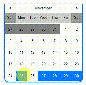
range
On user date selection, it will find nearest provided day (
startWithDay) and add providedstepsfrom that dayExample
<Calendar
  visible={visible}
  steps={steps}
  startWithDay={startWithDay}
  dateRange={dateRange}
  onDateClick={(minDate, maxDate) => {
    this.setState({ dateRange: [minDate, maxDate] });
  }}
  type="range"
/>
Demo
Props
Prop name Description Default Value Example values steps* Steps from start date 77startWithDay* Starting day of nearest selected date WedWed -
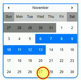
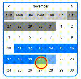
free-range
Users can select date freely
Example
<Calendar
  visible={visible}
  dateRange={dateRange}
  onDateClick={(minDate, maxDate) => {
    this.setState({ dateRange: [minDate, maxDate] });
  }}
  type="free-range"
/>
Demo
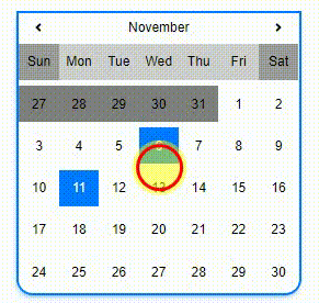
-
single
For single date select
Example
<Calendar
  visible={visible}
  dateRange={dateRange}
  onDateClick={date => {
    this.setState({ dateRange: [date] });
  }}
  type="single"
/>
Demo
Contributors ✨
Thanks goes to these wonderful people
 Hams Ahmed Ansari (Author) 🚇 💻 |
 Mohammad Kashif Sulaiman 💻 |
Pull Requests
Feel free to make Pull Request for your feature/fix.
License
MIT © Expertizo
 Expertizo