BookStack
 BookStack copied to clipboard
 BookStackApp
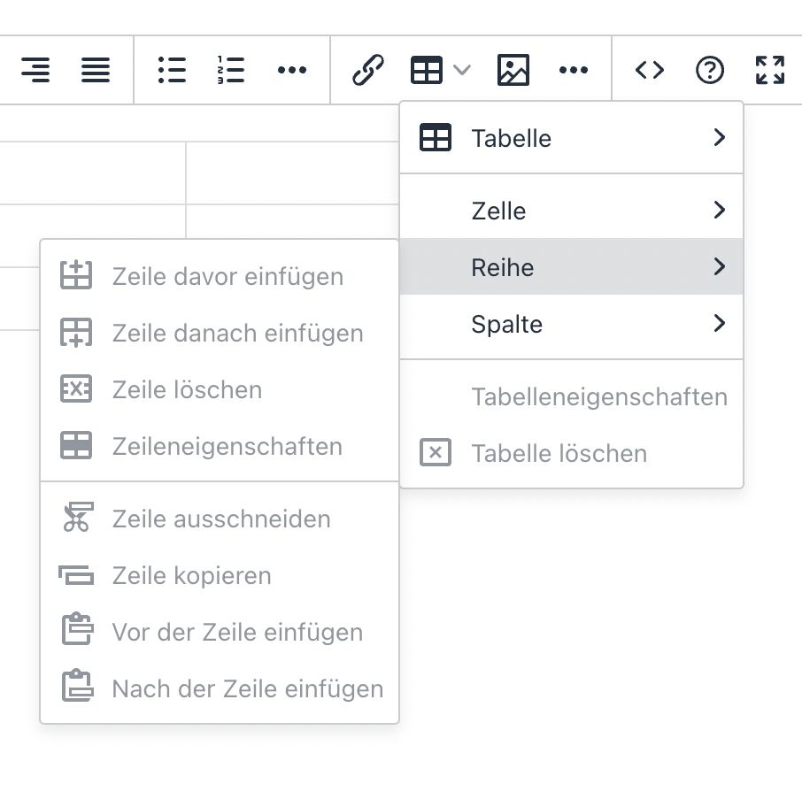
Table editing icons hardly decipherable
Describe the feature you'd like
More a design flaw, than a bug. But also not quite a feature request.
Compared to the previous design I find the new icons for table editing hardly decipherable, especially at very dense display resolutions (as smaller the icons, as more difficult to distinguish). If not replacing those icons entirely, one should at least make the X in the icons red and the + green.
Describe the benefits this would bring to existing BookStack users
Better usability.
Can the goal of this request already be achieved via other means?
No.
Have you searched for an existing open/closed issue?
- [X] I have searched for existing issues and none cover my fundemental request
How long have you been using BookStack?
1 to 5 years
Additional context
No response
Thanks for the input @Wookbert
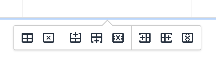
Previous Icon Designs for Reference
TinyMCE 6 icons appear to be the same as the current, newer icons.
Personally, I don't see too much of a difference between these, and think the newer icons actually make a little more sense in their representation although differentiating between the cross and plus is maybe slightly harder in the new.
Is there anything particular in the new icons that you find particularly troublesome in comparison to the old ones or is it mainly due to distinguishing the cross/plus?
No idea what you display size and resolution is, but I use a 14" MacBook Pro with 3024 × 1964 px. resolution, which is set to "more space" under scaling (looks as 1800 x 1169). As smaller the icons on the screen are (due to high resolution and scaling), as harder it becomes to identify the individual icons and their function. You might get a better idea if you view the icon images in this thread on a small Smartphone screen or decrease Zoom below 100% on your Desktop browser.
Keep in mind that you personally might be able to press the respective buttons blindly, but anyone who’s using the function only occasionally, has to identify them actually by their graphical meaning.
As for previous TinyMCE icons: These are clearly much easier/better to identify as the X and + are both bigger, bolder and the + in particular has more white space. Every designer knows that: As smaller a line graphic gets, as more space between the lines are needed. That’s why same logos can't be printed on ball pens (if they still should be recognizable).
Sure, as I alluded to in my previous comment, I think the older icons are graphically clearer but the new icons are a better representation of their action.
Keep in mind that you personally might be able to press the respective buttons blindly, but anyone who’s using the function only occasionally, has to identify them actually by their graphical meaning.
I don't use these actions too much, I have often deferred to the hover text, both before and after the icon change.
I looked to google material icons for some alternatives but they don't have many options for these cases.
Getting color involved is a little messy and adds some complication but doable. Coloring small details can often appear awkward, and we may have to have different colors for light/dark modes. Would need to test things out.
Sure, as I alluded to in my previous comment, I think the older icons are graphically clearer but the new icons are a better representation of their action.
IMO there is ZERO room for misinterpreting the previous icons, but a SERIOUS problem deciphering the current ones at small representation and /or bad eye sight. Can’t you simply roll back to the previous graphics, or does that involve tweaking TinyMCE now and in future releases?
Can’t you simply roll back to the previous graphics, or does that involve tweaking TinyMCE now and in future releases?
We could probably find the old icon sources then override the newer icons, assuming the old ones were also SVGs, but then they won't really fit with the theme of the others too well. Personally I still have a slight preference for the new icons.
I can lend you my nearly 50 year old eyes, plus my 14" 2021 MacBook and you'll instantly change your mind. 🤪 (Say no more... you are going for the MacBook only).
OK... Coincidentally creating a table in BookStack right now and noticed that in the menus, the disable icons in medium grey are a bit easier readable (sic!) than the high contrast black editing icons which appear under an existing table. But I understand that this color scheme is reserved for the ghosted items and would require the ghosted icons to be brighter.
Still, if we'd make the editing icons in the same grey, it would help already. And if we could turn the + green and the X red I think it would be perfect.
Forward me the SVG package and I'll create an alternative, improved version. Both color added to black/medium grey and medium grey/lighter grey.
Here's an easy "Custom HTML Head Content" addition which should work on a current instance:
<style>
.tox-pop__dialog .tox-toolbar button svg {
	fill: #666;
}

.tox button[title="Delete table"] svg,
.tox button[title="Delete row"] svg,
.tox button[title="Delete column"] svg {
	fill: #ac4242;
}

.tox button[title="Insert row before"] svg,
.tox button[title="Insert column before"] svg,
.tox button[title="Insert column after"] svg,
.tox button[title="Insert row after"] svg {
	fill: #41992f;
}
</style>
This will selectively change the color of the icons as a whole. Not tested against dark mode though. I did play around with changing the +/x color but they don't look right, the tiny hint of color made the icons harder to parse from my perspective.
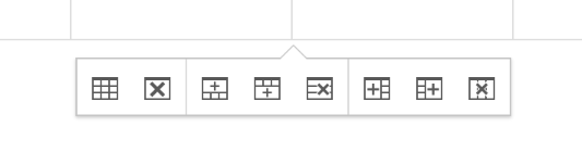
Just spent a little time with the icons, seeing if I use the modern & monotone styling of the newer icons while removing some of the visual noise. In the image is the current icons and then the tweaked icons below. I've tried to scale this screenshot (Within the display of this issue, not the file itself) to be representative of the matching web-viewed size as 100% zoom.
Do you find the second set to be an improvement?
Commit for my reference: 953402f2eb05e00f2aa8440084df17a16fc8e52a
Second design is definitely an improvement in my opinion. Any chance to additionally make the +sses green and the Xsses red? (Only the + and X, not the entire icons).
Any chance to additionally make the +sses green and the Xsses red? (Only the + and X, not the entire icons).
I did play about with that back in July, but it only seemed to make the icons harder to read. The small amount of color seemed to not be instantly recognizable and caused more visual distraction.
Have now merged the tweaked icons into the development branch, to be part of the next feature release. Hopefully between these changes, the hover-labels that already exist and, if applied, the color tweak above, these icons should be significantly more decipherable so I will therefore close this off.