bloop
 bloop copied to clipboard
Light mode?
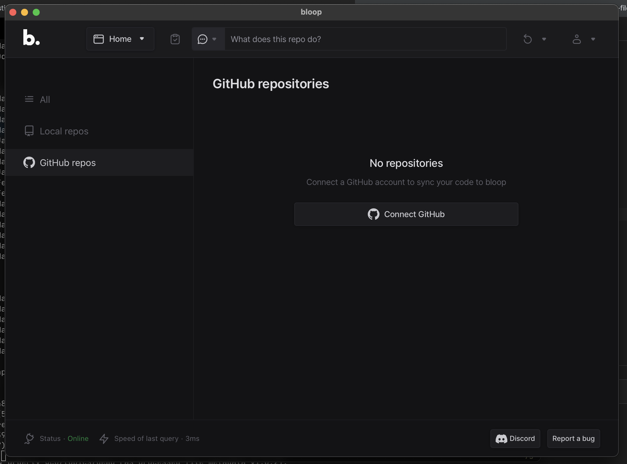
What's the problem? I'm not sure what kind of eyes or monitors y'all have, but I find this dark mode of this app absolutely unreadable. It's dark gray text on dark background and it's basically impossible for me to read anything on this. No other apps with dark mode are that bad, but this one is 100% impossible to use because of that.
What's the solution? Just add light mode :/ But also even in dark mode, the buttons for "Discord" or "Report a bug" are fine/reasonable, but most of the text is unreadable.
Additional context Dark modes overall are pretty bad for many people with astigmatism.
- https://medium.com/@h_locke/why-dark-mode-causes-more-accessibility-issues-than-it-solves-d2f8359bb46a
- https://kevq.uk/is-dark-mode-such-a-good-idea/

Looks fine for me on macOS. The text in the bottom left is a little dim, but it's background info anyway. This dark mode does not stand out to me as any less readable than dark mode in other apps. I do support having a light mode option though. At this point there's no reason to not include both options for new apps.
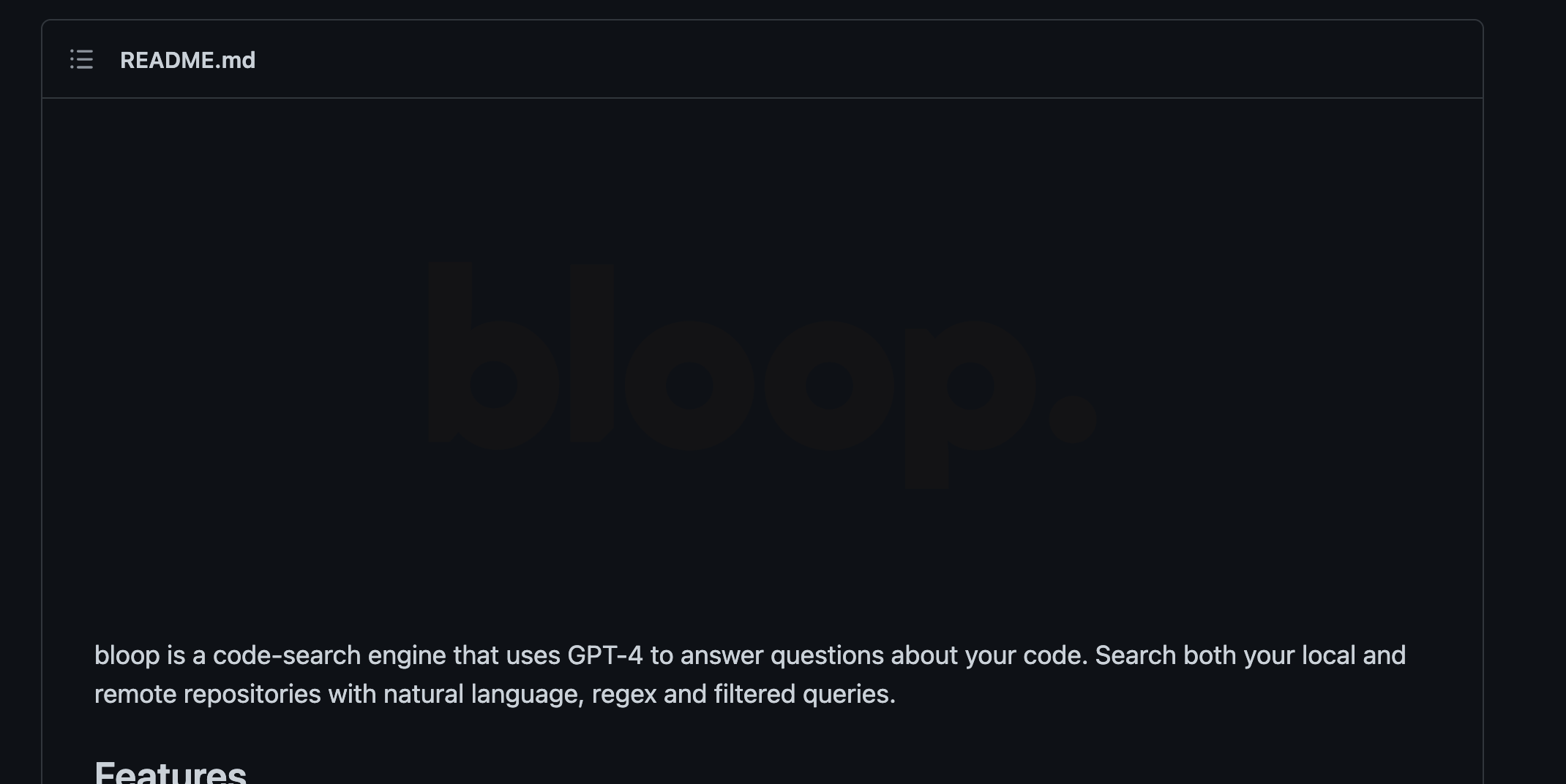
Although... The logo in the readme is unreadable in GitHub's dark mode, maybe that's a separate issue
Well the dark gray text for me is barely readable in regular daylight in a room, I could only read it when putting down window blinders or looking at the screen from the side, irregardless of whether the screen is matte or not. Perhaps that's a matter of having a TN screen rather than IPS or OLED, but I think design should take this into consideration, because I didn't really encounter something like that to this level in any other app that I recall (though I'd still prefer to just use light mode instead personally xd)
The text in the bottom left is a little dim, but it's background info anyway.
You could say that, but the same color is used for tabs on the left and description under "No repositories", and I think those don't apply to that category. Similar with icons and text on the top, there's barely any contrast on them
Best way to demonstrate the issue is with an actual unedited photo:
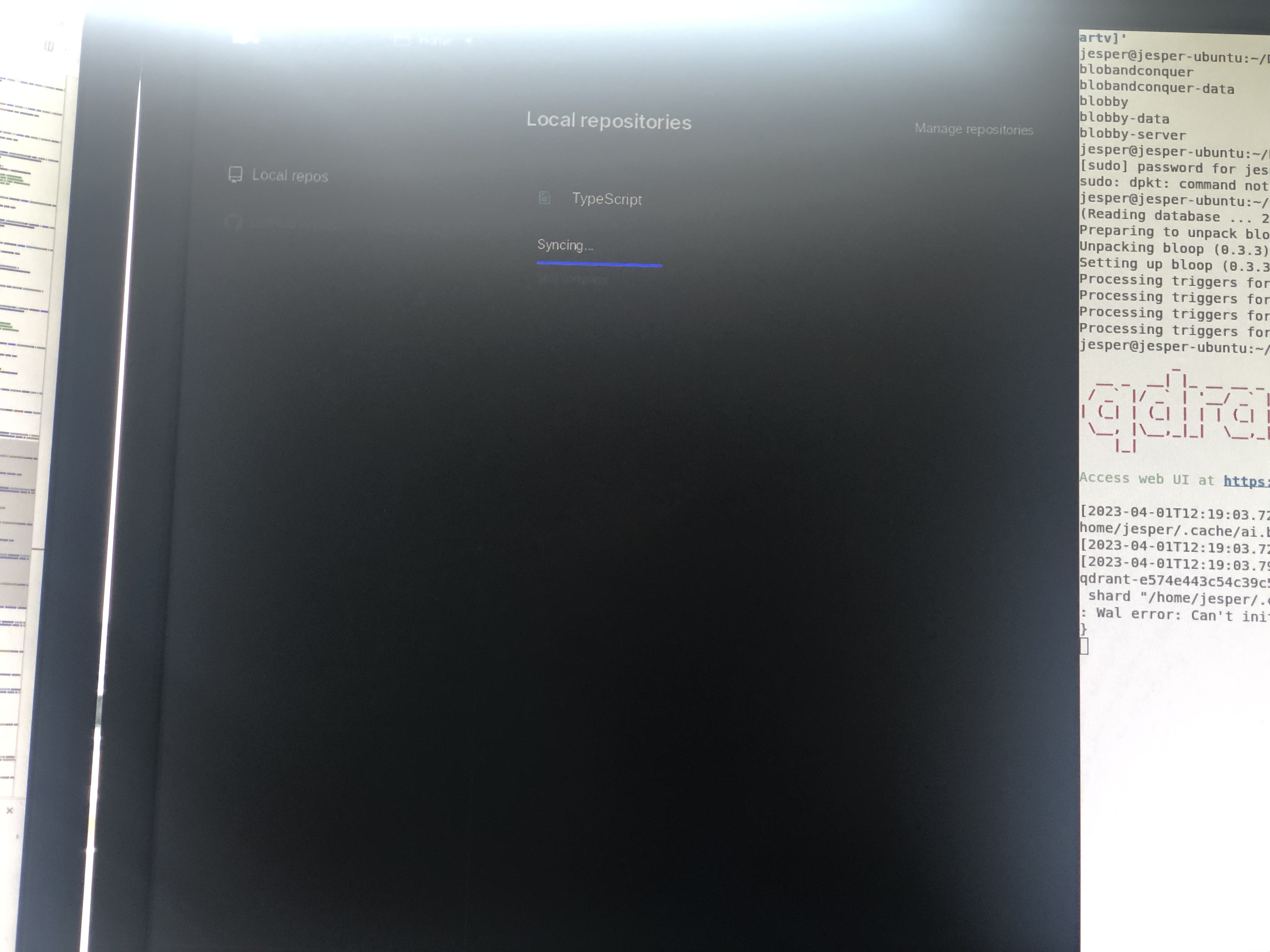
Light mode would fix this, but if that's too much work changing the contrast of some of the UI would work as well.
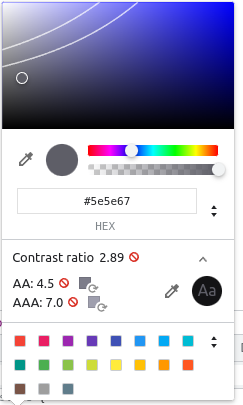
Much of the UI does not pass AA WebAIM guidelines:
Themes (including light mode) are supported as of v0.4.0! https://github.com/BloopAI/bloop/releases/tag/v0.4.3