 AlecAivazis
It is not working on IOS devices
We've found that the behaviour in our IOS devices is not right. Is this happening of any of you?
it works for Android devices and browsers so we are assuming that we have done the configuration right.
Any clue?
Thanks in advance.
Hey @dpcrespo sorry for taking so long to reply to you. Unfortunately, I do not do much responsive native development so I haven't tried redux-responsive on IOS. However, it seems someone else has experienced it so I'm leaving this open as a reminder for me to look into this next time I do. If you want some guidance for tracking this down yourself, I'd love to help any way I can.
@AlecAivazis this issue should be closed: It is a problem that only occurs in a few (old) browsers and it can be fixed with Modernizr (for example).
Thanks for digging into this @linuxonrails - do you think the problem is the same on #97?
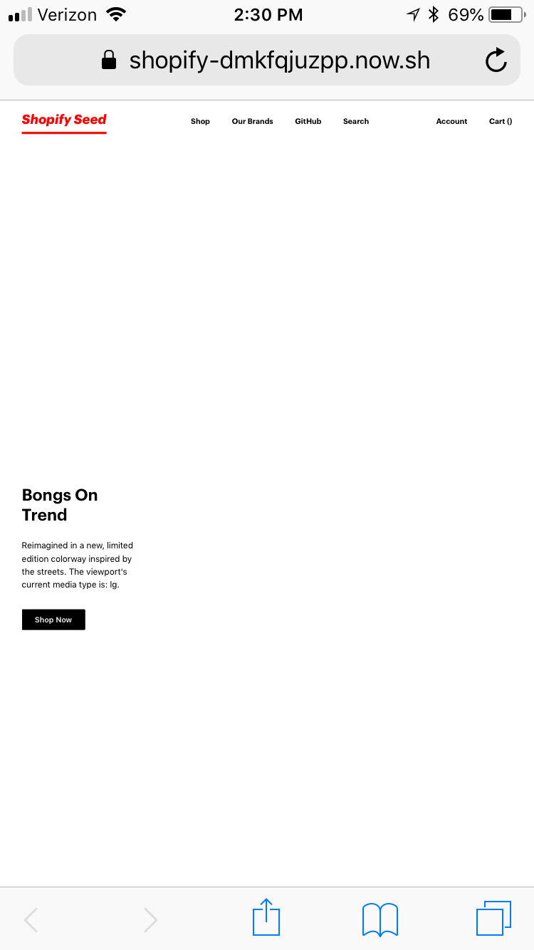
I just experienced an issue on an iPhone 6s where the responsive state isn't right. If you look at the text underneath "Bongs on Trend", it says that the current media type is "lg", but I have that media type set to the width of 1024px. Any clue why this is happening only on this device? Browsers on desktop works fine... @AlecAivazis
hey @ianseverance - thanks for reporting this. Do you see anything in your browser console when you visit the site on your phone? It seems strange that this line would execute but things not work
@AlecAivazis I don't see anything strange. There are no errors in the console. I have tried on both my iPhone 6s (Safari), iPhone 7 Plus (Safari) and Google Pixel (Chrome). It is obviously working because browser.mediaType isn't returning null, it is returning one of the breakpoints. But for some reason, even with orientation change, the browser.mediaType is still returning my lg breakpoint, which is only windows sized 1024px to 1280px.
I also noticed that the compatibility for MediaQueryList is unknown for a lot of different platforms (more specifically mobile devices) which may mean that the issue isn't on your side, but on browser support...
@AlecAivazis Found the issue to my problem. It had to deal with not adding the <meta name="viewport"> tag to my HTML page. So I added this bit of code to make sure mobile is responsive: <meta name="viewport" content="width=device-width, height=device-height, initial-scale=1.0, minimum-scale=1.0">. Now, redux-responsive works correctly! I'd maybe add this to the readme in case someone else runs into a problem like this.
Ah! Nice catch! I'm going to be away for a few days, would you mind submitting a PR that adds that? Also, could you check if that also fixes the orientation change detection problems that have been reported?
@AlecAivazis I submitted a pull request https://github.com/AlecAivazis/redux-responsive/pull/105. I tested it and it seems that any of the orientation problems that people have been experiencing I couldn't reproduce on my machine, but I'm not entirely sure that it is fixed so I left it out of my pull request. It would be worth mentioning in other issues this fix, and seeing if it helps them!
Thanks for doing that @ianseverance!
@dpcrespo, can you verify if what @ianseverance added fixes your problem?
Let me get some time, and I'll give another try. Anyway when I met the issue I checked the viewport out and it was there already. As I said let me get some time and I'll back to you. Thanks for being worried about this.